可视化时间范围数据表达为日期范围

3

我希望能够可视化下面五个项目的时间框架数据。目前我正在使用OpenOffice绘图应用程序并手动制作下面所示的图表。但我不满意。请问您能否帮助我解决以下问题。谢谢。

1. How can I produce somewhat similar graphs using R (or excel) with better precision in terms of days? 
2. Is there a way for better visualization of the data? If so, please let me know how to produce that using R or Excel. 

Project     Time
-------    ------ 
A   Feb 15 – March 1
B   March 15 – June 15
C   Feb 1 – March 15
D   April 10 – May 15
E   March 1 – June 30

enter image description here

2个回答

4

ggplot2 提供了一种(相对)简单的构建图表的方式。

首先,您需要将数据导入到 R 中。您希望起始和结束日期在 R 中以某种日期格式表示(我使用了 Date)。

library(ggplot2)
library(scales) # for date formatting with ggplot2

DT <- data.frame(Project = LETTERS[1:5], 
  start = as.Date(ISOdate(2012, c(2,3,2,4,3), c(15,15,1,10) )),
  end = as.Date(ISOdate(2012, c(3,5,3,5,6), c(1,15,15,15,30))))
# it is useful to have a numeric version of the Project column (
DT$ProjectN <- as.numeric(DT$Project)

您还需要计算文本放置的位置,我将使用plyr包中的ddply1函数。

library(plyr)
# find the midpoint date  for each project
DTa <- ddply(DT, .(ProjectN, Project), summarize, mid = mean(c(start,end)))

您想为每个项目创建矩形,因此可以使用geom_rect

  • 每个中点都需要文本标签

这是构建绘图的示例

ggplot(DT) + 
   geom_rect(aes(colour = Project,ymin = ProjectN - 0.45, 
                ymax = ProjectN + 0.45,  xmin = start, xmax = end)), fill = NA) + 
  scale_colour_hue(guide = 'none') +  # this removes the legend
 geom_text(data = DTa, aes(label = Project, y = ProjectN, x = mid,colour = Project), inherit.aes= FALSE) + # now some prettying up to remove text / axis ticks
  theme(panel.background = element_blank(), 
        axis.ticks.y = element_blank(), axis.text.y = element_blank()) + # and add date labels
  scale_x_date(labels = date_format('%b %d'), 
  breaks = sort(unique(c(DT$start,DT$end))))+ # remove axis labels
  labs(y = NULL, x = NULL) 

enter image description here


4
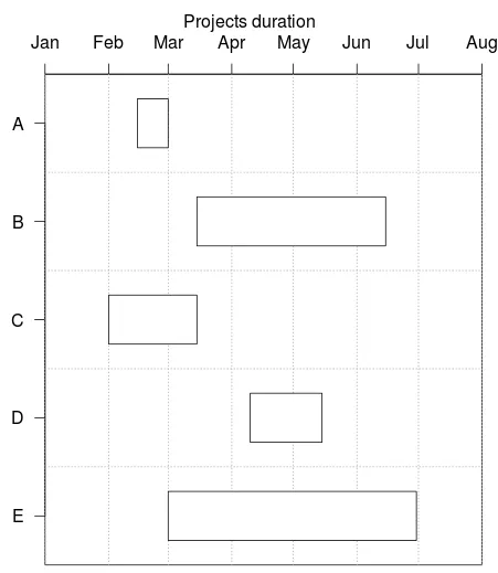
你可以在plotrix包中检查gantt.chart函数。
library(plotrix)
?gantt.chart

以下是一种实现方式:

dmY.format<-"%d/%m/%Y"
gantt.info<-list(
  labels= c("A","B","C","D","E"),
  starts= as.Date(c("15/02/2012", "15/03/2012", "01/02/2012", "10/04/2012","01/03/2012"),
                  format=dmY.format),
  ends= as.Date(c("01/03/2012", "15/06/2012", "15/03/2012", "15/05/2012","30/06/2012"),
                format=dmY.format)
  )

vgridpos<-as.Date(c("01/01/2012","01/02/2012","01/03/2012","01/04/2012","01/05/2012","01/06/2012","01/07/2012","01/08/2012"),format=dmY.format)
vgridlab<-
  c("Jan","Feb","Mar","Apr","May","Jun","Jul","Aug")

gantt.chart(gantt.info, xlim= c(as.Date("01/01/2012",format=dmY.format), as.Date("01/08/2012",format=dmY.format)) , main="Projects duration",taskcolors=FALSE, border.col="black",
            vgridpos=vgridpos,vgridlab=vgridlab,hgrid=TRUE)

在此输入图像描述

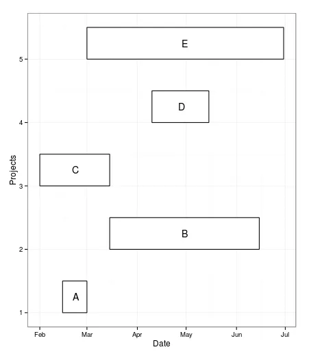
我也尝试过使用ggplot2,但mnel比我更快。这是我的代码:

data1 <- as.data.frame(gantt.info)
data1$order <- 1:nrow(data1)

library(ggplot2)

ggplot(data1, aes(xmin = starts, xmax = ends, ymin = order, ymax = order+0.5)) + geom_rect(color="black",fill=FALSE) + theme_bw()  + geom_text(aes(x= starts + (ends-starts)/2 ,y=order+0.25, label=labels)) +  ylab("Projects") + xlab("Date") 

enter image description here


网页内容由stack overflow 提供, 点击上面的
可以查看英文原文,
原文链接