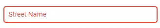
我正在尝试在自定义 Material 输入框中使用 ControlValueAccessor 应用 Error Validation 样式。自从应用了这个自定义组件后,所有带有 formControlName/FormBuilders 的必需、最小长度等的红色边框验证状态都不显示了。在 Angular Material 文本框中,它可以原生地(开箱即用)工作,直到应用了自定义控件。
目标是让自定义文本框与表单验证一起工作。这在 matInput 文本框中自然显示。
更新: 发布了答案;但不确定是否最有效,正在尝试让 Saloo 答案也能工作(如果有人能发布 stackbliz,那就太好了),欢迎任何更有效的选项。
TypeScript:
import { Component, OnInit, Input, ViewChild, EventEmitter, Output, forwardRef } from '@angular/core';
import { ControlValueAccessor, NG_VALUE_ACCESSOR } from '@angular/forms';

@Component({
  selector: 'app-input-textbox',
  templateUrl: './input-textbox.component.html',
  styleUrls: ['./input-textbox.component.scss'],
  providers: [
    {
      provide: NG_VALUE_ACCESSOR,
      useExisting: forwardRef(() => InputTextboxComponent),
      multi: true
    }
  ]
})

export class InputTextboxComponent implements OnInit, ControlValueAccessor {
  @Input() MaxLength: string;
  @Input() Value: string;
  @Input() type: string;
  @Input() Label: string;
  @Input() PlaceHolder: string;
  @Output() saveValue = new EventEmitter();
  @Output() onStateChange = new EventEmitter();

  disabled: boolean;

  constructor() { }

  ngOnInit() {
  }

  saveValueAction(e) {
    this.saveValue.emit(e.target.value);
  }

  onChange(e) {
    this.Value = e;
  }

  onTouched() {
    this.onStateChange.emit();
  }

  writeValue(value: any) {
    this.Value = value ? value : '';
  }

  registerOnChange(fn: any) { this.onChange = fn; }

  registerOnTouched(fn: any) { this.onTouched = fn; }

  setDisabledState(isDisabled) { this.disabled = isDisabled; }
}
HTML:
<div class="input-wrap">
    <mat-form-field appearance="outline">
        <mat-label>{{Label}}</mat-label>
        <input matInput
            [attr.maxlength] = "MaxLength"
            [value]="Value ? Value : ''"
            [placeholder]="PlaceHolder ? PlaceHolder : ''"
            [type]="type ? type: 'text'"
            (input)="onChange($event.target.value)"
        >
    </mat-form-field>
</div>
尝试将此答案与Angular Material文本框的自然错误样式相结合, 在Angular中使用ControlValueAccessor继承验证