使用略微旋转的两个SVG作为导航背景?

5
我正在为我的网站创建导航菜单,希望背景是由两个矩形SVG组合而成,每个都略微偏离轴线并重叠。边缘将延伸超出屏幕边缘,以便看不到。在所有断点处,SVG的高度应保持相同(120px),并且导航应在容器内垂直居中(尽管由于旋转而显得偏离中心)。我的当前尝试会导致随着浏览器窗口的调整,SVG的高度缩小,此外还存在一些对齐问题。是否有更好的方法来完成这个任务?

.hero-bg {
  height:20vh;
  min-height:200px;
  max-height:350px;
  width:100%;
  background:url('http://placehold.it/1920x1080');
  background-size:cover;
}
.navigation {
 position:relative;
  height:120px;
  overflow:hidden;
}
.nav-bg-1 {
  fill:red;
}
.nav-bg-2 {
  fill:black;
}
.navigation svg {
 position:absolute;
 top:-10px;
 width:110%;
 left:-5%;
}
.navigation ul {
  list-style-type:none;
  padding:0;
  margin:0;
  position:absolute;
  top:50%;
  transform:translateY(-50%);
}
  .navigation ul > li {
    display:inline-block;
  }
    .navigation ul > li > a{
      color:#fff;
      text-transform:uppercase;
      text-decoration:none;
    }
<link href="https://maxcdn.bootstrapcdn.com/bootstrap/4.0.0-beta.3/css/bootstrap.min.css" rel="stylesheet"/>
<section id="hero">
  <div class="hero-bg"></div>
  <div class="navigation">
      <svg viewBox="0 0 2027.79 155.34">
          <rect class="nav-bg-1" x="953.89" y="-935.33" width="120" height="2026" transform="translate(918.54 1090.05) rotate(-89)"/>
          <rect class="nav-bg-2" x="0.89" y="14.67" width="2026" height="120" transform="translate(-0.32 4.42) rotate(-0.25)"/>
      </svg>
      <div class="container">
          <div class="row">
              <div class="col-sm-4 hidden-xs">
                <!-- LOGO -->
              </div>
              <div class="col-sm-8">
                  <ul>
                      <li><a href="#">Home</a></li>
                      <li><a href="#">About</a></li>
                      <li><a href="#">Products</a></li>
                      <li><a href="#">Contact</a></li>
                  </ul>
              </div>
          </div>
      </div>
  </div>
</section>

一旦我能完成这些背景条,我的计划是使用MorphSVG对它们进行动画处理并略微改变形状(使它们不是完美的矩形),随着用户滚动屏幕。因此,解决方案必须使用SVG代替其他解决方案。
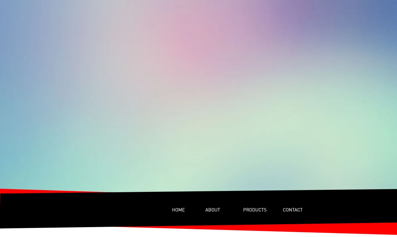
这是我期望结果的模拟图。导航将在容器中,但红色/黑色条应在任何屏幕大小下延伸到屏幕边缘:

enter image description here


1
尝试在你的 SVG 中添加 preserveAspectRatio="none" - brouxhaha
谢谢您的建议,已添加所需结果的模型。 - user13286
@hungerstar 没有原因。我对SVG不是很有经验,所以我只是在尝试如何实现这一点。如果你有更好的解决方案,我很乐意听取! - user13286
@user13286,这与您刚才在下面答案中留下的评论相矛盾。您说您需要对它们进行变形。 - hungerstar
@hungerstar 我不知道变形所需的具体方法,只知道它们需要是SVG格式的。 - user13286
你打算将它变形成什么? - Facundo Corradini
2个回答

1

我会使用伪元素和倾斜变换,就像这样:

.navigation {
  display: flex;
  justify-content:center;
  margin-top:50px;
  height:80px;
  padding:30px 0;
  position:relative;
  margin-bottom:50px;
}
.navigation:before {
  content:"";
  position:absolute;
  right:0;
  left:0;
  top:10px;
  bottom:0;
  background:#000;
  transform:skewY(-3deg);
  z-index:2;
}
.navigation:after {
  content:"";
  position:absolute;
  right:0;
  left:0;
  top:10px;
  bottom:0;
  background:red;
  transform:skewY(3deg);
  z-index:1;
}
.navigation ul {
 position:relative;
 z-index:3;
}

.navigation ul>li {
  display: inline-block;
}

.navigation ul>li>a {
  color: #fff;
  text-transform: uppercase;
  text-decoration: none;
}
<div class="navigation">
  <ul>
    <li><a href="#">Home</a></li>
    <li><a href="#">About</a></li>
    <li><a href="#">Products</a></li>
    <li><a href="#">Contact</a></li>
  </ul>
</div>

更新

由于解决方案应该使用SVG,这里提供一种涉及一些JS的解决方案。思路是创建之前使用倾斜和SVG创建的内容,但具有固定宽度。然后,我只需使用JS代码在窗口调整大小时进行缩放,以使其保持全宽:

$('.back-nav').css('transform', 'scaleX(' + $('.navigation').width() / 500 + ')');
$(window).resize(function() {
  $('.back-nav').css('transform', 'scaleX(' + $('.navigation').width() / 500 + ')');
});
body {
  margin: 0;
}

.navigation {
  display: flex;
  justify-content: center;
  margin-top: 50px;
  height: 80px;
  width: 100%;
  padding: 30px 0;
  position: relative;
  margin-bottom: 50px;
}

.back-nav {
  position: absolute;
  top: 0;
  left: 0;
  transform-origin: left;
}

.navigation ul {
  position: relative;
  z-index: 3;
}

.navigation ul>li {
  display: inline-block;
}

.navigation ul>li>a {
  color: #fff;
  text-transform: uppercase;
  text-decoration: none;
}
<script src="https://ajax.googleapis.com/ajax/libs/jquery/2.1.1/jquery.min.js"></script>
<div class="navigation">
  <ul>
    <li><a href="#">Home</a></li>
    <li><a href="#">About</a></li>
    <li><a href="#">Products</a></li>
    <li><a href="#">Contact</a></li>
  </ul>
  <svg class="back-nav" width="500" height="200" xmlns="http://www.w3.org/2000/svg">
  <rect x="0" y="20" width="500" fill="red" height="120" transform="skewY(3)"/>
  <rect x="0" y="50" width="500" height="120" transform="skewY(-3)"/>
</svg>
</div>

另一种使用背景且没有任何JS的想法(但是您将无法在其上应用变形,因为它是一个背景)

body {
 margin:0;
}
.navigation {
  display: flex;
  justify-content:center;
  margin-top:50px;
  height:120px;
  width:100%;
  position:relative;
  margin-bottom:50px;
  background-image: url('data:image/svg+xml;charset=UTF-8,<svg version="1.1"  xmlns="http://www.w3.org/2000/svg" xmlns:xlink="http://www.w3.org/1999/xlink" x="0px" y="0px" preserveAspectRatio="none" viewBox="0 0 25.1 30" style="enable-background:new 0 0 25.1 30;" xml:space="preserve"><polygon points="25,0 25,20 0,25 0,5" fill="red"/><polygon points="25,5 25,25 0,20 0,0" fill="black"/></svg>');
  background-size:100%;
}

.navigation ul {
 position:relative;
 z-index:3;
}

.navigation ul>li {
  display: inline-block;
}

.navigation ul>li>a {
  color: #fff;
  text-transform: uppercase;
  text-decoration: none;
}
<script src="https://ajax.googleapis.com/ajax/libs/jquery/2.1.1/jquery.min.js"></script>
<div class="navigation">
  <ul>
    <li><a href="#">Home</a></li>
    <li><a href="#">About</a></li>
    <li><a href="#">Products</a></li>
    <li><a href="#">Contact</a></li>
  </ul>

</div>


谢谢您的建议。不幸的是,我需要使用SVG,因为我的计划是在滚动时使用MorphSVG来改变背景条形的形状。 - user13286
1
@user13286 哦,我明白了 :) 好的,我会用SVG更新的。 - Temani Afif
1
@user13286:这是一些比较重要的信息,应该包含在你的问题中。否则人们可能会建议使用图像或单独的SVG。 - hungerstar
感谢您的周到回复。 - user13286
1
@user13286 欢迎 ;) 如果您的变形可以使用,请告诉我,我很想看到结果并提供帮助 ;) - Temani Afif

1
如果我理解正确,对于您的情况,我会将两个svg-bar分别放置。也许,可以将它们分组在一个div中。
(在下一个片段中,您仍需要添加一些媒体查询来定位
    在黑色条中间以及整个.navigation元素。但我认为您会明白)

    .hero {
      position: relative;
    }
    .hero-bg {
      height:20vh;
      min-height:200px;
      max-height:350px;
      width:100%;
      background:url('http://placehold.it/1920x1080');
      background-size:cover;
      z-index: -1;
      position: absolute;
    }
    
    .navigation {
      position:relative;
      width: 100vw;
      min-height: auto;
      height: auto;
      overflow:hidden;
      padding-top: 185px;
    }
    
    .svg-wrapper {
      position: absolute;
      width: 100%;
      height: 100%;
    }
    
    .nav-bg-1 {
      width: 105vw;
      position: absolute;
      z-index: -1;
      height: 50px;
      height: auto;
      left:-1em;
    }
    
    .nav-bg-rect-1 {
      fill: red
    }
    
    .nav-bg-rect-2 {
      fill: black;
    }
    
    .navigation ul {
      list-style-type:none;
      padding:0;
      margin:0;
      position:relative;
      padding: .6rem 1rem 1rem;
      height: 100%;
      width: 100%;
      transform: rotate(-1.01deg);
    }
    
    .navigation ul > li {
      display:inline-block;
    }
    
    .navigation ul > li > a{
      color:white;
      display: block;
      //padding: 2rem 1rem;
      text-transform:uppercase;
      text-decoration:none;
    }
    <link href="https://cdnjs.cloudflare.com/ajax/libs/twitter-bootstrap/4.0.0-beta.2/css/bootstrap.css" rel="stylesheet"/>
    
    <section id="hero" class="hero">
      <div class="hero-bg"></div>
      <div class="navigation">
        
        <div class="svg-wrapper">
          <svg xmlns="http://www.w3.org/2000/svg" viewBox="0 0 1117.79 73" class="nav-bg-1">
            <defs></defs><title>rectred</title><g id="Laag_2" data-name="Laag 2"><g id="Laag_1-2" data-name="Laag 1"><rect class="nav-bg-rect-1" x="534.9" y="-522" width="48" height="1117" transform="matrix(0.02, -1, 1, 0.02, 509.89, 594.44)"/></g></g>
          </svg>
          <svg xmlns="http://www.w3.org/2000/svg" viewBox="0 0 1117.8 79.83" class="nav-bg-1">
            <title>rectblack</title><g id="Laag_2" data-name="Laag 2"><g id="Laag_1-2" data-name="Laag 1"><rect class="nav-bg-rect-2" x="0.4" y="7.92" width="1117" height="64" transform="translate(-0.51 7.93) rotate(-0.81)"/></g></g>
          </svg>
        </div>
        
        <div class="container">
              <div class="row">
                  <div class="col-sm-4 hidden-xs">
                    <!-- LOGO -->
                  </div>
                  <div class="col-sm-8">
                      <ul class="nav-bar">
                          <li><a href="#">Home</a></li>
                          <li><a href="#">About</a></li>
                          <li><a href="#">Products</a></li>
                          <li><a href="#">Contact</a></li>
                      </ul>
                  </div>
              </div>
          </div>
      </div>
    </section>

    我认为使用两个单独的svg元素很容易阅读/操作。在这种情况下,将其包裹在一个div中,并绝对定位在nav-list后面。
    如果我没看错,您的菜单有轻微的旋转(如黑色条?)。所以,我假设您不会变换这个条。否则,我不知道您的菜单会发生什么。
    如果这不是您要寻找的内容,请详细说明您将向这些条添加何种变换。
    我的codepen链接:https://codepen.io/fspin/pen/YYJyNY。(片段中有一个有趣的滚动!)

    更新: 我再想一下,这也可能是正确方向的东西: https://codepen.io/fspin/pen/zpmdOd

    我想你需要考虑以下几点:

    1. 为了让svg流出视口,您可以使用vwvh作为单位,您的容器将具有属性overflow:hidden
    2. 为了跟踪黑色条的位置,也许您必须将其放在容器内。这会带来另一个问题:它不会溢出视口。那么,也许需要两个svg?一个在容器内,一个(真正的)在svg的包装器内?

    也许我想太多了,但我喜欢挑战。很想听听我是否朝着正确的方向思考。

    免责声明:我不是SVG或CSS专家,但我认为我足够理解,可以尝试以不太繁琐的方式解决这个问题。


网页内容由stack overflow 提供, 点击上面的
可以查看英文原文,
原文链接