在ggplot2上方叠加基本的R图形

3

我有一个ggplot的图形,希望能够叠加一个基于R语言创建的地图图例。我不知道如何将基于R语言的图形叠加在ggplot上面,希望得到帮助。

目前,我有一个ggplot的图例,它看起来像这样:enter image description here

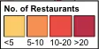
我不喜欢这个图例中的几点,我想要改变它们(这也让我认为使用基于R语言的图形更容易实现)。

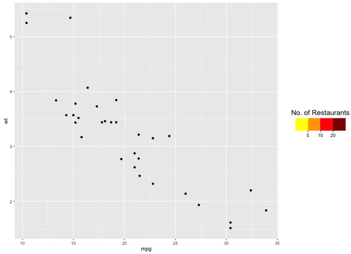
特别是,我希望消除图例中方框之间的白色空间,并在方框之间添加刻度线。我还希望在第一个和第二个方框之间的刻度线下方放置“5”;在第二个和第三个方框之间的刻度线下方放置“10”;在第三个和第四个方框之间的刻度线下方放置“20”。我还希望使图例中的方框与我的图形中的一个“bin”的大小相同(我使用了stat_bin2d层)。

相关代码:

ggplot()+
stat_bin2d(restaurants.df,binwidth=c(1500,2500), alpha=0.6,aes(x=X,y=Y,fill=cut(..count.., c(0,5,10,20,Inf))))+
scale_fill_manual("No. of Restaurants",labels=c("<5","5-10","10-20",">20"),values=cols, guide = guide_legend(direction = "horizontal", title.position = "top",                                      ticks=TRUE,label.position="bottom")) + 
theme(legend.background = element_rect(colour = "black"),
    legend.key = element_rect(color='black'))

3
我相信这里的众多ggplot专家之一可以向您展示如何使用ggplot创建所需的图例。这可能比尝试叠加基本的R更容易和更可靠。 - Molx
你会有些困难,ggplot2 使用 grid 图形,请参阅 ?graphics - Rorschach
3
你可能需要查看gridBase包。 - joran
1
有很多人能够利用地图制图和ggplot2做出非常有用的事情。给我们更多细节(例如代码和数据),这样我们就可以提供帮助! - hrbrmstr
感谢您提供支持 - 我现在已经更新了我的问题,希望能更清楚地表达我想要实现的目标。 - ZAC
2
你的图例详细描述听起来就像是一个独立的情节。你可以使用ggplot制作它,并用 annotation_custom 包含进去。 - baptiste
2个回答

6

@baptiste的评论让我有兴趣尝试创建一个将成为图例的情节。这是我的尝试。我使用geom_tile创建一个将成为图例的情节。由于OP没有提供样本数据,所以我使用内置的mtcars数据创建了一个情节,只是为了在旁边放置图例。然后我使用grid.arrange创建最终的情节加图例布局。

library(ggplot2)
library(grid)
library(gridExtra) 

## Create legend

# Fake data
dat = data.frame(x=1:4, y="Group", col=factor(1:4))

# Create a plot that will become the legend
legend = ggplot(dat, aes(x,y, fill=col)) + 
  geom_tile(show.legend=FALSE) +
  scale_x_continuous(breaks=c(1.5,2.5,3.5), labels=c(5,10,20)) +
  scale_fill_manual(values=c("yellow","orange","red","darkred")) +
  labs(y="", x="") +
  ggtitle("No. of Restaurants") +
  theme_bw() +
  theme(panel.border=element_blank(),
        axis.ticks.y=element_blank(),
        axis.text.y=element_blank())

## Create a plot to put next to the legend
p1 = ggplot(mtcars, aes(mpg, wt)) + 
  geom_point() +
  theme(plot.margin=unit(c(0,0,0,0)))

# Arrange plot and legend
grid.arrange(p1, arrangeGrob(rectGrob(gp=gpar(col=NA)), 
                             legend,
                             rectGrob(gp=gpar(col=NA)),
                             heights=c(0.42,0.16,0.42)), 
             widths=c(0.8,0.2))

enter image description here


您将一个听起来非常复杂的问题,以一种非常简单的方式解决了。做得好! - Gregor Thomas
非常感谢你,Gregor。 - eipi10
感谢eipi10 - 这太棒了 :-) - ZAC

3
可能更容易定义自己的自定义图例,与此同时,您需要确保使用正确的HTML标记。
library(gridExtra)
library(grid)

stripGrob <- function(cols = c("yellow","orange","red","darkred"), 
                      labels= c(5,10,20), 
                      gp=gpar(fontsize=10,fontface="italic"), vp=NULL){
  n <- length(cols)
  rg <- rasterGrob(t(cols), y=1, vjust=1, interpolate = FALSE)
  sg <- segmentsGrob(x0=seq(1/n, 1-1/n, length.out=n-1),
                     x1=seq(1/n, 1-1/n, length.out=n-1),
                     y0=unit(1,"npc") - grobHeight(rg),
                     y1=unit(1,"npc") - grobHeight(rg) - unit(2,"mm"),
                     gp=gpar(lwd=2))
  tg <- textGrob(labels, x=seq(1/n, 1-1/n, length.out=n-1),
                 unit(1,"npc") - grobHeight(rg) - grobHeight(sg) - unit(1,"mm"), 
                 vjust=1)

  stripGrob <- gTree(children = gList(rg, tg, sg), gp=gp, vp=vp)
}

qplot(1,1) +
  annotation_custom(grob=stripGrob(), xmax=1.0)

enter image description here


网页内容由stack overflow 提供, 点击上面的
可以查看英文原文,
原文链接