ItemsControl:整个项都是子项的可展开项。

3

很难描述我想要的行为,所以我用业余绘画技能画了一张漂亮的图片。

enter image description here

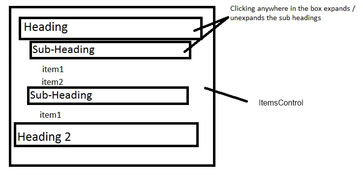
基本上我希望ItemsControl的标题像可展开面板一样操作,但不需要丑陋的可展开图标(所以只需在框中的任何位置单击即可展开以查看子项)。我已经准备好了数据层次结构,但我无法让可展开面板按照我的意愿进行操作。是否有人成功地覆盖了可展开面板样式以实现此类操作,还是有其他控件可以更轻松地实现此类操作?下面是一些简单代码,但是有丑陋的可展开按钮,覆盖其头部模板和样式只会使它看起来更糟糕。

<ItemsControl ItemsSource="{Binding Collection}" 
  HorizontalContentAlignment="Stretch">
    <ItemsControl.ItemTemplate>
        <DataTemplate>
            <Expander Header="Heading">
                <ItemsControl ItemsSource="{Binding Items}" HorizontalContentAlignment="Stretch">
                    <ItemsControl.ItemTemplate>
                        <DataTemplate>
                            <Expander Header="Sub-Heading">
                                <ListBox ItemsSource="{Binding Items}" HorizontalContentAlignment="Stretch"/>
                            </Expander>
                        </DataTemplate>
                    </ItemsControl.ItemTemplate>
                </ItemsControl>
            </Expander>
        </DataTemplate>
    </ItemsControl.ItemTemplate>
</ItemsControl>

1
你还应该使用HierarchicalDataTemplate将内容读入TreeView中。 http://msdn.microsoft.com/zh-cn/library/system.windows.hierarchicaldatatemplate.aspx - eran otzap
1个回答

1

如果您不喜欢内置的样式,只需为您的扩展器使用自定义样式即可 :)

以下是一个起点:

<Style x:Key="customExpander">
        <Setter Property="Control.Template">
            <Setter.Value>
                <ControlTemplate TargetType="Expander">
                    <DockPanel>
                        <ToggleButton DockPanel.Dock="Top"
                                      IsChecked="{Binding Path=IsExpanded,Mode=TwoWay, RelativeSource={RelativeSource TemplatedParent}}"
                                      Background="{TemplateBinding Background}"
                                      Content="{TemplateBinding Header}"
                                      ContentTemplate="{TemplateBinding HeaderTemplate}"
                                      Foreground="{TemplateBinding Foreground}"
                                      FontFamily="{TemplateBinding FontFamily}"
                                      FontSize="{TemplateBinding FontSize}"
                                      FontStretch="{TemplateBinding FontStretch}"
                                      FontStyle="{TemplateBinding FontStyle}"
                                      FontWeight="{TemplateBinding FontWeight}"
                                      HorizontalContentAlignment="{TemplateBinding HorizontalContentAlignment}"
                                      VerticalContentAlignment="{TemplateBinding VerticalContentAlignment}"
                                      Padding="{TemplateBinding Padding}"
                                      Name="HeaderSite"
                                      MinWidth="0"
                                      MinHeight="0"
                                      Margin="1,1,1,1">
                            <ToggleButton.Template>
                                <ControlTemplate TargetType="ToggleButton">
                                    <TextBlock Text="{TemplateBinding Content}" Background="{TemplateBinding Background}" />
                                </ControlTemplate>
                            </ToggleButton.Template>
                        </ToggleButton>

                        <ContentPresenter Content="{TemplateBinding Content}"
                                  ContentTemplate="{TemplateBinding ContentTemplate}"
                                  ContentStringFormat="{TemplateBinding ContentStringFormat}"
                                  Name="ExpandSite" Margin="{TemplateBinding Padding}"
                                  HorizontalAlignment="{TemplateBinding HorizontalContentAlignment}"
                                  VerticalAlignment="{TemplateBinding VerticalContentAlignment}"
                                  Visibility="Collapsed"
                                  Focusable="False"
                                  DockPanel.Dock="Bottom" />
                    </DockPanel>

                    <ControlTemplate.Triggers>
                        <Trigger Property="IsExpanded" Value="True">
                            <Setter TargetName="HeaderSite" Property="Background" Value="Gold" />
                            <Setter TargetName="ExpandSite" Property="Visibility" Value="Visible" />
                        </Trigger>
                        <Trigger Property="IsEnabled" Value="False">
                            <Setter Property="TextElement.Foreground" Value="{DynamicResource DisabledTextBrush}" />
                        </Trigger>
                    </ControlTemplate.Triggers>
                </ControlTemplate>
            </Setter.Value>
        </Setter>
</Style>

然后将您的XAML更改为使用此样式:

<ItemsControl ItemsSource="{Binding Items}" HorizontalContentAlignment="Stretch">
    <ItemsControl.ItemTemplate>
        <DataTemplate>
            <Expander Header="Heading" Style="{StaticResource customExpander}" Background="LightSteelBlue" >
                <ItemsControl ItemsSource="{Binding Items}" HorizontalContentAlignment="Stretch">
                    <ItemsControl.ItemTemplate>
                        <DataTemplate>
                            <Expander Header="Sub-Heading" Style="{StaticResource customExpander}" Background="LightSalmon">
                                <ListBox ItemsSource="{Binding Items}" HorizontalContentAlignment="Stretch"/>
                            </Expander>
                        </DataTemplate>
                    </ItemsControl.ItemTemplate>
                </ItemsControl>
            </Expander>
        </DataTemplate>
    </ItemsControl.ItemTemplate>
</ItemsControl>

编辑 重要的部分是

<ControlTemplate TargetType="ToggleButton">
    <TextBlock Text="{TemplateBinding Content}" Background="{TemplateBinding Background}" />
</ControlTemplate> 

如果您想要自定义,这是一个非常基础的解决方案,因此您有足够的空间来增强它;)


非常酷,现在假设我想将背景更改为特定颜色(悬停和展开触发器加分)。然后我会给你承诺的检查 :). 我只是有点困难弄清楚一些明显的东西需要指定在哪里才能看到任何结果。 - Kevin DiTraglia
你真棒,非常感谢。有些复杂的模板仍然让我有点晕头转向。 - Kevin DiTraglia

网页内容由stack overflow 提供, 点击上面的
可以查看英文原文,
原文链接