jQuery:根据窗口宽度/媒体查询禁用脚本

6
我有下面这个jQuery脚本,可以使一个DIV变成浮动定位。(目前正常工作没有问题)
```html

我有下面这个jQuery脚本,可以使一个DIV变成浮动定位。(目前正常工作没有问题)

```
$(document).ready(function() {
    ctop = $('#comment').offset().top - parseFloat($('#comment').css('margin-top').replace(/auto/, 0));
});
$(window).scroll(function (event) {
    // what the y position of the scroll is
    var y = $(this).scrollTop();
    var abottom = $('#individual_second_tier').offset().top - parseFloat($('#individual_second_tier').css('margin-top').replace(/auto/, 0));

    // whether that's below the form
    if (y >= ctop) {
        // if so, ad the fixed class
        $('#comment').addClass('fixed');
        if (y > abottom-$('#comment').height()){
            $('#comment').offset({'top': abottom-$('#comment').height()-y});
        }
        else
        {
            $('#comment').offset({'top': 0 });
        }
    } else {
        // otherwise remove it
        $('#comment').removeClass('fixed');
    }
    var newWidth = $('#comment').parent().width();
    $('#comment').width(newWidth);

    });

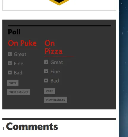
您可以在此处看到它的实际应用。它是右侧的灰色框,上面写着“Poll”。
我的网站是响应式的,因此当宽度小于768像素时,投票div会移动到博客内容下方。因此,在完整浏览器宽度下,脚本运作良好,但当我调整大小时,投票div就会出现问题。
当涉及到jQuery时,我完全是个初学者——我只是一个优秀的复制粘贴者——但我想象中现有的脚本中有一种花哨的方法,可以指示它在匹配媒体查询或浏览器宽度时禁用它,以便我可以摆脱固定浮动div功能。
如果有人想要一个本地副本进行操作,这里是一个zip文件,其中包含html文件(由于我正在使用webfonts,类型可能不正确)。

我想玩弄一下你的ZIP文件,但是需要在FTP上进行身份验证。 - Esteban
@Esteban,非常抱歉。我忘记将路径更改为http://而不是ftp:// - 链接已在帖子中更新。 - Armin
6个回答

1
一位没有Stack Overflow账户的人通过电子邮件提供了答案。这是一个看似简单的解决方案。只需在现有代码中添加:
if ($(window).width() > 768) {

最终的代码块如下所示:

$(document).ready(function() {
    ctop = $('#comment').offset().top - parseFloat($('#comment').css('margin-top').replace(/auto/, 0));
});
$(window).scroll(function (event) {

    if ($(window).width() > 768) {

        // what the y position of the scroll is
        var y = $(this).scrollTop();
        var abottom = $('#individual_second_tier').offset().top - parseFloat($('#individual_second_tier').css('margin-top').replace(/auto/, 0));

        // whether that's below the form
        if (y >= ctop) {
            // if so, ad the fixed class
            $('#comment').addClass('fixed');
            if (y > abottom-$('#comment').height()){
                $('#comment').offset({'top': abottom-$('#comment').height()-y});
            }
            else
            {
                $('#comment').offset({'top': 0 });
            }
        } else {
            // otherwise remove it
            $('#comment').removeClass('fixed');
        }
        var newWidth = $('#comment').parent().width();
        $('#comment').width(newWidth);
    }
});

我测试了这里提供的所有其他答案,但没有一个能正常工作。非常感谢你的帮助。


不要忘记将其标记为已接受的答案,因为其他人可能会遇到与您相同的问题,并最终寻找带有已接受答案的问题。 - Esteban
是的,确实如此。由于我回答了自己的问题,系统直到24小时后才允许我将其标记为已回答。 - Armin

1
你是否可以将投票框的位置强制设置为相对定位,而不是使用媒体查询在指定屏幕尺寸上固定位置?
@media (min-width: 768) {
    #comment { 
        position: relative !important; 
        top: 0 !important; 
    }
}

或者,您可以在函数内使用jQuery。
if ($(window).width() > 768) { 
    $('#comment').removeClass('fixed');
}

enter image description here


0

jQuery:根据窗口宽度/媒体查询禁用脚本,仅适用于移动视图的Jquery

添加Javascript

在添加了jQuery之后,您可以在自定义JavaScript文件中使用以下代码。您可以根据您所针对的设备分辨率将“739”更改为不同的数字。

if ( $(window).width() > 739) {      
  //Add your javascript for large screens here 
} 
else {
  //Add your javascript for small screens here 
}

结束了

是的,我们已经完成了!现在您可以执行JavaScript以针对不同的屏幕尺寸。如果您有任何问题或反馈,请在下面告诉我。谢谢!


0

我之前也遇到过同样的问题,这是我解决的方法:

设置一个媒体查询,在需要时隐藏元素:

/* Somewhere above... */
div#toHide { display: block; /* ... */ }

@media (min-width: 800) {
    div#toHide { display: none; }
}

然后在我的.js文件中,我创建了一个像这样的函数:

function isDivVisible() {
    return $('div#toHide').is(':visible');
}

现在谈论一下我的方法,如果用户无法看到它,我不想执行它的所有代码:

function someHugeFunction() {
    if(isDivVisible()) {
        // some crazy stuff here.
    }
}

我不知道这是否算是优雅,但这对我来说有效


如果我正确理解上面的答案... 这将完全隐藏DIV。我仍然希望显示DIV,但禁用脚本。 - Armin
@Armin:你可以很容易地改变这个,说实话,就像我说的那样,当我遇到同样的问题时,我进行了研究。但我没有找到不使用 JavaScript 如何做到这一点的方法。如果你想改变这种行为,只是为了确保,你希望避免隐藏 div,只停止脚本的循环吗? - Esteban

0
可能是这样的东西:
$(window).resize(function(){
  if( $(this).width() <= 768 ) {
    $('foo').removeClass('bar') //whatever css class is doing the undesired effect at breakpoint
  } 
});

0

matchMedia可能是你在寻找的:http://hacks.mozilla.org/2012/06/using-window-matchmedia-to-do-media-queries-in-javascript/

在你的滚动函数之外添加类似以下内容:

var isWide,
    width768Check = window.matchMedia("(min-width: 768px)");

width768Check.addListener(setWidthValue);
function setWidthValue (mediaQueryList) {
    isWide = width768Check.matches;
}
isWide = width768Check.matches;

$(window).resize(function(){
    if (isWide) {
        $('#comment').addClass('fixed');
    } else {
        $('#comment').removeClass('fixed');
    }
});

然后在你的滚动中

if (y >= ctop && isWide) {
...
}

不是完美的,但能解决问题。当调整窗口大小时,resize()函数会适当地添加/删除您的fixed类。


网页内容由stack overflow 提供, 点击上面的
可以查看英文原文,
原文链接