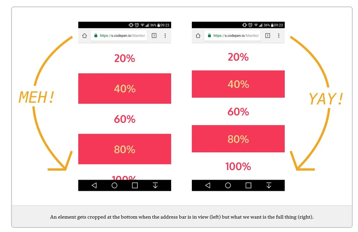
我在移动设备上遇到了视差效果的问题。实际上,整个页面的大小似乎大于100vh(并且还出现了侧边的滚动条)。如果我将overflow-y从auto更改为hidden,它可以解决问题,但是还会切掉页面的一部分。在桌面上不会出现这种情况。有人可以帮我吗?
屏幕截图: https://imgur.com/a/n9wMmqN
.selector-for-some-widget {
  box-sizing: content-box;
}

header .carousel-item {
  height: 100vh;
  min-height: 350px;
  background: no-repeat center center scroll;
  -webkit-background-size: cover;
  background-size: cover;
}

body {
  margin: 0;
  background-color: white;
  font-family: 'Open Sans', sans-serif;
  min-height: 100%;
}

.wrapper {
  height: 100vh;
  overflow-y: auto;
  overflow-x: hidden;
  perspective: 10px;
}

header {
  position: relative;
  display: flex;
  justify-content: center;
  align-items: center;
  height: calc(100% - 75px);
  transform-style: preserve-3d;
  z-index: -1;
}

.background {
  transform: translateZ(-10px) scale(2.5);
}

.background {
  position: absolute;
  height: 100%;
  width: 100%;
  object-fit: cover;
  z-index: -1;
}

.title {
  font-family: 'Montez', cursive;
  color: white;
  text-align: center;
}

section {
  background-color: white;
}

.navbar {
  height: 75px;
  font-size: 1.25rem;
  letter-spacing: 3px;
  font-weight: bold;
}

.navbar-brand {
  font-size: 1.75rem;
  letter-spacing: 10px;
}
<!doctype html>
<html lang="en">
<head>
<!-- Required meta tags -->
<meta charset="utf-8">
<meta name="viewport" content="width=device-width, initial-scale=1">
<!-- Bootstrap CSS -->
<link href="https://cdn.jsdelivr.net/npm/bootstrap@5.1.3/dist/css/bootstrap.min.css" rel="stylesheet"
integrity="sha384-1BmE4kWBq78iYhFldvKuhfTAU6auU8tT94WrHftjDbrCEXSU1oBoqyl2QvZ6jIW3" crossorigin="anonymous">
<!-- Bootstrap Icon CSS -->
<link rel="stylesheet" href="https://cdn.jsdelivr.net/npm/bootstrap-icons@1.8.1/font/bootstrap-icons.css">
<!-- Style CSS -->
<link rel="stylesheet" href="css/styles.css">
<title>Ariano Francesco Photography</title>
</head>
<body>
<div class="wrapper">
<header>
<div id="carouselExampleControls" class="carousel slide background" data-bs-ride="carousel">
<div class="carousel-inner">
<div class="carousel-item active" style="background-image: url('img/carousel_1.jpg')">
</div>
<div class="carousel-item" style="background-image: url('img/carousel_2.jpg')">
</div>
</div>
</div>
<button class="carousel-control-prev" type="button" data-bs-target="#carouselExampleControls"
data-bs-slide="prev">
<span class="carousel-control-prev-icon" aria-hidden="true"></span>
<span class="visually-hidden">Previous</span>
</button>
<button class="carousel-control-next" type="button" data-bs-target="#carouselExampleControls"
data-bs-slide="next">
<span class="carousel-control-next-icon" aria-hidden="true"></span>
<span class="visually-hidden">Next</span>
</button>
<div class="title">
<h1>Ariano Francesco</h1>
<h2>Photography</h2>
</div>
</header>
<section>
<nav class="navbar navbar-expand-lg navbar-light bg-white sticky-top shadow-sm">
<div class="container px-5">
<a class="navbar-brand" href="#">AFR</a>
<button class="navbar-toggler" type="button" data-bs-toggle="offcanvas" data-bs-target="#offcanvasNavbar"
aria-controls="offcanvasNavbar">
<span class="navbar-toggler-icon"></span>
</button>
<div class="offcanvas offcanvas-start" tabindex="-1" id="offcanvasNavbar"
aria-labelledby="offcanvasNavbarLabel">
<div class="offcanvas-header justify-content-end">
<button type="button" class="btn-close text-reset" data-bs-dismiss="offcanvas"
aria-label="Close"></button>
</div>
<div class="offcanvas-body d-flex text-center align-items-center">
<ul class="navbar-nav justify-content-end flex-grow-1">
<li class="nav-item ms-2">
<a class="nav-link active" aria-current="page" href="index.html">Gallery</a>
</li>
<li class="nav-item ms-2">
<a class="nav-link" href="contact.html">Contact</a>
</li>
</ul>
</div>
</div>
</div>
</nav>
<div class="container px-5">
<div class="text-center mt-5">
<h2 class="fw-bold fade-in">Gallery</h2>
</div>
<div class="row mt-5">
<div class="col-lg-4 col-md-12">
<a href="img/_IMG1556.jpg" data-toggle="lightbox" data-gallery="gallery" class="fade-in">
<img src="img/_IMG1556.jpg" class="img-fluid rounded mb-4">
</a>
<a href="img/_IMG1594.jpg" data-toggle="lightbox" data-gallery="gallery" class="fade-in">
<img src="img/_IMG1594.jpg" class="img-fluid rounded mb-4">
</a>
</div>
<div class="col-lg-4">
<a href="img/_IMG1491.jpg" data-toggle="lightbox" data-gallery="gallery" class="fade-in">
<img src="img/_IMG1491.jpg" class="img-fluid rounded mb-4">
</a>
<a href="img/_IMG1558.jpg" data-toggle="lightbox" data-gallery="gallery" class="fade-in">
<img src="img/_IMG1558.jpg" class="img-fluid rounded mb-4">
</a>
</div>
<div class="col-lg-4">
<a href="img/_IMG74c91.jpg" data-toggle="lightbox" data-gallery="gallery" class="fade-in">
<img src="img/_IMG74c91.jpg" class="img-fluid rounded mb-4">
</a>
<a href="img/_IMG1510.jpg" data-toggle="lightbox" data-gallery="gallery" class="fade-in">
<img src="img/_IMG1510.jpg" class="img-fluid rounded mb-4">
</a>
</div>
</div>
</div>
<footer class="text-center text-muted">
<div class="container px-5">
<div class="mb-4 border-bottom">
<a class="btn btn-floating m-3" href="https://instagram.com/_afr.photo" role="button"><i
class="bi bi-facebook"></i></a>
<a class="btn btn-floating m-3" href="https://www.facebook.com/ArianoFrancescoPH" role="button"><i
class="bi bi-instagram"></i></a>
</div>
<div class="mb-4">
<h6 class="text-uppercase fw-bold mb-4">
Contact
</h6>
<p>
Castagnole delle Lanze, AT
</p>
<p>
franci.ariano@gmail.com
</p>
<p>
339 2350792
</p>
</div>
</div>
<div class="p-4" style="background-color: rgba(0, 0, 0, 0.05);">
© 2022 Copyright:
<a class="text-reset fw-bold" href="www.afr.altervista.org">Ariano Francesco Photography</a>
</div>
</footer>
</section>
</div>
<!-- Bootstrap Bundle with Popper -->
<script src="https://cdn.jsdelivr.net/npm/bootstrap@5.1.3/dist/js/bootstrap.bundle.min.js"
integrity="sha384-ka7Sk0Gln4gmtz2MlQnikT1wXgYsOg+OMhuP+IlRH9sENBO0LRn5q+8nbTov4+1p"
crossorigin="anonymous"></script>
<!-- Lightbox for Bootstrap 5 -->
<script src="https://cdn.jsdelivr.net/npm/bs5-lightbox@1.7.11/dist/index.bundle.min.js"></script>
<!-- Script.js -->
<script src="js/script.js"></script>
</body>
</html>