沿着矩形路径平滑移动SVG线

3

我正在尝试重新创建以下动画:

enter image description here

我无法使一个线条正确地沿着弯角移动。我尝试使用animateMotion元素,如下所示:

<line class="testLine" x1="10" y1="10" x2="100" y2="10" stroke="white"> 
        <animateMotion dur="1.6s" repeatCount="indefinite" 
            path="M 10 10 L 390 10
             M 390 10 L 390 290
             M 390 290 L 10 290
             M 10 290 L 10 10"> 
        </animateMotion>
</line> 

但是这条线在转弯处并不平滑。有什么方法可以使其像GIF中展示的那样平滑地绕过角落吗?


2
请阅读关于SVG线条动画如何工作的内容。 - enxaneta
3个回答

3
你需要创建一个路径,其srtoke-dasharray值为矩形边长的1/2,并将路径的stroke-dashoffset动画化为0。
请阅读代码中的注释:

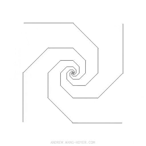
const SVG_NS = "http://www.w3.org/2000/svg";
let sz = 50;//initial size 1/2 rect side
//the array of the paths. Inside the array uou have a first object for the path #p
let sqRy = [{ s: sz, d: "", l: p.getTotalLength(), el: p }];

//create several paths and rotate those paths accordingly
for (let i = 1; i < 8; i++) {
  let o = {};
  let size = sqRy[i - 1].s / 2;
  
  o.s = Math.sqrt(2 * size * size);
  //the value od the d attribute of the new path
  o.d = `M-${o.s},-${o.s}L${o.s},-${o.s} ${o.s},${o.s} -${o.s},${o.s} -${o.s},-${o.s}z`;

  o.el = document.createElementNS(SVG_NS, "path");
  o.el.setAttribute("d", o.d);//set the d attribute
  o.el.setAttribute("transform", `rotate(${45 * i})`);//set the rotation
  svg.appendChild(o.el);//append the new path to the svg element
  o.l = o.el.getTotalLength();//calculate the total length of the new path
  //push the object for the path to the array
  sqRy.push(o);
}


//for every element in the array set the stroke-dasharray and the stroke-dashoffset.
sqRy.map((sq) => {
  sq.el.setAttribute("style", `stroke-dasharray:${sq.s};stroke-dashoffset:${sq.l}`);
});
svg{fill:none;stroke:black;}

path{
     animation: dash 16s linear infinite;
}

@keyframes dash {
  to {
    stroke-dashoffset: 0;
  }
}
<svg width="300" viewBox="-60 -60 120 120" id="svg">
  <path id="p" d="M-50,-50L50,-50 50,50 -50,50 -50,-50z" />  
</svg>


我认为你可以使用CSS关键帧来做同样的事情,对吗? - Greg--
@Greg-- 但我是用 CSS 关键帧来实现的。 - enxaneta
我谈论的是不使用js - 用纯svg绘制并使用css进行动画。 - Greg--
1
@Greg-- 如果你看一下js代码,你会发现需要一些方法来计算正方形的大小,以便它们可以完美地嵌套在一起。一旦你有了它们,你需要一种方法来计算每条路径的长度以及虚线数组的描边和间隙值。你不能用css完成所有这些。 - enxaneta

2

同样的事情只是尺度、旋转和正方形对角线乘数-sqrt(2)不同。

document.querySelector('svg').innerHTML = [...Array(11)]
  .map((_, i) => Math.pow(2, i/2))
  .map((s, i) => `
    <path transform="scale(${s})rotate(${i*45})" 
          stroke-width="${2/s}" 
          d="m5,5h-10v-10h10z"></path>
`).join(',');
path {
  stroke-dasharray: 5 5;
  fill: none;
  stroke: black;
  animation: shift 3s infinite linear;
}

@keyframes shift {
  100% {stroke-dashoffset: -20}
}
<svg viewBox='-200,-200,400,400' width="90vw" height="90vh"></svg>


1

不是通过计算得出的,而是通过使用svg属性transform对齐svg矩形(最好使用svg路径),并利用css stroke-dasharray和stroke-offset进行动画处理,可以获得结果。

如果不能使用js,则只需添加和对齐所需的矩形即可。

代码

   svg>rect {
            stroke-dasharray: 100;
            -webkit-animation: draw 5s infinite linear;
            /* Chrome, Safari, Opera */
            animation: draw 5s infinite linear;
        }
        
        @keyframes draw {
            to {
                stroke-dashoffset: 1000;
            }
        }
        
        @-moz-keyframes draw {
            to {
                stroke-dashoffset: 1000;
            }
        }
        
        @-webkit-keyframes draw {
            to {
                stroke-dashoffset: 1000;
            }
        }
<svg width="500" height="500">
    <rect width="300" height="300" style="fill:none;stroke-width:2;stroke:black" />
    <rect width="210" height="210" transform='translate(150 1) rotate(45)' style="fill:none;stroke-width:2;stroke:black" />
    <rect width="150" height="150" transform='translate(75 75)' style="fill:none;stroke-width:2;stroke:black" />
  </svg>


网页内容由stack overflow 提供, 点击上面的
可以查看英文原文,
原文链接