JSFiddle: http://jsfiddle.net/lustre/c6cwbjLz/13/
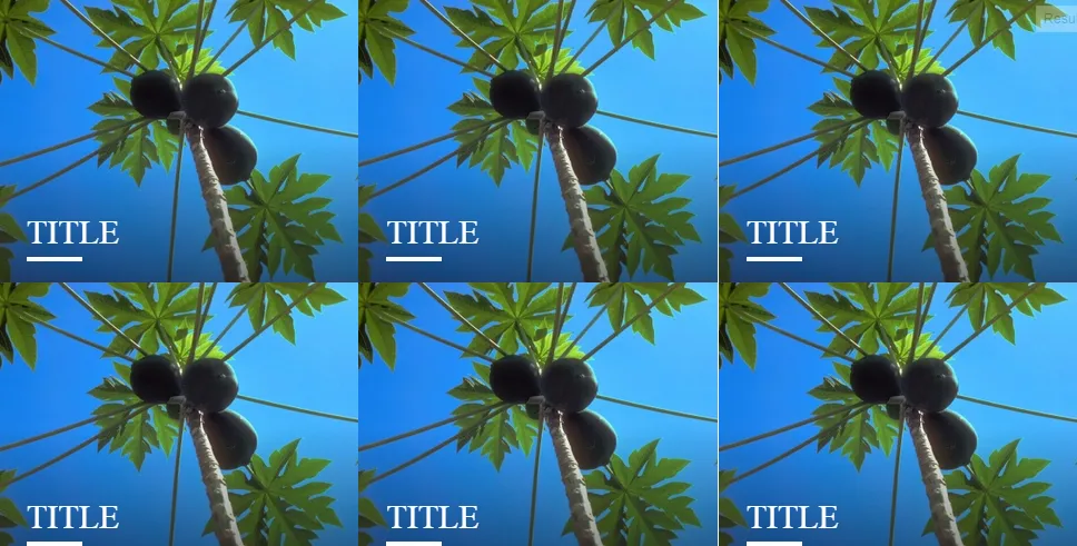
我一直在尝试制作一个全屏3x2网格,实际上已经做到了,但当我悬停在网格项上时,在第二列和第三列之间会出现一条1像素的细竖线。这是什么原因,并且如何消除它?
我在其他地方读到,包括-webkit-backface-visibility:hidden;可以在使用3D变换时有所帮助;然而,我没有使用任何3D变换。这行代码在某种程度上确实起作用,因为它在某些尺寸上隐藏了白色线条,但在其他情况下仍然会出现(我认为是当它不能被3整除时?)。我已在以下的JSFiddle中注释掉此行代码,以便您可以轻松查看悬停时出现的白色线条。
如果您没有遇到过这个问题,下面是我看到的屏幕截图。不过迄今为止,我只在Chrome浏览器中遇到了这个问题。
JSFiddle: http://jsfiddle.net/lustre/c6cwbjLz/13/
jQuery(document).ready(function () {
    gridSize();
});

jQuery(window).resize(function () {
    gridSize();
});

/* Returns scrollbar width*/
function getScrollBarWidth() {
    var inner = document.createElement('p');
    inner.style.width = "100%";
    inner.style.height = "200px";

    var outer = document.createElement('div');
    outer.style.position = "absolute";
    outer.style.top = "0px";
    outer.style.left = "0px";
    outer.style.visibility = "hidden";
    outer.style.width = "200px";
    outer.style.height = "150px";
    outer.style.overflow = "hidden";
    outer.appendChild(inner);

    document.body.appendChild(outer);
    var w1 = inner.offsetWidth;
    outer.style.overflow = 'scroll';
    var w2 = inner.offsetWidth;
    if (w1 == w2) w2 = outer.clientWidth;

    document.body.removeChild(outer);

    return (w1 - w2);
};

function gridSize() {

    if ($('.box').width() > 0) {
        var w = $(window).width();
    } else {
        var w = $(window).width() - getScrollBarWidth();
    }

    var h = $(window).height();

    var thirdw, halfw, halfh, overboxw, overboxh;

    /* Width needs to be 33%, height needs to be 50% */
    /* Full screen sizes */
    thirdw = w / 3;
    halfh = h / 2;

    $('.box').css({
        "width": thirdw,
            "height": halfh
    });

    /* Set overbox size */

    overboxw = thirdw - 60;
    overboxh = halfh - 60;

    $('.box .overbox').css({
        "width": overboxw,
            "height": overboxh
    });

    /* Resize the images based on the ratio */
    if (thirdw > halfh) {
        jQuery('.box img').css({
            "height": halfh +"px",
   "width": "auto"
        });
    } else {
        jQuery('.box img').css({
            //"height": halfh +"px"
        });
    }

    /*
    Bottom's affected:
    .box:hover .title == 110px (needs moving up depending on width of box as content beneath grows in height)

    */

}
body {
margin:0;
padding:0;
}
.boxWrapper {
font-size:0;
/*-webkit-backface-visibility: hidden;*/
}
.box {
cursor: pointer;
height: 400px;
position: relative;
overflow: hidden;
width: 300px;
z-index:400;
display:inline-block;
}
.gradient {
background: -moz-linear-gradient(top, rgba(255, 255, 255, 0) 0%, rgba(128, 128, 128, 0) 50%, rgba(0, 0, 0, 0.5) 100%);
/* FF3.6+ */
background: -webkit-gradient(linear, left top, left bottom, color-stop(0%, rgba(255, 255, 255, 0)), color-stop(50%, rgba(128, 128, 128, 0)), color-stop(100%, rgba(0, 0, 0, 0.5)));
/* Chrome,Safari4+ */
background: -webkit-linear-gradient(top, rgba(255, 255, 255, 0) 0%, rgba(128, 128, 128, 0) 50%, rgba(0, 0, 0, 0.5) 100%);
/* Chrome10+,Safari5.1+ */
background: -o-linear-gradient(top, rgba(255, 255, 255, 0) 0%, rgba(128, 128, 128, 0) 50%, rgba(0, 0, 0, 0.5) 100%);
/* Opera 11.10+ */
background: -ms-linear-gradient(top, rgba(255, 255, 255, 0) 0%, rgba(128, 128, 128, 0) 50%, rgba(0, 0, 0, 0.5) 100%);
/* IE10+ */
background: linear-gradient(to bottom, rgba(255, 255, 255, 0) 0%, rgba(128, 128, 128, 0) 50%, rgba(0, 0, 0, 0.5) 100%);
/* W3C */
filter: progid:DXImageTransform.Microsoft.gradient(startColorstr='#00ffffff', endColorstr='#80000000', GradientType=0);
/* IE6-9 */
z-index:401;
width:100%;
height:100%;
position:absolute;
top:0;
left:0;
}
.box img {
position: absolute;
left: 0;
-webkit-transition: all 300ms ease-out;
-moz-transition: all 300ms ease-out;
-o-transition: all 300ms ease-out;
-ms-transition: all 300ms ease-out;
transition: all 300ms ease-out;
z-index:400;
}
.box .title {
position:absolute;
bottom:20px;
left:25px;
text-transform:uppercase;
z-index:404;
color:#fff;
font-size:30px;
-webkit-transition: all 300ms ease-out;
-moz-transition: all 300ms ease-out;
-o-transition: all 300ms ease-out;
-ms-transition: all 300ms ease-out;
transition: all 300ms ease-out;
}
.box .title:after {
content:'';
margin-top:5px;
display:block;
height:4px;
width:60%;
background:#fff;
}
.box:hover .title {
bottom:110px;
-webkit-transition: all 300ms ease-out;
-moz-transition: all 300ms ease-out;
-o-transition: all 300ms ease-out;
-ms-transition: all 300ms ease-out;
transition: all 300ms ease-out;
}
.box .overbox {
background-color: rgba(246, 48, 62, 0.85);
margin: 10px;
padding: 20px;
width: 240px;
height: 340px;
position: absolute;
color: #fff;
z-index: 403;
-webkit-transition: all 300ms ease-out;
-moz-transition: all 300ms ease-out;
-o-transition: all 300ms ease-out;
-ms-transition: all 300ms ease-out;
transition: all 300ms ease-out;
opacity: 0;
}
.box:hover .overbox {
opacity: 1;
-webkit-transition: all 300ms ease-out;
-moz-transition: all 300ms ease-out;
-o-transition: all 300ms ease-out;
-ms-transition: all 300ms ease-out;
transition: all 300ms ease-out;
}
.box .overbox .tagline {
position:absolute;
bottom:0;
padding-right: 20px;
-webkit-transition: all 300ms ease-out;
-moz-transition: all 300ms ease-out;
-o-transition: all 300ms ease-out;
-ms-transition: all 300ms ease-out;
transition: all 300ms ease-out;
font-size:16px;
}
.box:hover .overbox .tagline {
bottom:20px;
-webkit-transition: all 300ms ease-out;
-moz-transition: all 300ms ease-out;
-o-transition: all 300ms ease-out;
-ms-transition: all 300ms ease-out;
transition: all 300ms ease-out;
}<div class="boxWrapper">
<div class="box">
<div class="gradient"></div>
<img src="http://www.webtutorialplus.com/Images/css-effects-image/1.jpg" alt="Web Tutorial Plus - Demo" width="300" height="400" />
<div class="title">Title</div>
<div class="overbox">
<div class="tagline">Lorem ipsum dolor sit amet, consectetur adipiscing elit. Cras efficitur ex velit, eget pellentesque dui dictum at.</div>
</div>
</div>
</div>
aaaaaaaaaaa
bbbbbbbbbbb
ccccccccccc