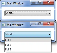
我有一个WPF组合框,绑定到一个带有长描述的项目列表。
ComboBox绑定的类型具有短描述和长描述作为属性。目前,我绑定到完整的描述。
comboBox.DisplayMemberPath = "FullDescription";
如何确保在选择项目并在组合框中显示为单个项目时,它将显示为ShortDescription属性的值,而下拉列表将显示FullDescription?
我有一个WPF组合框,绑定到一个带有长描述的项目列表。
ComboBox绑定的类型具有短描述和长描述作为属性。目前,我绑定到完整的描述。
comboBox.DisplayMemberPath = "FullDescription";
如何确保在选择项目并在组合框中显示为单个项目时,它将显示为ShortDescription属性的值,而下拉列表将显示FullDescription?
更新 2011-11-14
最近我再次遇到相同的需求,但对于我之前发布的解决方案并不满意。下面是一种更好的方法,可以在不重新为ComboBoxItem进行模板设计的情况下获得相同的行为,它使用了DataTemplateSelector
首先,在ComboBox资源中指定常规的DataTemplate、下拉DataTemplate和ComboBoxItemTemplateSelector,然后将ComboBoxItemTemplateSelector作为DynamicResource引用到ItemTemplateSelector中。
<ComboBox ...
          ItemTemplateSelector="{DynamicResource itemTemplateSelector}">
    <ComboBox.Resources>
        <DataTemplate x:Key="selectedTemplate">
            <TextBlock Text="{Binding Path=ShortDescription}"/>
        </DataTemplate>
        <DataTemplate x:Key="dropDownTemplate">
            <TextBlock Text="{Binding Path=FullDescription}"/>
        </DataTemplate>
        <local:ComboBoxItemTemplateSelector
            x:Key="itemTemplateSelector"
            SelectedTemplate="{StaticResource selectedTemplate}"
            DropDownTemplate="{StaticResource dropDownTemplate}"/>
    </ComboBox.Resources>
</ComboBox>
ComboBoxItemTemplateSelector 检查容器是否是 ComboBoxItem 的子元素,如果是,则表示我们正在处理下拉项,否则就是 ComboBox 中的项。
public class ComboBoxItemTemplateSelector : DataTemplateSelector
{
    public DataTemplate DropDownTemplate
    {
        get;
        set;
    }
    public DataTemplate SelectedTemplate
    {
        get;
        set;
    }
    public override DataTemplate SelectTemplate(object item, DependencyObject container)
    {
        ComboBoxItem comboBoxItem = VisualTreeHelpers.GetVisualParent<ComboBoxItem>(container);
        if (comboBoxItem != null)
        {
            return DropDownTemplate;
        }
        return SelectedTemplate;
    }
}
GetVisualParent
public static T GetVisualParent<T>(object childObject) where T : Visual
{
    DependencyObject child = childObject as DependencyObject;
    while ((child != null) && !(child is T))
    {
        child = VisualTreeHelper.GetParent(child);
    }
    return child as T;
}
ComboBoxItem。<SolidColorBrush x:Key="SelectedBackgroundBrush" Color="#DDD" />
<SolidColorBrush x:Key="DisabledForegroundBrush" Color="#888" />
<ControlTemplate x:Key="FullDescriptionTemplate" TargetType="ComboBoxItem">
<Border Name="Border" Padding="2" SnapsToDevicePixels="true">
<StackPanel>
<TextBlock Text="{Binding Path=FullDescription}"/>
</StackPanel>
</Border>
<ControlTemplate.Triggers>
<Trigger Property="IsHighlighted" Value="true">
<Setter TargetName="Border" Property="Background" Value="{StaticResource SelectedBackgroundBrush}"/>
</Trigger>
<Trigger Property="IsEnabled" Value="false">
<Setter Property="Foreground" Value="{StaticResource DisabledForegroundBrush}"/>
</Trigger>
</ControlTemplate.Triggers>
</ControlTemplate>
<ComboBox Name="c_comboBox" ItemsSource="{Binding}">
<ComboBox.ItemTemplate>
<DataTemplate>
<TextBlock Text="{Binding Path=ShortDescription}"/>
</DataTemplate>
</ComboBox.ItemTemplate>
<ComboBox.ItemContainerStyle>
<Style TargetType="{x:Type ComboBoxItem}">
<Setter Property="Template" Value="{StaticResource FullDescriptionTemplate}" />
</Style>
</ComboBox.ItemContainerStyle>
</ComboBox>
现在似乎对我不起作用,但这个可以:
public class ComboBoxItemTemplateSelector : DataTemplateSelector {
  public DataTemplate SelectedTemplate { get; set; }
  public DataTemplate DropDownTemplate { get; set; }

  public override DataTemplate SelectTemplate(object item, DependencyObject container) {
    var presenter = (ContentPresenter)container;
    return (presenter.TemplatedParent is ComboBox) ? SelectedTemplate : DropDownTemplate;
  }
}
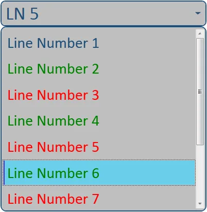
我修改了这个自定义的圆角WPF ComboBox,使其显示与所选项不同的值,并为每个项更改颜色。
首先,您需要创建结构:
//Structure
public class COMBOITEM
{
    string _ITEM_NAME;
    string _ITEM_SHORT_NAME;
    Brush _ITEM_COLOR;

    public string ITEM_NAME
    {
        get { return _ITEM_NAME; }
        set { _ITEM_NAME = value; }
    }

    public string ITEM_SHORT_NAME
    {
        get { return _ITEM_SHORT_NAME; }
        set { _ITEM_SHORT_NAME = value; }
    }

    public Brush ITEM_COLOR
    {
        get { return _ITEM_COLOR; }
        set { _ITEM_COLOR = value; }
    }
}
初始化结构体,填充数据并绑定到组合框:
private void Load_Data()
{
    Brush Normal_Blue = new SolidColorBrush((Color)ColorConverter.ConvertFromString("#FF1F4E79"));
    //Load first entry
    ObservableCollection<COMBOITEM> _Line_Data = new ObservableCollection<COMBOITEM>();
    _Line_Data.Add(new COMBOITEM() { ITEM_NAME = "Line Number 1", ITEM_SHORT_NAME = "LN 1", ITEM_COLOR = Normal_Blue });

    //Load Test Data
    for (int i = 2; i < 10; i++)
    {
        _Line_Data.Add(new COMBOITEM()
        {
            ITEM_NAME = "Line Number " + i.ToString(),
            ITEM_SHORT_NAME = "LN " + i.ToString(),
            ITEM_COLOR = (i % 2 == 0) ? new SolidColorBrush(Colors.Green) : new SolidColorBrush(Colors.Red) //This just changes color
        });
    }

    //Bind data to combobox
    cb_Test.ItemsSource = _Line_Data;
}
<ComboBox x:Name="cb_Test" FontSize="36" Padding="1,0" MinWidth="100" MaxWidth="400" Margin="5,53,10,207" FontFamily="Calibri" Background="#FFBFBFBF" Foreground="#FF1F4E79" BorderBrush="#FF1F4E79" VerticalContentAlignment="Center" TabIndex="5" IsSynchronizedWithCurrentItem="False"
            Style="{DynamicResource RoundedComboBox}"
            ItemContainerStyle="{DynamicResource ColorComboBoxItem}"
            DisplayMemberPath="ITEM_SHORT_NAME" />
<!-- Rounded ComboBox Button -->
<Style x:Key="ComboBoxToggleButton" TargetType="ToggleButton">
    <Setter Property="Template">
        <Setter.Value>
            <ControlTemplate TargetType="ToggleButton">
                <Grid>
                    <Grid.ColumnDefinitions>
                        <ColumnDefinition />
                        <ColumnDefinition Width="32" />
                    </Grid.ColumnDefinitions>
                    <Border
                    x:Name="Border"
                    Grid.ColumnSpan="2"
                    CornerRadius="8"
                    Background="{TemplateBinding Background}"
                    BorderBrush="#FF1F4E79"
                    BorderThickness="2"
                />

                    <Path
                    x:Name="Arrow"
                    Grid.Column="1"
                    Fill="{TemplateBinding Foreground}"
                    Stroke="{TemplateBinding Foreground}"
                    HorizontalAlignment="Center"
                    VerticalAlignment="Center"
                    Data="M 0 0 L 4 4 L 8 0 Z"/>
                </Grid>
            </ControlTemplate>
        </Setter.Value>
    </Setter>
</Style>

<ControlTemplate x:Key="ComboBoxTextBox" TargetType="TextBox">
    <Border x:Name="PART_ContentHost" Focusable="True" />
</ControlTemplate>

<!-- ComboBox Template -->
<Style x:Key="RoundedComboBox" TargetType="{x:Type ComboBox}">
    <Setter Property="Foreground" Value="#333" />
    <Setter Property="BorderBrush" Value="Gray" />
    <Setter Property="Background" Value="White" />
    <Setter Property="SnapsToDevicePixels" Value="true"/>
    <Setter Property="OverridesDefaultStyle" Value="true"/>
    <Setter Property="ScrollViewer.HorizontalScrollBarVisibility" Value="Auto"/>
    <Setter Property="ScrollViewer.VerticalScrollBarVisibility" Value="Auto"/>
    <Setter Property="ScrollViewer.CanContentScroll" Value="true"/>
    <Setter Property="FontSize" Value="13" />
    <Setter Property="MinWidth" Value="150"/>
    <Setter Property="MinHeight" Value="35"/>
    <Setter Property="Template">
        <Setter.Value>
            <ControlTemplate TargetType="ComboBox">
                <Grid>
                    <ToggleButton
                    Cursor="Hand"
                    Name="ToggleButton"
                    BorderBrush="{TemplateBinding BorderBrush}"
                    Background="{TemplateBinding Background}"
                    Foreground="{TemplateBinding Foreground}"
                    Style="{StaticResource ComboBoxToggleButton}"
                    Grid.Column="2"
                    Focusable="false"
                    IsChecked="{Binding Path=IsDropDownOpen,Mode=TwoWay,RelativeSource={RelativeSource TemplatedParent}}"
                    ClickMode="Press"/>

                    <ContentPresenter
                    Name="ContentSite"
                    IsHitTestVisible="False"
                    Content="{TemplateBinding SelectionBoxItem}"
                    ContentTemplate="{TemplateBinding SelectionBoxItemTemplate}"
                    ContentTemplateSelector="{TemplateBinding ItemTemplateSelector}"
                    Margin="10,3,30,3"
                    VerticalAlignment="Center"
                    HorizontalAlignment="Left" />
                    <TextBox x:Name="PART_EditableTextBox"
                    Style="{x:Null}"
                    Template="{StaticResource ComboBoxTextBox}"
                    HorizontalAlignment="Left"
                    VerticalAlignment="Center"
                    Margin="3,3,23,3"
                    Focusable="True"
                    Visibility="Hidden"
                    IsReadOnly="{TemplateBinding IsReadOnly}"/>
                    <Popup
                    Name="Popup"
                    Placement="Bottom"
                    IsOpen="{TemplateBinding IsDropDownOpen}"
                    AllowsTransparency="True"
                    Focusable="False"
                    PopupAnimation="Slide">
                        <Grid
                        Name="DropDown"
                        SnapsToDevicePixels="True"
                        MinWidth="{TemplateBinding ActualWidth}"
                        MaxHeight="{TemplateBinding MaxDropDownHeight}">
                            <Border
                            CornerRadius="10"
                            x:Name="DropDownBorder"
                            Background="#FFBFBFBF"
                            BorderThickness="2"
                            BorderBrush="#FF1F4E79"
                            />
                            <ScrollViewer Margin="4,6,4,6" SnapsToDevicePixels="True">
                                <StackPanel IsItemsHost="True" KeyboardNavigation.DirectionalNavigation="Contained" />
                            </ScrollViewer>
                        </Grid>
                    </Popup>

                </Grid>
                <ControlTemplate.Triggers>
                    <Trigger Property="HasItems" Value="false">
                        <Setter TargetName="DropDownBorder" Property="MinHeight" Value="95"/>
                    </Trigger>
                    <Trigger Property="IsGrouping" Value="true">
                        <Setter Property="ScrollViewer.CanContentScroll" Value="false"/>
                    </Trigger>
                    <Trigger Property="IsEditable" Value="true">
                        <Setter Property="IsTabStop" Value="false"/>
                        <Setter TargetName="PART_EditableTextBox" Property="Visibility" Value="Visible"/>
                        <Setter TargetName="ContentSite" Property="Visibility" Value="Hidden"/>
                    </Trigger>
                </ControlTemplate.Triggers>
            </ControlTemplate>
        </Setter.Value>
    </Setter>
    <Style.Triggers>
    </Style.Triggers>
</Style>

<!--This style uses the normal items.add function-->
<Style x:Key="CustomComboBoxItem" TargetType="{x:Type ComboBoxItem}">
    <Setter Property="SnapsToDevicePixels" Value="true" />
    <Setter Property="HorizontalAlignment" Value="Stretch" />
    <Setter Property="VerticalAlignment" Value="Stretch" />
    <Setter Property="FontSize" Value="30" />
    <Setter Property="OverridesDefaultStyle" Value="true"/>
    <Setter Property="Template">
        <Setter.Value>
            <ControlTemplate TargetType="ComboBoxItem">
                <Border
                Name="Border"
                Padding="5"
                Margin="2"
                BorderThickness="2,0,0,0"
                CornerRadius="0"
                Background="Transparent"
                BorderBrush="Transparent">
                    <TextBlock TextAlignment="Left">
                    <ContentPresenter />
                    </TextBlock>
                </Border>
                <ControlTemplate.Triggers>
                    <Trigger Property="IsHighlighted" Value="true">
                        <Setter TargetName="Border" Property="BorderBrush" Value="#FF3737CB"/>
                        <Setter TargetName="Border" Property="Background" Value="#FF6ACDEA"/>
                    </Trigger>
                </ControlTemplate.Triggers>
            </ControlTemplate>
        </Setter.Value>
    </Setter>
</Style>

<!--This style uses the structure to fill items and set the item color-->
<Style x:Key="ColorComboBoxItem" TargetType="{x:Type ComboBoxItem}">
    <Setter Property="SnapsToDevicePixels" Value="true" />
    <Setter Property="HorizontalAlignment" Value="Stretch" />
    <Setter Property="VerticalAlignment" Value="Stretch" />
    <Setter Property="FontSize" Value="30" />
    <Setter Property="OverridesDefaultStyle" Value="true"/>
    <Setter Property="Foreground" Value="{Binding ITEM_COLOR}" />
    <Setter Property="Template">
        <Setter.Value>
            <ControlTemplate TargetType="ComboBoxItem">
                <Border
                    Name="Border"
                    Padding="5"
                    Margin="2"
                    BorderThickness="2,0,0,0"
                    CornerRadius="0"
                    Background="Transparent"
                    BorderBrush="Transparent">
                    <TextBlock Text="{Binding ITEM_NAME}" TextAlignment="Left">
                    </TextBlock>
                </Border>
                <ControlTemplate.Triggers>
                    <Trigger Property="IsHighlighted" Value="true">
                        <Setter TargetName="Border" Property="BorderBrush" Value="#FF3737CB"/>
                        <Setter TargetName="Border" Property="Background" Value="#FF6ACDEA"/>
                    </Trigger>
                </ControlTemplate.Triggers>
            </ControlTemplate>
        </Setter.Value>
    </Setter>
</Style>
我希望这可以帮到你。
这个解决方案适用于 WPF + MVVM。
其他一些解决方案有效,而另一些则无效。其他一些解决方案的问题在于,如果它们不起作用,有时很难调试为什么不起作用,特别是对于没有 WPF 经验的人来说。
我认为最好使用字符串进行绑定,并在 C# 中转换为枚举,这意味着一切都更容易排除故障。
您可能需要使用 ReSharper,它将自动建议任何缺少的命名空间。
创建一个带有描述属性的枚举:
public enum EnumSelectedView
{
    [Description("Drop Down 1")]
    DropDown1 = 0,

    [Description("Drop Down 2")]
    DropDown2 = 1,
}
还有一个ComboBox:
<ComboBox HorizontalAlignment="Right"
   VerticalAlignment="Top"
   Width="130"
   ItemsSource="{Binding AvailableSelectedViews, Mode=OneWay}"
   SelectedItem="{Binding SelectedView, Mode=TwoWay, Converter={StaticResource enumToDescriptionConverter}}"
</ComboBox>
XAML中的转换器需要指向C#类。如果您正在使用UserControl或Window,则应该是UserControl.Resources或Window.Resources。
<DataTemplate.Resources>
    <converters:EnumToDescriptionConverter x:Key="enumToDescriptionConverter" />
</DataTemplate.Resources>
在您的项目中添加一些扩展方法和转换器:
using System;

namespace CMCMarkets.Phantom.CoreUI.Converters
{
    using System.Collections.Generic;
    using System.ComponentModel;
    using System.Globalization;
    using System.Linq;
    using System.Reflection;
    using System.Windows.Data;

    public class EnumToDescriptionConverter : IValueConverter
    {
        public object Convert(object value, Type targetType, object parameter, CultureInfo culture)
        {
            if ((value is Enum) == false) throw new ArgumentException("Error: value is not an enum.");
            return ((Enum)value)?.GetDescriptionAttribute();
        }

        public object ConvertBack(object value, Type targetType, object parameter, CultureInfo culture)
        {
            if ((value is string) == false)
            {
                throw new ArgumentException("Error: Value is not a string");
            }
            foreach (var item in Enum.GetValues(targetType))
            {
                var asString = (item as Enum).GetDescriptionAttribute();
                if (asString == (string)value)
                {
                    return item;
                }
            }
            throw new ArgumentException("Error: Unable to match string to enum description.");
        }
    }

    public static class EnumExtensions
    {
        /// <summary>
        /// For a single enum entry, return the [Description("")] attribute.
        /// </summary>
        public static string GetDescriptionAttribute(this Enum enumObj)
        {
            FieldInfo fieldInfo = enumObj.GetType().GetField(enumObj.ToString());
            object[] attribArray = fieldInfo.GetCustomAttributes(false);
            if (attribArray.Length == 0)
            {
                return enumObj.ToString();
            }
            else
            {
                DescriptionAttribute attrib = attribArray[0] as DescriptionAttribute;
                return attrib?.Description;
            }
        }

        /// <summary>
        /// For an enum type, return a list of all possible [Description("")] attributes.
        /// </summary>
        /*
         * Example: List<string> descriptions = EnumExtensions.GetDescriptionAttributeList<MyEnumType>();
         */
        public static List<string> GetDescriptionAttributeList<T>()
        {
            return typeof(T).GetEnumValues().Cast<Enum>().Select(x => x.GetDescriptionAttribute()).ToList();
        }

        /// <summary>
        /// For an enum instance, return a list of all possible [Description("")] attributes.
        /// </summary>
        /*
         * Example:
         *
         * List<string> descriptions = typeof(CryptoExchangePricingOrGraphView).GetDescriptionAttributeList();
         */
        public static List<string> GetDescriptionAttributeList(this Type type)
        {
            return type.GetEnumValues().Cast<Enum>().Select(x => x.GetDescriptionAttribute()).ToList();
        }

        /// <summary>
        /// For an enum instance, return a list of all possible [Description("")] attributes.
        /// </summary>
        /*
         * Example:
         *
         * MyEnumType x;
         * List<string> descriptions = x.GetDescriptionAttributeList();
         */
        public static List<string> GetDescriptionAttributeList(this Enum thisEnum)
        {
            return thisEnum.GetType().GetEnumValues().Cast<Enum>().Select(x => x.GetDescriptionAttribute()).ToList();
        }
    }
}
在你的ViewModel中:
public IReadOnlyList<string> AvailableSelectedViews { get; }
在构造函数中:
this.AvailableSelectedViews = typeof(EnumSelectedView).GetDescriptionAttributeList();
public EnumSelectedView SelectedView { get; set; }
如果IsEditable为false,则接受的解决方案有效。
如果IsEditable为true,即控件在组合列表和自由输入文本框方面是“真正”的组合框,则有一个非常简单的解决方案:
<ComboBox ...
    DisplayMemberPath="PropertyToUseForList"
    TextSearch.TextPath="PropertyToUseForTextBox" />
IsTextSearchEnable 为 false,这也可以正常工作。我发现的另一个选项是将文本框放置在组合框文本区域上方。调整大小和对齐方式,使其完美地覆盖在上面,然后使用类似于以下的子程序:
Private Sub ComboBox*_Change()
Dim T As String
T = Left(ComboBox*.Text, 1)
TextBox*.Value = T
End Sub
结果是当选择下拉列表时,它将像往常一样显示列表,但横跨其上的文本框只会显示第一个字符。
希望这可以帮助到您。
IsEditable=False。我已经添加了一个针对可编辑组合框的解决方案的答案。 - Heinzi