如何使用CSS在两个圆之间画一条水平线?

16

如何在CSS中在2个圆之间画一条水平线?

必须在它们的中间,就像截图中显示的那样。

示例在此处:

enter image description here

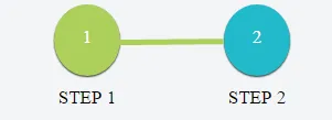
我已经画出了2个圆,但不知道如何连接它们。

#status-buttons a {
  color: black;
  display: inline-block;
  font-size: 17px;
  font-weight: normal;
  margin-right: 0;
  text-align: center;
  text-transform: uppercase;
  min-width: 150px;
  text-decoration: none;
}
#status-buttons a:hover {
  text-decoration: none;
}
#status-buttons a.active span {
  color: white;
  background: #ACCF5B;
  box-shadow: rgba(0, 0, 0, 0.792157) 3px 3px 3px 0;
}
#status-buttons span {
  color: white;
  background: #22bacb;
  display: block;
  height: 45px;
  margin: 0 auto 10px;
  padding-top: 20px;
  width: 60px;
  border-radius: 50%;
  box-shadow: rgba(0, 0, 0, 0.792157) 3px 3px 3px 0;
}
<div id="status-buttons" class="text-center">
  <a href="#/form/regalo" class="active"><span>1</span> Step 1</a>
  <a href="#/form/tusdatos"><span>2</span> Step 2</a>
</div>

请查看JSFiddle上的演示

7个回答

12

你可以使用伪元素来插入绝对定位的边框:

您可以使用伪元素来插入绝对定位的边框:

#status-buttons {
  position: relative;          /* 1 */
  display: inline-block;       /* 2 */
}
#status-buttons::after {       /* 3 */
  content: "";
  position: absolute;
  width: 50%;
  z-index: -1;                 /* 4 */
  top: 35%;
  left: 25%;
  border: 3px solid #ACCF5B;
}
#status-buttons a {
  color: black;
  display: inline-block;
  font-size: 17px;
  font-weight: normal;
  margin-right: 0;
  text-align: center;
  text-transform: uppercase;
  min-width: 150px;
  text-decoration: none;
}
#status-buttons a:hover {
  text-decoration: none;
}
#status-buttons a.active span {
  color: white;
  background: #ACCF5B;
  box-shadow: rgba(0, 0, 0, 0.792157) 3px 3px 3px 0;
}
#status-buttons span {
  color: white;
  background: #22bacb;
  display: block;
  height: 45px;
  margin: 0 auto 10px;
  padding-top: 20px;
  width: 60px;
  border-radius: 50%;
  box-shadow: rgba(0, 0, 0, 0.792157) 3px 3px 3px 0;
}
<div id="status-buttons" class="text-center">
  <a href="#/form/regalo" class="active"><span>1</span> Step 1</a>
  <a href="#/form/tusdatos"><span>2</span> Step 2</a>
</div>

注意:

  1. 为绝对定位设置最近的定位祖先容器。
  2. 使容器仅占用必要的宽度。
  3. 插入伪元素。
  4. 确保任何水平线重叠不会出现在圆形上方。

1
谢谢!太棒了。我把它改成了链接元素,这样它就可以处理多个步骤 https://jsfiddle.net/nerlijma/s5x2kmmz/10/,以防有人需要帮助! - nerlijma
1
@nerlijma,如果您不想让线条从最后一个链接延伸出来,您可以将规则更改为#status-buttons a:not(:last-child)::after - DaveMongoose
@DaveMongoose 很好的建议! - nerlijma

2
您可以添加一个新元素,并将其定位在两个圆之间:

#status-buttons a {
    color: black;
    display: inline-block;
    font-size: 17px;
    font-weight: normal;
    margin-right: 0;
    text-align: center;
    text-transform: uppercase;
    min-width: 150px;
    text-decoration: none;
}

#status-buttons a:hover {
  text-decoration: none;
}
    
#status-buttons a.active span {
    color: white;
    background: #ACCF5B;
    box-shadow: rgba(0, 0, 0, 0.792157) 3px 3px 3px 0;
}

#status-buttons span {
    color: white;
    background: #22bacb;
    display: block;
    height: 45px;
    margin: 0 auto 10px;
    padding-top: 20px;
    width: 60px;
    border-radius: 50%;
    box-shadow: rgba(0, 0, 0, 0.792157) 3px 3px 3px 0;
}

#line {
  position: absolute;
  top: 42px;
  left: 112px;
  width: 96px;
  height: 5px;
  background: #ACCF5B;
}
<div id="status-buttons" class="text-center">
                <a href="#/form/regalo" class="active"><span>1</span> Step 1</a>
                <div id="line">
                </div>
                <a href="#/form/tusdatos"><span>2</span> Step 2</a>
            </div>


2

这里有一个解决方案:

https://jsfiddle.net/sfyuxrs9/

它包含一个 div(形成线条),该 div 具有 position: absolute 和负的 z-index 值。其余部分只需要调整所有的宽度/高度/上下左右的值即可。


2

以下是最简洁的使用flex的解决方案

.timeline {
  display: flex;
  align-items: center;
  justify-content: center;
}

.circle {
  width: 13px;
  height: 13px;
  background: black;
  border-radius: 50%;
}

.dashed {
  width: 100px;
  border: 1px dashed #C4C4C4;
}
<div class="timeline">
  <div class="circle"></div>
  <div class="dashed"></div>
  <div class="circle"></div>
  <div class="dashed"></div>
  <div class="circle"></div>
</div>


非常干净的解决方案!! - dotnet-provoke

1

我猜你可以做类似这样的事情,检查下面的代码片段:

#status-buttons a {
    color: black;
    display: inline-block;
    font-size: 17px;
    font-weight: normal;
    margin-right: 0;
    text-align: center;
    text-transform: uppercase;
    min-width: 150px;
    text-decoration: none;
}

#status-buttons a:hover {
  text-decoration: none;
}
    
#status-buttons a.active span {
    color: white;
    background: #ACCF5B;
    box-shadow: rgba(0, 0, 0, 0.792157) 3px 3px 3px 0;
}

#status-buttons span {
    color: white;
    background: #22bacb;
    display: block;
    height: 45px;
    margin: 0 auto 10px;
    padding-top: 20px;
    width: 60px;
    border-radius: 50%;
    box-shadow: rgba(0, 0, 0, 0.792157) 3px 3px 3px 0;
}

div.linetop { border-top: 1px solid #111111; width:95px;
position:absolute;
  top:40px;
  left:115px;
}
<div id="status-buttons" class="text-center">
                <a href="#/form/regalo" class="active"><span>1</span> Step 1</a>
 
                <a href="#/form/tusdatos"><span>2</span> Step 2</a>
            </div>


<div class="linetop"></div>

希望这有所帮助。

1

给你。

<div id="status-buttons" class="text-center">
    <a href="#/form/regalo" class="active"><span>1</span> Step 1</a>
    <a href="#/form/tusdatos"><span>2</span> Step 2</a>
</div>
<div class="line">
</div>

The CSS

 #status-buttons a {
    position: relative;
    color: black;
    display: inline-block;
    font-size: 17px;
    font-weight: normal;
    margin-right: 0;
    text-align: center;
    text-transform: uppercase;
    min-width: 150px;
    text-decoration: none;
        z-index: 1;
}

#status-buttons a:hover {
  text-decoration: none;
}

#status-buttons a.active span {
    color: white;
    background: #ACCF5B;
    box-shadow: rgba(0, 0, 0, 0.792157) 3px 3px 3px 0;
}

#status-buttons span {
    color: white;
    background: #22bacb;
    display: block;
    height: 45px;
    margin: 0 auto 10px;
    padding-top: 20px;
    width: 60px;
    border-radius: 50%;
    box-shadow: rgba(0, 0, 0, 0.792157) 3px 3px 3px 0;

}
.line {
    position: absolute;
    border-bottom: 5px solid black;
    width: 20%;
    left: 71px;
    top: 39px;
    z-index: 0;
}

https://jsfiddle.net/norcaljohnny/nwjz2010/


0

你也可以使用这种方法 :)

.his-bar { display: flex; position: relative; padding-top: 50px; width: 100%; margin:auto; margin-top: 40px; }

.his-bar:before { content: ''; border: 1px solid #727272; position: absolute; top: 60px; right: 0; width: 99%; }

.his-bar .point { border: 2px solid #872071; width: 20px; height: 20px; border-radius: 50%; display: inline-block; background-color: #F8F8F8; z-index: 2; position: relative; }

.his-bar .point-start:after { content: '2000'; position: absolute; top: 30px; left: -7px; }

.his-bar .point-end { margin-left: auto; }

.his-bar .point-end:after { content: '2021'; position: absolute; top: 30px; left: -7px; }
 <div class="his-bar">
     <span class="point point-start"></span>
     <span class="point point-end"></span>
 </div>


网页内容由stack overflow 提供, 点击上面的
可以查看英文原文,
原文链接