特殊的Flexbox布局

3

我正在尝试实现以下布局:

enter image description here

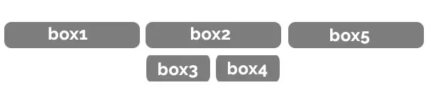
我首先的想法是使用flexbox来实现这种布局。目前,我的HTML代码如下:

<section>
   <div class"item">box1</div>
   <div class"item">box2</div>
   <div class"item">box3</div>
   <div class"item">box4</div>
   <div class"item">box5</div>
</section>

我该如何使用HTML实现所需的布局?我也可以在项目之间添加换行div元素,就像这样:
<div class"break"> </div>

很遗憾,我仍然无法达到所需的布局。请帮忙。


4
你使用CSS网格布局会更加顺利。 - Temani Afif
1
一维布局:Flexbox;二维布局:Grid。 - David Thomas
3个回答

4

一个基于CSS网格的简单方法是使用“命名网格区域模板”。

CSS 网格允许使用命名区域,这些命名区域根据网格子项的 grid-area 来确定其位置。在您的要求中,可以定义一个基于命名区域的模板,如下所示:

grid-template-areas: 
"a a b b c c" 
". . e f . .";

这些模板区域的作用是:
  • 带有 grid-area 属性为 abc 的子元素占据了模板布局的顶部行,每个元素跨越了 6 列网格中的两列
  • 带有 grid-area 属性为 ef 的子元素占据了模板的底部行,分别位于第三列和第四列。该行配置中的 . 指定了该模板区域不适用于任何子元素
请注意,可以在同一行上编写模板区域字符串,如下所示:grid-template-areas 属性。

section {
  /* Specify that CSS grid is to be used for layout of children */
  display: grid;
  /* Specify spacing between children */
  grid-gap:1rem;
  /* Wrap against six evenly spaced columns of this grid */
  grid-template-columns: repeat(6, 1fr);
  /* Define the area names of the grid template */
  grid-template-areas: "a a b b c c" ". . e f . .";
}

section div:nth-child(1) {
  grid-area: a;
}

section div:nth-child(2) {
  grid-area: b;
}

section div:nth-child(3) {
  grid-area: e;
}

section div:nth-child(4) {
  grid-area: f;
}

section div:nth-child(5) {
  grid-area: c;
}

/* Optional aesthetics to better match your example */
div {
  background: darkgrey;
  border-radius: 5px;
  color: white;
  text-align: center;
}
<section>
  <div class "item">box1</div>
  <div class "item">box2</div>
  <div class "item">box3</div>
  <div class "item">box4</div>
  <div class "item">box5</div>
</section>

更新

section {
  display: grid;
  grid-gap:1rem;
  grid-template-columns: repeat(5, auto);
  grid-template-areas: "a b c c d e" ". . f g . .";
}

section div:nth-child(1) {
  grid-area: a;
}

section div:nth-child(2) {
  grid-area: b;
}

section div:nth-child(3) {
  grid-area: c;
}

section div:nth-child(4) {
  grid-area: f;
}

section div:nth-child(5) {
  grid-area: g;
}

section div:nth-child(6) {
  grid-area: d;
}

section div:nth-child(7) {
  grid-area: e;
}

/* Optional aesthetics to better match your example */
div {
  background: darkgrey;
  border-radius: 5px;
  color: white;
  text-align: center;
}
<section>
  <div class "item">box1</div>
  <div class "item">box2</div>
  <div class "item">box3</div>
  <div class "item">box4 lots of content causes uneven column distribution</div>
  <div class "item">box5</div>
  <div class "item">box6</div>
  <div class "item">box7</div>
</section>


谢谢你的回答,但是框的布局不同,请注意box3和box4在box2下面。 - geoplous
@geoplous 不用谢 - 刚刚更新了答案。那有帮助吗? - Dacre Denny
第一次使用网格布局,我总是使用弹性盒子!您能否在前面添加一个框和另一个框在末尾?这样配置将是(1),(2),(3在上方)(4在下方)(5在下方),(6),(7)。另外,我不想要相等的框,而是根据内容进行调整,可能吗?谢谢。 - geoplous
@geoplous 网格非常强大,值得学习 :) 刚刚更新了答案,包括您提到的额外要点。这有帮助吗? - Dacre Denny
非常完美,谢谢。我想在小网格上只需使用"display block"来将它们堆叠在一起。 - geoplous
不客气 :) 是的,或者你可以定义另一行grid-template-areas来控制堆叠布局的方式。 - Dacre Denny

2
你可以使用CSS网格布局代替:完整的网格指南。以下是工作演示:

.grid {
  display: grid;
  grid-template-areas: "i1 i1 i2 i2 i3 i3" ". . i4 i5 . .";
  grid-template-columns: repeat(6,1fr); /* to make all boxes same with */
  grid-gap: 10px;
}

.i1 {
  grid-area: i1
}

.i2 {
  grid-area: i2
}

.i3 {
  grid-area: i3
}

.i4 {
  grid-area: i4
}

.i5 {
  grid-area: i5
}

.item {
  min-height: 40px;
  background-color: #7D7D7D;
  border-radius: 10px;
  display: flex;
  justify-content: center;
  ;
  align-items: center;
  color: white;
  font-size: 1.5rem;
  font-weight: bolder;
}

.i4,.i5 { 
border-radius: 8px;
}
<section class="grid">
  <div class="item i1">box1</div>
  <div class="item i2">box2</div>
  <div class="item i3">box3</div>
  <div class="item i4">box4</div>
  <div class="item i5">box5</div>
</section>


谢谢您的回答,但是盒子的布局不同,可以看到box3和box4在box2下面,请参见帖子中的图片。 - geoplous
我特别为盒子4和5添加了border-radius,使它们的半径比盒子1,2,3小。 - Kareem Dabbeet

1
使用 flexbox,您可以调整元素的顺序并依赖换行:

section {
 display:flex;
 flex-wrap:wrap;
 justify-content:center;
}
section > .item {
  width:calc(100%/3 - 10px);
  margin:5px;
}
section > .item:nth-child(3),
section > .item:nth-child(4){
  order:1;
  width:calc((100%/3 - 20px) /2);
}


/* Irrelevant styles */

section > .item {
  padding:10px;
  box-sizing:border-box;
  text-align:center;
  background:#000;
  color:#fff;
  border-radius:10px;

}
<section>
   <div class="item">box1</div>
   <div class="item">box2</div>
   <div class="item">box3</div>
   <div class="item">box4</div>
   <div class="item">box5</div>
</section>


网页内容由stack overflow 提供, 点击上面的
可以查看英文原文,
原文链接