我有一个图片元素,希望在点击时进行更改。
<img id="btnLeft">
这个有效:
#btnLeft:hover {
    width: 70px;
    height: 74px;
}
但是我需要的是:
#btnLeft:onclick {
    width: 70px;
    height: 74px;
}
但是,显然它不起作用。在CSS中是否有可能实现onclick的行为(即不使用JavaScript)?
最好的方法(实际上是唯一的方法*)使用仅 CSS 模拟实际的 点击 事件(而不只是悬停在元素上或使元素处于活动状态,在这种情况下,您没有 mouseUp),是使用复选框 hack。它通过将 label 附加到 <input type="checkbox"> 元素上,通过标签的 for="" 属性来工作。
此功能具有广泛的浏览器支持(:checked 伪类为 IE9+)。
将相同的值应用于<input>的ID属性和相应的<label>的for=""属性,您可以告诉浏览器使用:checked伪类在单击时重新设计标签,因为单击标签将选中和取消选中“关联”的<input type="checkbox">。
* 您可以通过IE7+中的:active或:focus伪类模拟“selected”事件(例如,对于通常为50px宽的按钮,您可以在active时更改其宽度:#btnControl:active { width: 75px; }),但这些不是真正的“click”事件。它们在元素被选择时一直处于“活动”状态(例如通过键盘Tab选择),这与真正的单击事件有所不同,后者通常在mouseUp上触发一个动作。
label {
    display: block;
    background: lightgrey;
    width: 100px;
    height: 100px;
}

#demo:checked + label {
    background: blue;
    color: white;
}<input type="checkbox" id="demo"/>
<label for="demo">I'm a square. Click me.</label>#demo复选框之后的标签。由于:checked伪类适用于复选框,当复选框被选中时,#demo:checked + label仅适用于它。
#btnControl {
    display: none;
}

#btnControl:checked + label > img {
    width: 70px;
    height: 74px;
}<input type="checkbox" id="btnControl"/>
<label class="btn" for="btnControl"><img src="https://placekitten.com/200/140" id="btnLeft" /></label>话虽如此,有一些坏消息。因为一个标签只能与一个表单控件相关联, 这意味着你不能只是把一个按钮放在<label></label>标签中就算完成了。然而,我们可以使用一些CSS使标签的外观和行为非常接近HTML按钮的外观和行为。
#btnControl {
    display: none;
}

.btn {
    width: 60px;
    height: 20px;
    background: silver;
    border-radius: 5px;
    padding: 1px 3px;
    box-shadow: 1px 1px 1px #000;
    display: block;
    text-align: center;
    background-image: linear-gradient(to bottom, #f4f5f5, #dfdddd);
    font-family: arial;
    font-size: 12px;
    line-height:20px;
}

.btn:hover {
    background-image: linear-gradient(to bottom, #c3e3fa, #a5defb);
}


.btn:active {
    margin-left: 1px 1px 0;
    box-shadow: -1px -1px 1px #000;
    outline: 1px solid black;
    background-image: linear-gradient(to top, #f4f5f5, #dfdddd);
}

#btnControl:checked + label {
    width: 70px;
    height: 74px;
    line-height: 74px;
}<input type="checkbox" id="btnControl"/>
<label class="btn" for="btnControl">Click me!</label>最接近的是:active:
#btnLeft:active {
    width: 70px;
    height: 74px;
}
您可以使用伪类:target来模拟点击事件。让我给您举个例子。
#something {
  display: none;
}

#something:target {
  display: block;
}<a href="#something">Show</a>
<div id="something">Bingo!</div>看起来是这样的:http://jsfiddle.net/TYhnb/
需要注意的一点是,这仅限于超链接,所以如果您需要在其他地方使用它,例如按钮,您可能需要进行一些修改,比如将超链接样式修改为按钮样式。
如果您给元素添加tabindex属性,则可以使用:focus伪类来模拟单击。
#btnLeft:focus {
  width: 70px;
  height: 74px;
}<img id="btnLeft" tabindex="0" src="https://picsum.photos/200"/>tabindex=-1 时,这个项目仍然可以被焦点选中,但只能用鼠标选择,而不能用键盘,这种情况更好。你也可以使用 outline:0 样式来去除焦点时的蓝色边框。 - Stefan Paul Noack以下是类似于JavaScript的onclick而不是:active伪类的内容。
这只能通过JavaScript或checkbox hack来实现。
复选框hack基本上让你点击标签,“勾选”复选框,从而允许您根据需要样式化标签。
演示。
在OP澄清他想要什么之前回答。
id 属性将它们绑定在一起。 - stackularTylerH提供了非常好的答案,我只是需要对最后一个按钮进行视觉更新。
.btn {
    border-radius: 5px;
    padding: 10px 30px;
    box-shadow: 1px 1px 1px #000;
    background-image: linear-gradient(to bottom, #eee, #ddd);
}

.btn:hover {
    background-image: linear-gradient(to top, #adf, #8bf);
}

.btn:active {
    margin: 1px 1px 0;
    box-shadow: -1px -1px 1px #000;
}

#btnControl {
    display: block;
    visibility: hidden;
}<input type="checkbox" id="btnControl"/>
<label class="btn" for="btnControl">Click me!</label>使用纯CSS解决方案,避免采用hack方法。
.page {
  position: fixed;
  top: 0;
  bottom: 0;
  right: 0;
  left: 0;
  background-color: #121519;
  color: whitesmoke;
}

.controls {
  display: flex;
  align-items: center;
  justify-content: center;
  height: 100%;
  width: 100%;
}

.arrow {
  cursor: pointer;
  transition: filter 0.3s ease 0.3s;
}

.arrow:active {
  filter: drop-shadow(0 0 0 steelblue);
  transition: filter 0s;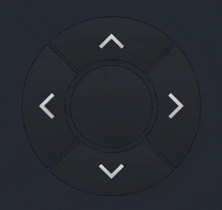
}<body class="page">
<div class="controls">
<div class="arrow">
<img src="https://i.imgur.com/JGUoNfS.png" />
</div>
</div>
</body>TylerH给出了很好的答案,但它是一个相当复杂的解决方案。我有一个简单的解决方案,适用于那些只想使用纯CSS实现"onclick"效果而不需要大量额外元素的人。
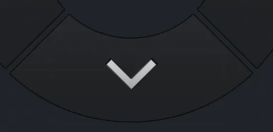
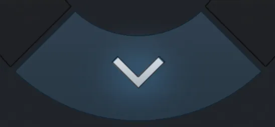
我们将简单地使用CSS过渡。您可能可以通过动画来做类似的事情。
诀窍是改变过渡的延迟时间,以便在用户单击时它将持续。
.arrowDownContainer:active,
.arrowDownContainer.clicked {
  filter: drop-shadow(0px 0px 0px steelblue);
  transition: filter 0s;
}
.arrowDownContainer {
  cursor: pointer;
  position: absolute;
  bottom: 0px;
  top: 490px;
  left: 108px;
  height: 222px;
  width: 495px;
  z-index: 3;
  transition: filter 0.3s ease 0.3s;
}
警告!下面的答案非常简单! :)
尽管许多(否则正确)的答案在这里声称,只要你仅需要在悬停期间保持永久性,实际上可以使用CSS(而无需使用复选框hack),例如块/弹出窗口在单击后出现并保持可见状态。
因此,如果Bojangles'和TylerH的答案对您有用,请看一眼,但如果您想要一个简单的,仅限CSS的回答,它将在单击后保持块可见(甚至可以使用跟进单击使块消失),请参见此解决方案。
我遇到了类似的情况。 我需要一个具有onClick的弹出div,在其中不能添加任何JavaScript或更改标记/ HTML(真正的CSS解决方案),并且可以通过一些警告来实现。 除非您可以更改HTML(以添加“id”),否则无法使用:target技巧创建不错的弹出窗口,因此不适用。
在我的情况下,弹出div包含在其他div中,并且我希望弹出显示在其他div的上方,可以使用:active和:hover的组合来实现:
/* Outer div - needs to be relative so we can use absolute positioning */
.clickToShowInfo {
    position: relative;
}
/* When clicking outer div, make inner div visible */
.clickToShowInfo:active .info { display: block; }
/* And hold by staying visible on hover */
.info:hover {
    display: block;
}
/* General settings for popup */
.info {
    position: absolute;
    top: -5;
    display: none;
    z-index: 100;
    background-color: white;
    width: 200px;
    height: 200px;
}
以下是一个示例(允许点击弹出窗口使其消失):
CSS-Only onClick to Popup Div (无需JavaScript或HTML更改!)
我还在下面插入了一个代码片段示例,但是在Stack Overflow沙盒中的定位很奇怪,所以我不得不将“单击此处”文本放在innerDiv之后,这通常是不需要的。
/* Outer div - needs to be relative so we can use absolute positioning */
    .clickToShowInfo {
        position: relative;
    }
    /* When clicking outer div, make inner div visible */
    .clickToShowInfo:active .info { visibility: visible; }
    /* And hold by staying visible on hover */
    .info:hover {
        visibility: visible;
    }
    /* General settings for popup */
    .info {
        position: absolute;
        top: -10;
        visibility: hidden;
        z-index: 100;
        background-color: white;
        box-shadow: 5px 5px 2px #aaa;
        border: 1px solid grey;
        padding: 8px;
        width: 220px;
        height: 200px;
    }
    /* If we want clicking on the popup to close, use this */
    .info:active {
        visibility: hidden;    /* Doesn't work because DCEvent is :active as well */
        height: 0px;
        width: 0px;
        left: -1000px;
        top: -1000px;
}<p />
<div class="clickToShowInfo">
<div class="info">
Lorem ipsum dolor sit amet, consectetur adipiscing elit, sed do eiusmod tempor incididunt ut labore et dolore magna aliqua
</div>
Click here to show info
</div>
<p />在我们深入讨论问题之前,为了以后参考方便,请记住 — 您应该使用 JavaScript 处理 click 事件。
document.querySelector('img').addEventListener('click', function() {
  this.classList.toggle('large');
});
.large {
width: 75px;
height: 75px;
}<img src="https://istack.dev59.com/5FBwB.webp" alt="Heart">然而,如果由于某些原因您无法使用JavaScript,则有两种常见方法来模拟一个点击事件并使用CSS创建切换按钮。
复选框技巧不是一种好的实践方法:
<html>和<body>元素。:target CSS伪类代表具有匹配URL片段的id的唯一元素(目标元素)。正如您在以下示例中看到的那样,动作者的href值#fade-out与目标元素的id相匹配。
a {
  display: inline-block;
  padding: 8px 12px;
  border-radius: 5px;
  background: linear-gradient(#eee, #ddd);
  color: #333;
  font: bold 12px Verdana;
  text-shadow: 0 1px white;
  text-decoration: none;
}

p {
  font: 13px/1.5 Arial;
  padding: 1em;
  background: aqua;
  transition: 1s linear;
}

:target {
  opacity: 0;
}<a href="#fade-out">Fade out</a>
<p id="fade-out">Lorem ipsum dolor sit amet, consectetur adipiscing elit, sed do eiusmod tempor incididunt ut labore et dolore magna aliqua. Ut enim ad minim veniam, quis nostrud exercitation ullamco laboris nisi ut aliquip ex ea commodo consequat. Duis aute irure dolor in reprehenderit in voluptate velit esse cillum dolore eu fugiat nulla pariatur. Excepteur sint occaecat cupidatat non proident, sunt in culpa qui officia deserunt mollit anim id est laborum.</p>:target选择器可用于样式化当前激活的目标元素。这意味着它的工作方式类似于单选按钮:在同一组中只能同时选择一个。
body {
  display: inline-grid;
  font: 16px "Times New Roman";
}

a {
  padding-left: 24px;
  margin: 0 2em 1em 0;
  justify-self: start;
  background: radial-gradient(circle 7px at 8px, #dedede 7px, transparent 8px);
  color: #333;
  text-decoration: none;
}

a:hover {
  background: radial-gradient(circle 7px at 8px, #ccc 7px, transparent 8px);
}

a:target {
  background: radial-gradient(circle 7px at 8px, dodgerBlue 4px, white 5px 6px, dodgerBlue 7px, transparent 8px);
}

div {
  grid-area: 1 / 2 / 7;
  width: 154px;
  height: 154px;
  text-align: center;
  background: aqua;
  color: black;
  border-radius: 50%;
  transition: 0.3s linear;
}

#rotate90:target ~ div {
  transform: rotate(90deg);
}

#rotate180:target ~ div {
  transform: rotate(180deg);
}

#rotate270:target ~ div {
  transform: rotate(270deg);
}

#rotate360:target ~ div {
  transform: rotate(360deg);
}<a href="#rotate0" id="rotate0">0°</a>
<a href="#rotate90" id="rotate90">90°</a>
<a href="#rotate180" id="rotate180">180°</a>
<a href="#rotate270" id="rotate270">270°</a>
<a href="#rotate360" id="rotate360">360°</a>
<div>•</div>问:如何创建一个切换按钮?
答:基本上,它的工作原理是这样的:你使用两个超链接,“doer”和“undoer”。Doer指向目标元素,而Undoer指向无处,以实现反转效果。
以下演示展示了:target选择器的潜力,并让您了解如何使用它。
div {
  width: 200px;
  height: 200px;
  background: #dedede;
  transition: 0.3s ease-in-out;
}

a {
  display: inline-flex;
  align-items: center;
  column-gap: 1ch;
  margin-top: 1em;
  font: 16px Arial;
  color: #333;
  text-decoration: none;
}

a::before {
  content: "✔";
  font-size: 13px;
  width: 1.2em;
  line-height: 1.2em;
  text-align: center;
  background: #dedede;
  color: transparent;
}

.undoer::before {
  background: dodgerBlue;
  color: white;
  text-shadow: 0 2px black;
}

.doer:hover::before {
  background: #ccc;
}

:target {
  border-radius: 50%;
}

.undoer,
:target ~ .doer {
  display: none;
}

:target ~ .undoer {
  display: inline-flex;
}<div id="circle"></div>
<a href="#circle" class="doer">Circle</a>
<a href="#square" class="undoer">Circle</a>链接可以指向同一个锚点元素。
body {
  text-align: center;
}

h1 {
  font-size: 24px;
}

a {
  display: inline-block;
  padding: 8px 12px;
  border-radius: 5px;
  margin-bottom: 1em;
  background: linear-gradient(#eee, #ddd);
  color: #333;
  font: bold 12px Verdana;
  text-shadow: 0 1px white;
  text-decoration: none;
}

[class]:not(.yellow) {
  color: white;
  text-shadow: 0 1px black;
}

.red {
  background: red;
}

.orange {
  background: orange;
}

.yellow {
  background: yellow;
}

.green {
  background: green;
}

.blue {
  background: blue;
}

.indigo {
  background: indigo;
}

.violet {
  background: violet;
}

div {
  width: 600px;
  height: 400px;
  margin: 0 auto;
  background: #eee;
  transition: 0.3s ease-in-out;
}

[class],
:target {
  display: none;
}

:target + a {
  display: inline-block;
}

#red:target ~ div {
  background: red;
}

#orange:target ~ div {
  background: orange;
}

#yellow:target ~ div {
  background: yellow;
}

#green:target ~ div {
  background: green;
}

#blue:target ~ div {
  background: blue;
}

#indigo:target ~ div {
  background: indigo;
}

#violet:target ~ div {
  background: violet;
}<h1></h1>
<a href="#red" id="red">Red</a>
<a href="#cancel" class="red">Red</a>
<a href="#orange" id="orange">Orange</a>
<a href="#cancel" class="orange">Orange</a>
<a href="#yellow" id="yellow">Yellow</a>
<a href="#cancel" class="yellow">Yellow</a>
<a href="#green" id="green">Green</a>
<a href="#cancel" class="green">Green</a>
<a href="#blue" id="blue">Blue</a>
<a href="#cancel" class="blue">Blue</a>
<a href="#indigo" id="indigo">Indigo</a>
<a href="#cancel" class="indigo">Indigo</a>
<a href="#violet" id="violet">Violet</a>
<a href="#cancel" class="violet">Violet</a>
<div></div>正如您可能已经注意到的那样,您可以完全用另一个元素来替换一个元素。
.undoer,
:target {
  display: none;
}

:target + .undoer {
  display: inline;
}<a href="#on" title="Turn on the light" id="on"><img src="https://istack.dev59.com/nuKgJ.webp" alt="Light on"></a>
<a href="#off" title="Turn off the light" class="undoer"><img src="https://istack.dev59.com/3DLVM.webp" alt="Light off"></a>你甚至可以在锚点内嵌套块级元素。
如果你希望在从执行者切换到撤销者时产生过渡效果,请在第一个元素上使用 position: absolute ,在第二个元素上使用 visibility: hidden 。
a {
  display: block;
  box-sizing: border-box;
  width: 64px;
  padding-left: 33px;
  border-radius: 16px;
  background: radial-gradient(circle 12px, white 100%, transparent calc(100% + 1px)) #ccc -16px;
  font: bold 12px/32px Verdana;
  color: white;
  text-shadow: 0 1px black;
  text-decoration: none;
  transition: 0.3s ease-in-out;
  transition-property: padding-left, background-color, background-position;
}

#start {
  position: absolute;
}

:target,
:target + .undoer {
  padding-left: 8px;
  background-color: dodgerBlue;
  background-position: 16px;
}

.undoer,
:target {
  visibility: hidden;
}

:target + .undoer {
  visibility: visible;
}<a href="#start" id="start">OFF</a>
<a href="#stop" class="undoer">ON</a>这是一个导航菜单。
html,
body {
  margin: 0;
  padding: 0;
}

header {
  display: flex;
  line-height: 50px;
  background: linear-gradient(#999, #333);
  color: white;
}

a {
  color: inherit;
  text-decoration: none;
}

header > a,
header h1 {
  font-size: 26px;
  font-family: 'Times New Roman';
  text-shadow: 0 3px black;
}

header > a {
  width: 50px;
  text-align: center;
}

header h1 {
  margin: 0;
  letter-spacing: 1px;
}

nav {
  position: absolute;
  top: 50px;
  background: #333;
  visibility: hidden;
  transform: translateX(-100%);
  transition: 280ms ease-out 120ms;
}

nav a {
  display: block;
  padding: 1em;
  font: bold 12px Verdana;
  transition: inherit;
}

nav a:not(:last-child) {
  border-bottom: 1px solid black;
}

nav a:hover,
#current {
  background: #A00;
}

.undoer,
:target {
  display: none;
}

:target + .undoer {
  display: block;
}

:target ~ nav {
  visibility: visible;
  transform: none;
}

main {
  padding: 16px;
  font: 13px Arial;
  color: #333;
}

main h1 {
  font-size: 1.5em;
}

p {
  line-height: 1.5;
}<header>
<a href="#open" id="open">☰</a>
<a href="#close" class="undoer">✕</a>
<h1> Music School</h1>
<nav>
<a href="#" id="current">Home</a>
<a href="#">Instruments</a>
<a href="#">Online Lessons</a>
<a href="#">Register</a>
<a href="#">Contact</a>
</nav>
</header>
<main>
<h1>Home</h1>
<p>Lorem ipsum dolor sit amet, consectetur adipiscing elit, sed do eiusmod tempor incididunt ut labore et dolore magna aliqua. Ut enim ad minim veniam, quis nostrud exercitation ullamco laboris nisi ut aliquip ex ea commodo consequat. Duis aute irure dolor in reprehenderit in voluptate velit esse cillum dolore eu fugiat nulla pariatur. Excepteur sint occaecat cupidatat non proident, sunt in culpa qui officia deserunt mollit anim id est laborum.</p>
</main>以下是常见问题解答页面。
body {
  font: 16px Arial;
  color: #333;
  max-width: 600px;
  margin: 1em auto;
}

h1 {
  text-align: center;
  font-family: "Times New Roman";
}

p {
  display: none;
  padding: 12px;
  border: 2px solid #dedede;
  border-top: 0;
  margin: 0;
  font-size: 13px;
  line-height: 1.5;
}

a {
  display: flex;
  align-items: center;
  column-gap: 12px;
  padding: 12px;
  margin-top: 1em;
  background: #dedede;
  color: inherit;
  font-weight: bold;
  line-height: 1.5;
  text-shadow: 0 1px white;
  text-decoration: none;
}

a::before {
  content: "➕";
  padding: 3px;
  background: #eee;
  font-weight: initial;
}

a[href="#close"]::before {
  content: "➖";
}

a:hover::before {
  background: #fff;
}

a[href="#close"],
a:target {
  display: none;
}

a:target + a {
  display: flex;
}

a:target + a + p {
  display: block;
}<h1>Frequently Asked Questions</h1>
<a href="#open1" id="open1">How do we get more energy from the sun?</a>
<a href="#close">How do we get more energy from the sun?</a>
<p>Dwindling supplies of fossil fuels mean we’re in need of a new way to power our planet. Our nearest star offers more than one possible solution. We’re already harnessing the sun’s energy to produce solar power. Another idea is to use the energy in sunlight to split water into its component parts: oxygen, and hydrogen, which could provide a clean fuel for cars of the future. Scientists are also working on an energy solution that depends on recreating the processes going on inside stars themselves – they’re building a nuclear fusion machine. The hope is that these solutions can meet our energy needs.</p>
<a href="#open2" id="open2">What's so weird about prime numbers?</a>
<a href="#close">What's so weird about prime numbers?</a>
<p>The fact you can shop safely on the internet is thanks to prime numbers – those digits that can only be divided by themselves and one. Public key encryption – the heartbeat of internet commerce – uses prime numbers to fashion keys capable of locking away your sensitive information from prying eyes. And yet, despite their fundamental importance to our everyday lives, the primes remain an enigma. An apparent pattern within them – the Riemann hypothesis – has tantalised some of the brightest minds in mathematics for centuries. However, as yet, no one has been able to tame their weirdness. Doing so might just break the internet.</p>
<a href="#open3" id="open3">Can computers keep getting faster?</a>
<a href="#close">Can computers keep getting faster?</a>
<p>Our tablets and smartphones are mini-computers that contain more computing power than astronauts took to the moon in 1969. But if we want to keep on increasing the amount of computing power we carry around in our pockets, how are we going to do it? There are only so many components you can cram on to a computer chip. Has the limit been reached, or is there another way to make a computer? Scientists are considering new materials, such as atomically thin carbon – graphene – as well as new systems, such as quantum computing.</p>
<a href="#open4" id="open4">When can I have a robot butler?</a>
<a href="#close">When can I have a robot butler?</a>
<p>Robots can already serve drinks and carry suitcases. Modern robotics can offer us a “staff” of individually specialised robots: they ready your Amazon orders for delivery, milk your cows, sort your email and ferry you between airport terminals. But a truly “intelligent” robot requires us to crack artificial intelligence. The real question is whether you’d leave a robotic butler alone in the house with your granny. And with Japan aiming to have robotic aides caring for its elderly by 2025, we’re thinking hard about it now.</p>
<a href="#open5" id="open5">What's at the bottom of the ocean?</a>
<a href="#close">What's at the bottom of the ocean?</a>
<p>Ninety-five per cent of the ocean is unexplored. What’s down there? In 1960, Don Walsh and Jacques Piccard travelled seven miles down, to the deepest part of the ocean, in search of answers. Their voyage pushed the boundaries of human endeavour but gave them only a glimpse of life on the seafloor. It’s so difficult getting to the bottom of the ocean that for the most part we have to resort to sending unmanned vehicles as scouts. The discoveries we’ve made so far – from bizarre fish such as the barreleye, with its transparent head, to a potential treatment for Alzheimer’s made by crustaceans – are a tiny fraction of the strange world hidden below the waves.</p>
<a href="#open6" id="open6">What's at the bottom of a black hole?</a>
<a href="#close">What's at the bottom of a black hole?</a>
<p>It’s a question we don’t yet have the tools to answer. Einstein’s general relativity says that when a black hole is created by a dying, collapsing massive star, it continues caving in until it forms an infinitely small, infinitely dense point called a singularity. But on such scales quantum physics probably has something to say too. Except that general relativity and quantum physics have never been the happiest of bedfellows – for decades they have withstood all attempts to unify them. However, a recent idea – called M-Theory – may one day explain the unseen centre of one of the universe’s most extreme creations.</p>
<a href="#open7" id="open7">How do we solve the population problem?</a>
<a href="#close">How do we solve the population problem?</a>
<p>The number of people on our planet has doubled to more than 7 billion since the 1960s and it is expected that by 2050 there will be at least 9 billion of us. Where are we all going to live and how are we going to make enough food and fuel for our ever-growing population? Maybe we can ship everyone off to Mars or start building apartment blocks underground. We could even start feeding ourselves with lab-grown meat. These may sound like sci-fi solutions, but we might have to start taking them more seriously.</p>您可以针对一个元素及其所有后代进行定位和样式修改。例如,让我们针对 <body> 元素并切换暗/亮模式。
body,
a,
h2 {
  transition: 0.3s linear;
}

body {
  font: 13px Arial;
  background: white;
  color: #333;
}

a {
  font-size: 16px;
  text-decoration: none;
}

main {
  column-count: 3;
  column-gap: 2em;
  padding: 0 1em;
}

h1 {
  column-span: all;
  text-align: center;
}

h2:nth-of-type(1) {
  margin-top: 0;
}

p {
  line-height: 1.5;
}

:target {
  background: #333;
  color: white;
}

.doer {
  position: absolute;
}

.undoer,
:target .doer {
  visibility: hidden;
  opacity: 0;
}

:target .undoer {
  visibility: visible;
  opacity: 1;
}

:target h2:nth-of-type(1) {
  color: red;
}

:target h2:nth-of-type(2) {
  color: green;
}

:target h2:nth-of-type(3) {
  color: blue;
}<body id="dark">
<a href="#dark" title="Dark mode" class="doer"></a>
<a href="#light" title="Light mode" class="undoer">☀️</a>
<main>
<h1>Primary Colors</h1>
<h2>Red</h2>
<p>Lorem ipsum dolor sit amet, consectetur adipiscing elit, sed do eiusmod tempor incididunt ut labore et dolore magna aliqua. Ut enim ad minim veniam, quis nostrud exercitation ullamco laboris nisi ut aliquip ex ea commodo consequat. Duis aute irure dolor in reprehenderit in voluptate velit esse cillum dolore eu fugiat nulla pariatur. Excepteur sint occaecat cupidatat non proident, sunt in culpa qui officia deserunt mollit anim id est laborum.</p>
<h2>Green</h2>
<p>Lorem ipsum dolor sit amet, consectetur adipiscing elit, sed do eiusmod tempor incididunt ut labore et dolore magna aliqua. Ut enim ad minim veniam, quis nostrud exercitation ullamco laboris nisi ut aliquip ex ea commodo consequat. Duis aute irure dolor in reprehenderit in voluptate velit esse cillum dolore eu fugiat nulla pariatur. Excepteur sint occaecat cupidatat non proident, sunt in culpa qui officia deserunt mollit anim id est laborum.</p>
<h2>Blue</h2>
<p>Lorem ipsum dolor sit amet, consectetur adipiscing elit, sed do eiusmod tempor incididunt ut labore et dolore magna aliqua. Ut enim ad minim veniam, quis nostrud exercitation ullamco laboris nisi ut aliquip ex ea commodo consequat. Duis aute irure dolor in reprehenderit in voluptate velit esse cillum dolore eu fugiat nulla pariatur. Excepteur sint occaecat cupidatat non proident, sunt in culpa qui officia deserunt mollit anim id est laborum.</p>
</main>
</body>:target 的建议并不新颖。 - TylerH:target是不够的,因此它被拒绝了。OP正在寻找类似于:hover的东西,它具有撤销效果,但是在click事件上。换句话说,OP正在寻找一个带有CSS的切换按钮,这就是为什么你的答案被接受。正如你自己在这个长串评论中已经正确地提到的那样,撤销效果是满足OP需求的必要条件,这就是你和我发表的帖子所做的事情,但是采用了不同的方法。 - Mori首先,我会使用 focus。
这是因为它非常适用于我正在展示的示例。如果有人想要鼠标按下类型的事件,则使用 active。
<button class="mdT mdI1" ></button>
<button class="mdT mdI2" ></button>
<button class="mdT mdI3" ></button>
<button class="mdT mdI4" ></button>
/* Change *button size, border, bg color, and align to middle* */
    .mdT {
        width: 96px;
        height: 96px;
        border: 0px;
        outline: 0;
        vertical-align: middle;
        background-color: #AAAAAA;
    }
    .mdT:focus {
        width: 256px;
        height: 256px;
    }

/* Change Images Depending On Focus */
    .mdI1       { background-image: url('http://placehold.it/96x96/AAAAAA&text=img1');     }
    .mdI1:focus { background-image: url('http://placehold.it/256x256/555555&text=Image+1');   }
    .mdI2       { background-image: url('http://placehold.it/96x96/AAAAAA&text=img2');     }
    .mdI2:focus { background-image: url('http://placehold.it/256x256/555555&text=Image+2');   }
    .mdI3       { background-image: url('http://placehold.it/96x96/AAAAAA&text=img3');     }
    .mdI3:focus { background-image: url('http://placehold.it/256x256/555555&text=Image+3');   }
    .mdI4       { background-image: url('http://placehold.it/96x96/AAAAAA&text=img4');     }
    .mdI4:focus { background-image: url('http://placehold.it/256x256/555555&text=Image+4');   }
JSFiddle链接:http://jsfiddle.net/00wwkjux/
提问者只希望效果在点击事件期间持续。虽然这不是完全符合需求,但很接近。 active 在鼠标按下时进行动画处理,任何需要持续更长时间的更改都需要使用JavaScript完成。
:active表示当鼠标按下时起作用。根据您想要做什么,您可能可以使用 CSS4 伪类:target来实现相同的效果。 - bfavaretto:target并不是一个新的概念。它自选择器3起就已经存在了,并且在写作时已经成为推荐标准已经有一年之久。 - BoltClock