在IE7中,margin auto + float right无法正常工作。

3

我在HTML渲染IE7时遇到问题。
当将“margin:auto”块与“float:right”块组合时。

以下是此问题的示例代码:

<!DOCTYPE html PUBLIC "-//W3C//DTD XHTML 1.0 Transitional//EN" "http://www.w3.org/TR/xhtml1/DTD/xhtml1-transitional.dtd">
<html xmlns="http://www.w3.org/1999/xhtml">
<head>
</head>
<body>
<div id="floating" style="float: right; background-color: #ccf">
This is the top right links block
</div>
<div id="body" style="width: 800px; margin: auto; background-color: #fcc">
This is the body.
This is the body.
This is the body.
This is the body.
This is the body.
This is the body.
This is the body.
This is the body.
This is the body.
This is the body.
</div>
</body>

在IE7中出现的问题:
- margin:auto不能使"body"块居中。它似乎受到"floating"块的影响。 - 当折叠时,"floating"块实际上并没有浮动到"body"上面。
在IE7中的表现:
- "body"块没有居中,如下图所示:div "body" is not centered - 
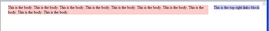
"floating"块没有浮动到"body"上面,如下图所示:
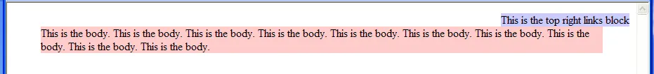
div "floating" do not float 正确的显示效果:
- "body"块居中,如下图所示:div "body" correctly centered - "floating"块浮动到了"body"上面,如下图所示:div "floating" correctly floating 有人遇到过这种问题吗?有什么提示可以让在IE7上正确显示呢?
谢谢!

看起来对我来说没问题,不过我只能通过将IE9放入IE7渲染模式中来进行测试。唯一的区别似乎是IE7在body上放置了更多的padding/margin,这可以很容易地通过重置样式表进行修正。 - WickyNilliams
添加了一些图片以澄清问题。 - manuelgos
@mr.nicksta - 在IE7兼容模式和真正的IE7之间呈现存在显着差异,因此如果您仅通过使用IE9的IE7模式来测试您的网站是否适用于IE7,则可能比您想象的要不兼容IE7。我建议下载像IETester这样的工具,它可以让您使用真正的IE7呈现引擎。 - Spudley
1
为了让事情变得更容易,我已经将问题中的代码示例粘贴到了JSFiddle页面上:http://jsfiddle.net/E6c9g/ -- IE7确实与其他浏览器呈现不同。很抱歉我没有真正的解决方案,但我希望这能让其他人更容易尝试解决它。 - Spudley
@Spudley - 我相当有信心认为IE9中的IE7渲染模式比IETester更准确。我以前使用过IETester等工具,它们可能会出现极大的不一致性。Smashing Magazine的最新文章可证实此点。作者完全否定了IETester,并稍微更有利地谈到了渲染模式(尽管也有抱怨)。就个人而言,我相信微软能够提供比第三方工具更好的体验。 - WickyNilliams
显示剩余2条评论
1个回答

0
将这两个 div 标签放到一个容器 div 中。给容器设置宽度: 100% 或你想要的总宽度。因此,你的代码应该像这样:
<!DOCTYPE html PUBLIC "-//W3C//DTD XHTML 1.0 Transitional//EN" "http://www.w3.org/TR/xhtml1/DTD/xhtml1-transitional.dtd">
<html xmlns="http://www.w3.org/1999/xhtml">
<head>
</head>
<body>
<div id="wrapper" style="width: 100%;">
 <div id="body" style="width: 800px; margin: auto; background-color: #fcc">

/*---- Moved element ---- */
  <div id="floating" style="float: right; background-color: #ccf">
  This is the top right links block
  </div>
/*---- End Moved element ---- */

 This is the body.
 This is the body.
 This is the body.
 This is the body.
 This is the body.
 This is the body.
 This is the body.
 This is the body.
 This is the body.
 This is the body.
 </div>
</div>
</body>
</html>

我不是很理解,但你可以将其包装在一个 div 中,或者给 body 标签设置宽度为 100% 或任何你想要的大小。通常最好给 body 标签设置宽度为 100%,然后设置一个包装 div 来样式化盒子的宽度。


尝试过这个但没有成功。我已经在问题中添加了一些图片以更好地解释这个问题。 - manuelgos
我认为你想要将元素浮动到右边,但在body内是正确的,这样div id = floating就在body的右侧。 请查看更新后的代码。 - CBRRacer
很抱歉,这并不能解决问题。我们希望div“floating”可以浮动到超过800像素(这是“body” div的宽度)。根据浏览器屏幕的大小,"floating" div实际上可以浮动在"body" div之上或者屏幕右侧(超出"body" div)。 - manuelgos
我刚刚在问题中添加了一些图片,以正确的可视化方式展示预期的显示结果。 - manuelgos
我进行了快速搜索,似乎唯一真正的方法是使用定位元素或jquery。这里有一个关于类似问题的其他帖子的链接。参考链接 从经验来看,定位元素可能会导致其他与跨浏览器兼容性相关的问题,不过现在随着新的浏览器的出现,这种问题越来越少了。 - CBRRacer

网页内容由stack overflow 提供, 点击上面的
可以查看英文原文,
原文链接