如何使固定内容显示在iOS键盘上方?

32

我只能找到人们遇到相反问题的解答。

我希望我的固定内容能够出现在iOS键盘上方。问题截图如下:

fixed content goes below content on ios

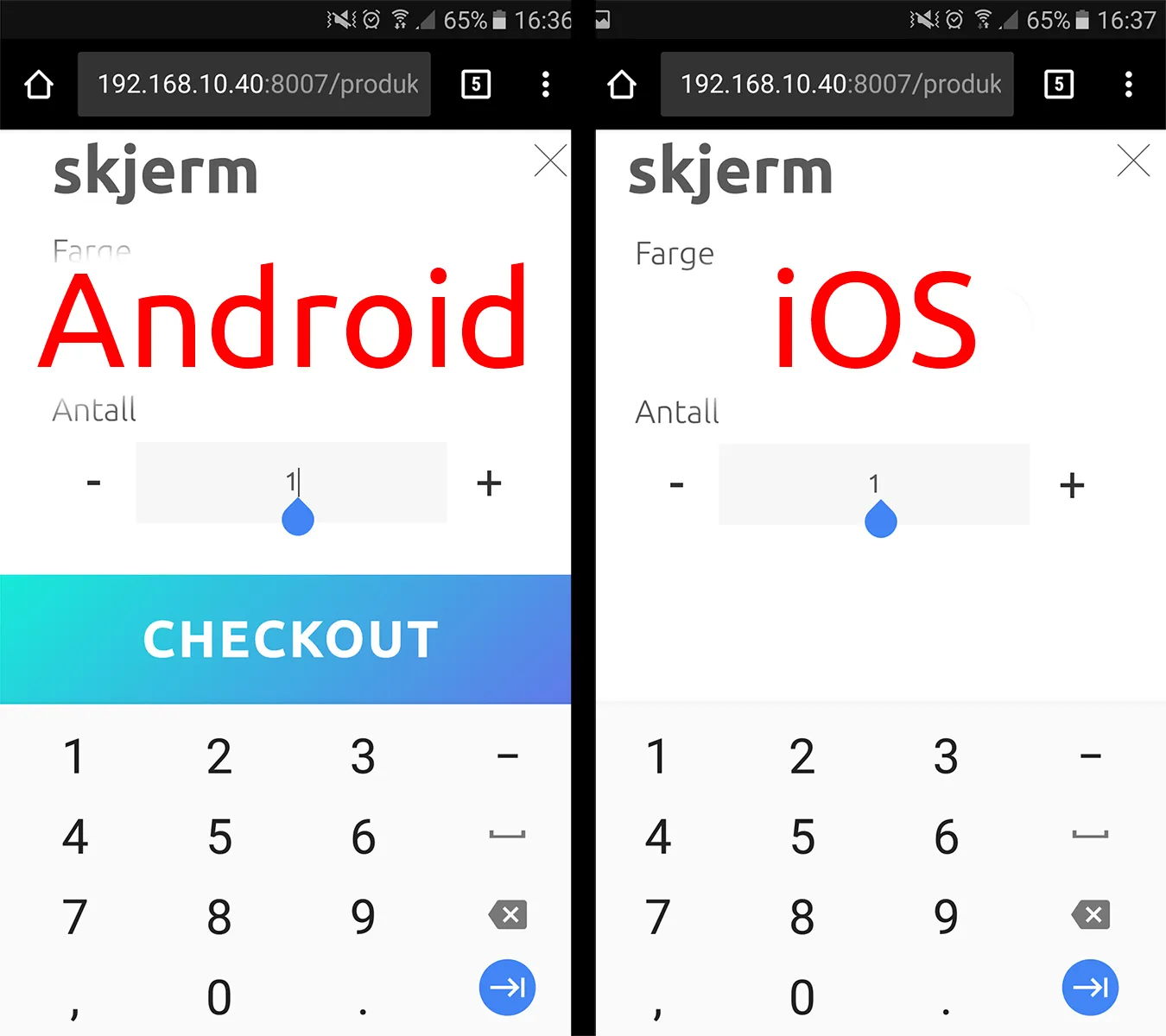
我希望iOS的表现与Android相同。

有没有简单的方法可以实现这一目标?

父元素CSS:

.parent{
    position:fixed;
    top: 0;
    left 0;
    right: 0;
    bottom: 0;
    width: 100%;
    height: 100%;
}

按钮的CSS样式:

.button{
    position:fixed;
    left 0;
    right: 0;
    bottom: 0;
    width: 100%;
    height: 5rem;
}
7个回答

22
我们可以使用VisualViewport来计算键盘的高度,这样我们就可以正确地设置固定内容的位置。
小示例:https://whatwg6.github.io/pos-above-keyboard/index.html Github仓库:https://github.com/whatwg6/pos-above-keyboard 代码片段:

  const button = document.getElementById("button");
  const input = document.getElementById("input");
  let height = window.visualViewport.height;
  const viewport = window.visualViewport;

  window.addEventListener("scroll", inputBlur);
  window.visualViewport.addEventListener("resize", resizeHandler);

  function inputBlur() {
    input.blur();
  }

  function resizeHandler() {
    if (!/iPhone|iPad|iPod/.test(window.navigator.userAgent)) {
      height = viewport.height;
    }
    button.style.bottom = `${height - viewport.height + 10}px`;
  }

  function blurHandler() {
    button.style.bottom = "10px";
  }
  html,
  body {
    margin: 0;
    padding: 0;
  }

  #button {
    position: fixed;
    width: 100%;
    bottom: 10px;
    background-color: rebeccapurple;
    line-height: 40px;
    text-align: center;
  }
<input
  type="text"
  inputmode="decimal"
  value="0.99"
  id="input"
  onblur="blurHandler()"
/>
<div id="button" onclick="inputBlur()">Button</div>

问题:https://developers.google.com/web/updates/2017/09/visual-viewport-api#the_event_rate_is_slow 为什么不使用innerHeight?:Iphone safari not resizing viewport on keyboard open

1
五年后...它出现了!这很棒,似乎有很好的支持,谢谢!此外,那个按钮的颜色也很不错 :) - Bjørnar Hagen
代码库:https://github.com/whatwg6/pos-above-keyboard/blob/main/index.html - whatwg
1
不知道发生了什么,但这使得我的网站上的按钮出现得太高了,但在演示中看起来运行良好。 - Glass Cannon
1
这个答案几乎正确,但是当滚动到底部时它不起作用。像素的数量应该是: window.innerHeight - viewport.height - viewport.offsetTop;。 请随意更新你的答案。 - GermanJablo
当我将演示复制到自己的服务器上时,它在那里无法正常工作。在iOS Safari上,当焦点聚集时,页面会向上滚动一点,导致输入框上方出现空白,按钮也不再可见。这是完全相同的代码,非常奇怪。不过还是谢谢你的指点,我会根据那个来构建自己的解决方案。 - undefined
抱歉,我已经更新了我的代码片段。 - undefined

13

当输入框被选中并且虚拟键盘弹出时,移动版Safari不支持position: fixed。

为了使其像移动版Chrome一样工作,您需要为整个页面或伪固定元素的容器使用position: absolute、height: 100%,拦截scroll、touchend、focus和blur事件。

诀窍是在输入控件激活焦点之前将其放置在屏幕底部。在这种情况下,iOS Safari始终可预测地滚动视口,并且window.innerHeight变得完全可见。

在移动版Safari中打开https://avesus.github.io/docs/ios-keep-fixed-on-input-focus.html,以查看其工作原理。

请避免使用具有多个可聚焦元素的表单,因为需要更多的技巧来修复位置,这些技巧仅供演示目的而添加。

请注意,对于旋转和横向模式,需要使用其他技巧。我正在开发一个名为Tuff.js的框架,它将提供一个全屏容器,帮助移动Web开发人员更快地构建Web应用程序。我已经花了近一年的时间进行研究。

顺便说一下,为了在虚拟键盘激活时防止整个窗口滚动,您可以使用这个超级简单的技巧。

var hack = document.getElementById('scroll-hack');

function addScrollPixel() {
  if (hack.scrollTop === 0) {
    // element is at the top of its scroll position, so scroll 1 pixel down
    hack.scrollTop = 1;
  }

  if (hack.scrollHeight - hack.scrollTop === hack.clientHeight) {
    // element is at the bottom of its scroll position, so scroll 1 pixel up
    hack.scrollTop -= 1;
  }
}

if (window.addEventListener) {
  // Avoid just launching a function on every scroll event as it could affect performance. 
  // You should add a "debounce" to limit how many times the function is fired
  hack.addEventListener('scroll', addScrollPixel, true);
} else if (window.attachEvent) {
  hack.attachEvent('scroll', addScrollPixel);
}
body {
  margin: 0 auto;
  padding: 10px;
  max-width: 800px;
}

h1>small {
  font-size: 50%;
}

.container {
  display: flex;
  align-items: top;
  justify-content: space-between;
}

.container>div {
  border: #000 1px solid;
  height: 200px;
  overflow: auto;
  width: 48%;
  -webkit-overflow-scrolling: touch;
}
<h1>iOS Scroll Hack</h1>
<p>Elements with overflow:scroll have a slightly irritating behaviour on iOS, where when the contents of the element are scrolled to the top or bottom and another scroll is attempted, the browser window is scrolled instead. I hacked up a fix using minimal,
  native JavaScript.</p>
<p>Both lists have standard scrolling CSS applied (<code>overflow: auto; -webkit-overflow-scrolling: touch;</code>), but the list on the right has the hack applied. You'll notice you can't trigger the browser to scroll whilst attempting to scroll the list
  on the right.</p>
<p>The only very slight drawback to this is the slight "jump" that occurs when at the top or bottom of the list in the hack.</p>
<div class='container'>
  <div id='scroll-orig'>
    <ul>
      <li>1</li>
      <li>2</li>
      <li>3</li>
      <li>4</li>
      <li>5</li>
      <li>6</li>
      <li>7</li>
      <li>8</li>
      <li>9</li>
      <li>10</li>
      <li>11</li>
      <li>12</li>
      <li>13</li>
      <li>14</li>
      <li>15</li>
      <li>16</li>
      <li>17</li>
      <li>18</li>
      <li>19</li>
      <li>20</li>
    </ul>
  </div>
  <div id='scroll-hack'>
    <ul>
      <li>1</li>
      <li>2</li>
      <li>3</li>
      <li>4</li>
      <li>5</li>
      <li>6</li>
      <li>7</li>
      <li>8</li>
      <li>9</li>
      <li>10</li>
      <li>11</li>
      <li>12</li>
      <li>13</li>
      <li>14</li>
      <li>15</li>
      <li>16</li>
      <li>17</li>
      <li>18</li>
      <li>19</li>
      <li>20</li>
    </ul>
  </div>
</div>

我从这里得到了答案。


10
很遗憾,苹果至今仍未解决这个问题。现在是2021年。 - Iman Mohamadi
7
苹果是新的IE :( - Stephane
1
根据 https://dev59.com/DVkS5IYBdhLWcg3w05eT,window.innerHeight 可能不正确,因此从 iOS 13 开始,可以使用 VisualViewport API 实现来解决这个问题。https://dev59.com/DVkS5IYBdhLWcg3w05eT#59056851 - whatwg
1
对于 addScrollPixel() 的黑客操作点赞。根据 Element.scrollHeight 文档 ,最安全的检查是否已经滚动到底部的方法是 Math.abs(element.scrollHeight - element.clientHeight - element.scrollTop) < 1 - Eric Mutta
3
我的天啊。如此基本的用例需要一年的研究,真是让人深感沮丧。 - Patrick Michaelsen
显示剩余2条评论

7

这是一个众所周知的问题,不幸的是,目前只能采用像被接受的答案那样的hacky技巧。不过,W3C正在制定虚拟键盘API

注意:在撰写本文时,该答案尚未准备好投入使用。需要了解的是,该规范还必须具有前瞻性,以适应未来可能出现的各种虚拟键盘。在可靠的跨平台浏览器支持开始出现之前,可能需要几年时间,才会成为正确的答案。


1
我根据whatwg的答案进行了调整,因为它对我的网站没有起作用(我不知道为什么)。 我使用top属性而不是bottom属性来设置绝对定位的div。 我的页面是一个聊天页面,我的div包含一个输入框。
这是我的解决方案:
// Only for Safari on iOS
// (use interactive-widget=resizes-content to fix Chrome)
if (/iPad|iPhone|iPod/.test(navigator.userAgent)) {
    if (navigator.userAgent.indexOf('Chrome') === -1 && navigator.userAgent.indexOf('Safari') > -1) {

        // Put the body relative
        document.body.style.position = 'relative';
        let marginTop = parseInt(window.getComputedStyle(document.body).marginTop);
    
        // My toolbar (in my case, a div with an input inside to make a chat)
        myBottomDiv.style.position = 'absolute';
    
        // Events (touchmove on mobile, because the scroll event doesn't work well)
        window.addEventListener("scroll", resizeHandler);
        window.addEventListener("touchmove", resizeHandler);
        window.visualViewport.addEventListener("resize", resizeHandler);
    
        function resizeHandler() {
            myBottomDiv.style.top = (window.scrollY +  window.visualViewport.height - marginTop - myBottomDiv.offsetHeight) + 'px';
        }
    }
}

0
我找到了一个有趣的解决方案。
这个解决方案是创建一个隐藏的输入框,并在touchstart事件上聚焦它。
<input id="backinput" style="position:absolute;top:0;opacity:0;pointer-events: none;">
<input id="input" style="position:absolute;bottom:0;">

使用jQuery:
$('#backinput').on('focus',function(e)
{
    e.preventDefault();
    e.stopPropagation();
    const input = document.getElementById('input');
    input.focus({ preventScroll: true });
})
$('#input').on("touchstart", function (event) {
    if(!$(this).is(":focus"))
    {
        event.stopPropagation();
        event.preventDefault();
        $('#backinput').focus();
    }
})

最后,调整视口大小,以便底部输入框在需要时移动到键盘上方。
window.visualViewport.addEventListener("resize", (event) => {
    $('body').height(parseInt(visualViewport.height));
});

对我来说,它完美地运作。我正在构建一个通讯应用。


在我的情况下,将 height 设置到 body 上没有任何效果。我还尝试在 html 上设置,但也没有效果。(我尝试在 Safari 上使用 jQuery,并使用 Chrome DevTools) - Nuno

0

当键盘显示或屏幕滚动时,底部css属性会发生变化。这不是你想要的,但这是我能实现的最好效果

下面您可以看到我的React钩子及其使用方法。

import _ from 'lodash'
import { useRef, useEffect } from 'react'

export const useFixedPositionWithOpenedIOSKeyboard = (extraBottomOffset = 10) => {
  const elementRef = useRef(null)

  useEffect(() => {
    if (/iPhone|iPad|iPod/.test(window.navigator.userAgent)) {
      const setElementOffsetBottom = () => {
        const screenHeight = document.documentElement.clientHeight
        const screenHeightWithoutKeyboard = visualViewport?.height ?? 0
        const offsetTop = visualViewport?.offsetTop ?? 0

        if (elementRef?.current) {
          const elementStyles = (elementRef.current as HTMLElement).style

          if (Math.round(screenHeightWithoutKeyboard) < screenHeight) {
            elementStyles.bottom = `${
              screenHeight - screenHeightWithoutKeyboard - offsetTop + extraBottomOffset
            }px`
          } else {
            elementStyles.bottom = ''
          }
        }
      }

      const debounceElementOffsetBottom = _.debounce(setElementOffsetBottom, 150)
      const showElement = () => debounceElementOffsetBottom()

      window.addEventListener('scroll', showElement)

      return () => window.removeEventListener('scroll', showElement)
    }
  }, [])

  return elementRef
}

...

export const Component = () => {
  const buttonRef = useFixedPositionWithOpenedIOSKeyboard();

  return (
    <>
      <input type='text' />
      <button type='submit' ref={button} style='
        position: fixed;
        bottom: 40px;
        left: 50%;
        transform: translate(-50%);
        transition: bottom 0.5s cubic-bezier(0.4, 0, 0.2, 1);
      '>
        This is Button
      </button>
    </>
  );
}

0
我觉得whatwg的回答指出了正确的方向,即使用visualViewport,但我想构建一个带有滚动功能的东西(这有一些额外的挑战)并且代码更加清晰明了。
在这里查看解决方案的简单演示:https://nnrh69.csb.app/ 基本上,它会在iOS上将元素的position属性从fixed改为absolute,并在滚动和视口调整事件中调整其位置(同时解决了移动Safari的额外滚动问题)。
以下是JavaScript的核心部分:
const fixedElement       = document.querySelector('#fixedElement');
const fixedElementHeight = fixedElement.offsetHeight;
const docHeight          = document.documentElement.scrollHeight + fixedElementHeight;  // Total height of the document (padding to be added manually)
let   fixedElementBottom; // Distance from top of the document to the BOTTOM of the fixedElement. Will change through scrolling and touch keyboard.

function adjustFixedPos() {
  fixedElementBottom = document.documentElement.scrollTop + window.visualViewport.height;
  // Limit the position to the end of the document, otherwise Safari lets the user to scroll without end
  if (fixedElementBottom > docHeight) { fixedElementBottom = docHeight; }
  fixedElement.style.top = (fixedElementBottom - fixedElementHeight) + "px"; 
}

// On iOS, switch to from fixed to absolute positioning which gets updated when needed.
if (/iPhone|iPad|iPod/.test(window.navigator.userAgent)) {
  fixedElement.style.position = "absolute";
  fixedElement.style.bottom   = "auto";
  adjustFixedPos();

  document.addEventListener('scroll', adjustFixedPos, {passive: true});
  window.visualViewport.addEventListener('resize', adjustFixedPos, {passive: true});  // Fires on touch keyboard extension and collapse
}        

你可以在演示中看到完整的代码,包括HTML和CSS。在移动Safari中打开以查看解决方法的效果。在其他浏览器上,原生的固定定位已经生效。
希望这对你有所帮助,也希望其他人不用像我一样花费几天的时间来解决这个问题:)

网页内容由stack overflow 提供, 点击上面的
可以查看英文原文,
原文链接