我找到了一个很棒的解决方法!!!
我非常兴奋地展示这个方法,因为我已经烦恼了很长时间如何实现它。
首先,将所有的CSS文件更改为SCSS;
对于现有项目
在控制台中运行ng set defaults.styleExt=scss
(ng set似乎已经被淘汰,但您可以查看此链接以获得修复方案,感谢用户@wlyles:get/set已被弃用,改用config命令)
- 将所有现有的
.css文件重命名为.scss
- 手动更改
.angular-cli.json中styles的文件扩展名,从.css更改为.scss
- 如果您没有使用像WebStorm Refactor这样的工具进行重命名,那么请手动将所有的
styleUrls从.css更改为.scss
对于未来的项目
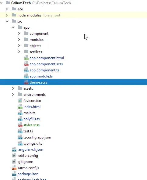
现在您需要在应用程序根目录中拥有一个theme.scss文件,如下所示:
现在在你的style.scss文件中添加以下内容(如您所见,我引用了background-color,但您可以将其更改为任何元素以根据自己的喜好设置网站主题):
编辑: 您不需要将此自定义@mixin元素放在您的styles.scss中,您可以将其放在任何一个您的*name*.component.scss中,然后以相同的方式导入和包含它!
@import '~@angular/material/theming';

// Define a custom mixin that takes in the current theme
@mixin theme-color-grabber($theme) {
  // Parse the theme and create variables for each color in the pallete
  $primary: map-get($theme, primary);
  $accent: map-get($theme, accent);
  $warn: map-get($theme, warn);
  // Create theme specfic styles
  .primaryColorBG {
    background-color: mat-color($primary);
  }
  .accentColorBG {
    background-color: mat-color($accent);
  }
  .warnColorBG {
    background-color: mat-color($warn);
  }
}
现在前往您用于主题化Material 2项目的theme.scss文件,如果需要帮助进行主题化,请查看此链接:Material 2 Github - 主题化指南
现在打开您的theme.scss并导入您的style.scss。由于我的theme.scss位于/src/app/theme.scss文件夹的根目录中,因此我必须先退出它才能引用我的/src/styles.scss全局样式文件,代码如下:
@import '../styles';
那么我们必须在所有主题中实际包含我们创建的新自定义@mixin(如果您像我一样有多个主题,因此根据当前选择的主题更改颜色)。
将其包含在实际的 angular-material-theme 包含之前,如下所示:
@include theme-color-grabber($theme);
@include angular-material-theme($theme);
如果你和我一样有任何主题,请将它添加到相同的位置,方法如下:
.light {
  $light-primary: mat-palette($mat-blue, 200,300, 900);
  $light-accent:  mat-palette($mat-light-blue, 600, 100, 800);
  $light-warn:    mat-palette($mat-red, 600);
  $light-theme: mat-dark-theme($light-primary, $light-accent, $light-warn);
  @include theme-color-grabber($light-theme);
  @include angular-material-theme($light-theme);

}
你可以看到我在include上方添加了theme-color-grabber,它是否在主题的上方或下方并不重要,因为它获取的是主题颜色,这才是关键。
我的整个themes.scss文件如下:
@import '~@angular/material/theming';
//We import our custom scss component here
@import '../styles';

@include mat-core();

$theme-primary: mat-palette($mat-red);
$theme-accent:  mat-palette($mat-deep-orange, A200, A100, A400);
$theme-warn:    mat-palette($mat-red);
$theme: mat-dark-theme($theme-primary, $theme-accent, $theme-warn);
//
@include theme-color-grabber($theme);
@include angular-material-theme($theme);
.light {
  $light-primary: mat-palette($mat-blue, 200,300, 900);
  $light-accent:  mat-palette($mat-light-blue, 600, 100, 800);
  $light-warn:    mat-palette($mat-red, 600);
  $light-theme: mat-dark-theme($light-primary, $light-accent, $light-warn);
  @include theme-color-grabber($light-theme);
  @include angular-material-theme($light-theme);

}
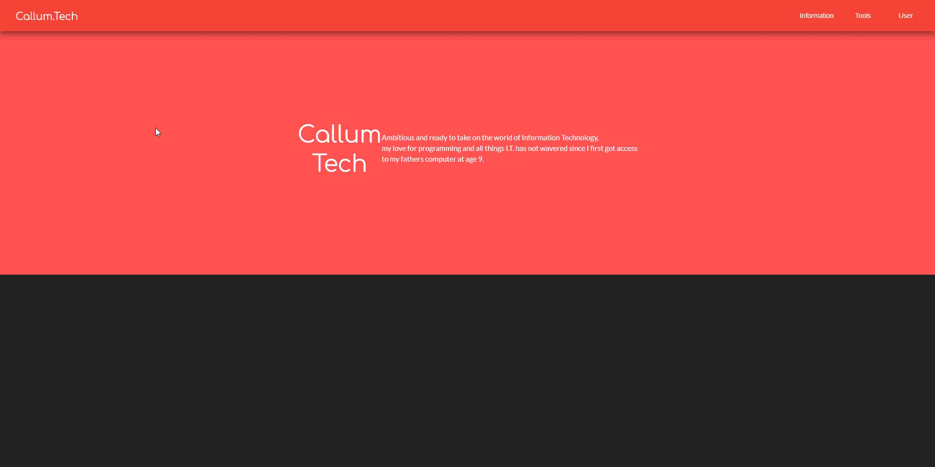
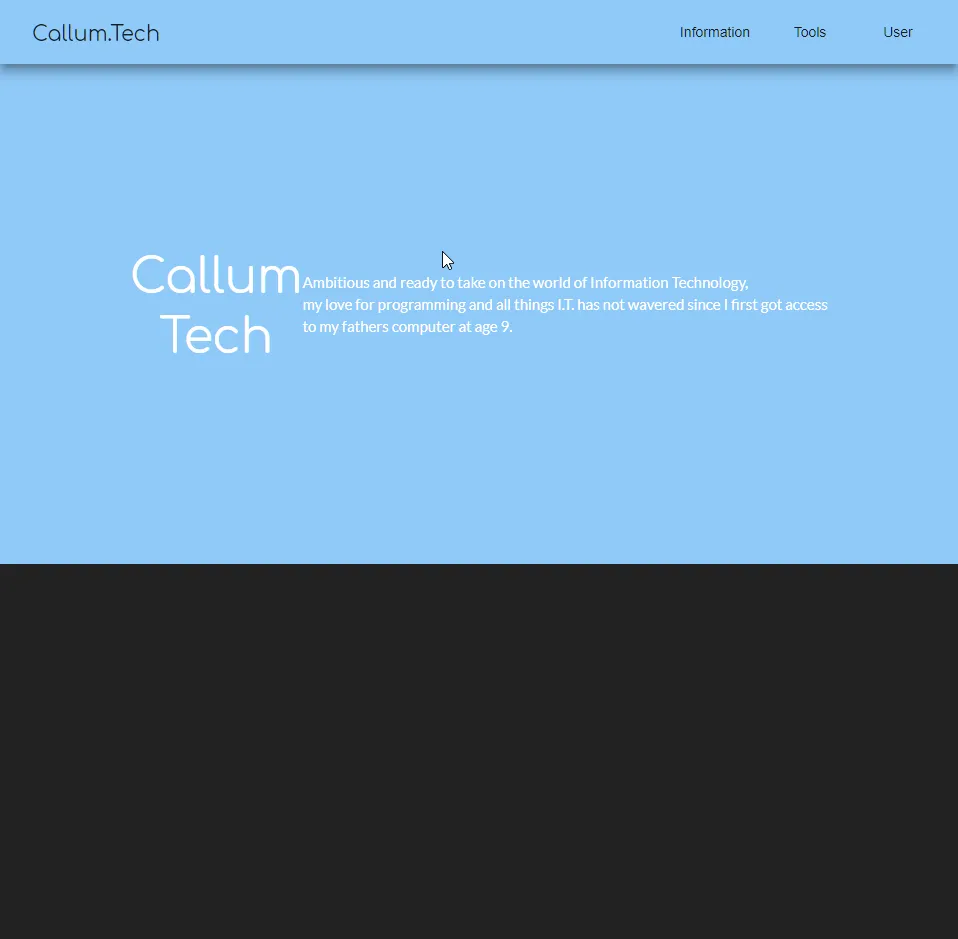
最后,我们现在可以在任何地方使用我们的主题颜色作为背景!例如,我可以通过将其类设置为相应的类名来为mat-grid-tile设置“primary”颜色(它不像其他元素(如mat-toolbar)那样采用color =''参数):
编辑:在每个组件的scss文件中,您需要import '<path-to>/theme.scss'以使主题应用于该组件。不要在styles.scss中导入theme.scss,因为这会创建一个导入循环!
<mat-grid-list cols="4" rows="4" rowHeight="100px">
  <mat-grid-tile
    colspan="4"
    rowspan="5"
  class="primaryColorBG">
    <div fxLayout="column" fxLayoutAlign="center center">
      <h1 class="title-font">Callum</h1>
      <h1 class="title-font">Tech</h1>
    </div>
    <p>
      Ambitious and ready to take on the world of Information Technology,<br>
      my love for programming and all things I.T. has not wavered since I first got access<br>
      to my fathers computer at age 9.
    </p>
  </mat-grid-tile>

</mat-grid-list>
最终我们的结果会是这样的!:
红色主题激活
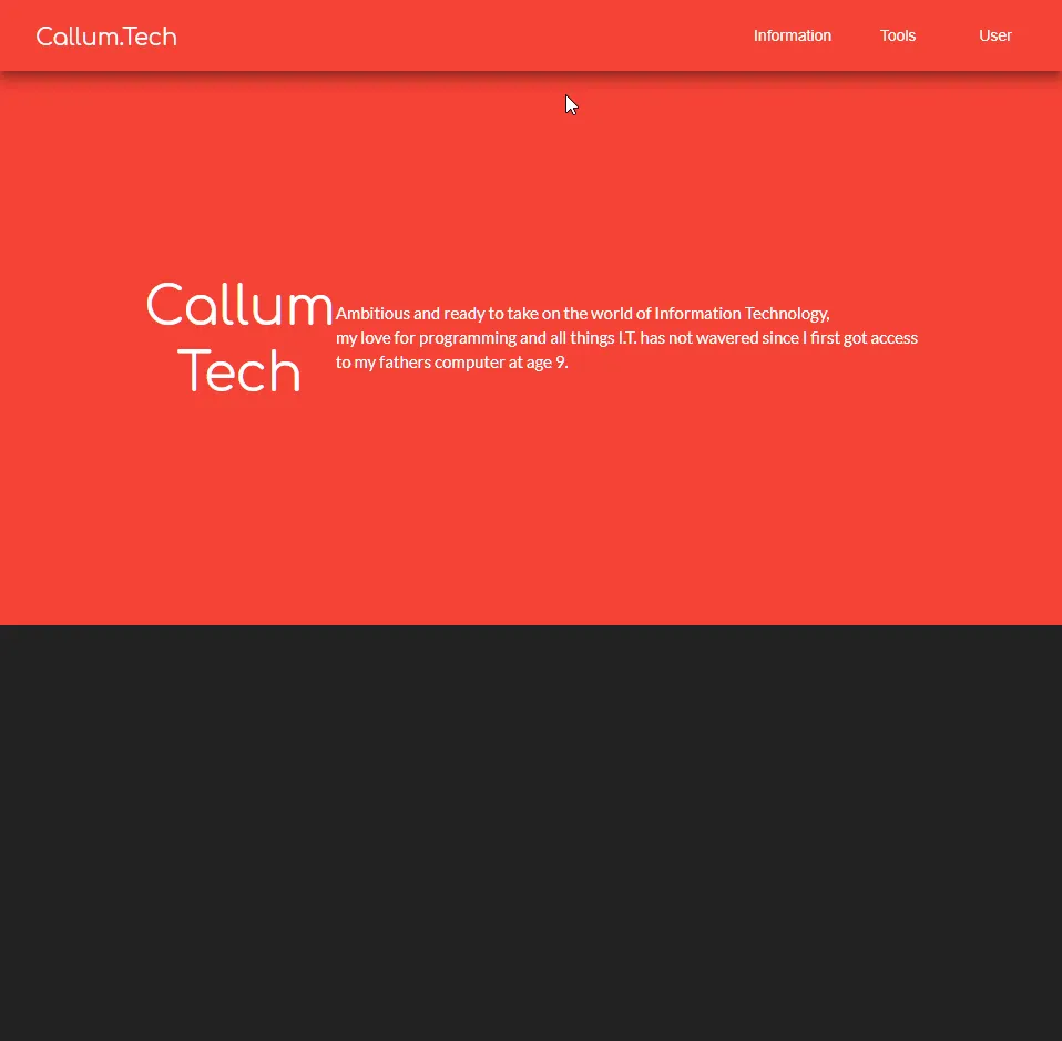
蓝色主题激活