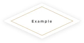
我想创作一种类似于以下图片的样式处理效果:
使用CSS变形:
您可以通过使用两个伪元素和CSS旋转变换来创建菱形,就像下面的代码片段中所示。这样会使文本不受变换影响,因此定位它将相对容易。
rotateZ(45deg) 产生一个具有等长边的菱形,而额外的 rotateX(45deg) 则负责拉伸外观,使边缘看起来长度不相等。
文本定位非常简单,只需将其居中对齐,然后将 line-height 设置为容器的 height 相同即可。请注意,此竖直居中方法仅适用于文本在单行中的情况。如果可以跨越多行,则应将其放在额外的元素中,并使用 translateY(-50%) 变换进行竖直居中。
.diamond {
  position: relative;
  height: 200px;
  width: 200px;
  line-height: 200px;
  text-align: center;
  margin: 10px 40px;
}
.diamond:before {
  position: absolute;
  content: '';
  top: 0px;
  left: 0px;
  height: 100%;
  width: 100%;
  transform: rotateX(45deg) rotateZ(45deg);
  box-shadow: 0px 0px 12px gray;
}
.diamond:after {
  position: absolute;
  top: 10px;
  left: 10px;
  content: '';
  height: calc(100% - 22px);  /* -22px is 2 * 10px gap on either side - 2px border on either side */
  width: calc(100% - 22px);  /* -22px is 2 * 10px gap on either side - 2px border on either side */
  border: 1px solid orange;
  transform: rotateX(45deg) rotateZ(45deg);
}<div class='diamond'>
Text Here
</div>使用 SVG:
可以使用 SVG 的 path 元素来创建相同的形状,而不是使用 CSS 变换。示例在下面的代码片段中可用。
.diamond {
  position: relative;
  height: 200px;
  width: 300px;
  line-height: 200px;
  text-align: center;
}
.diamond svg {
  position: absolute;
  top: 0px;
  left: 0px;
  height: 100%;
  width: 100%;
  z-index: -1;
}
path.outer {
  fill: white;
  stroke: transparent;
  -webkit-filter: url(#dropshadow);
  filter: url(#dropshadow);
}
path.inner {
  fill: transparent;
  stroke: orange;
}<div class='diamond'>
<svg viewBox='0 0 100 100' preserveAspectRatio='none'>
<filter id="dropshadow" height="125%">
<feGaussianBlur in="SourceAlpha" stdDeviation="1" />
<feOffset dx="0" dy="0" result="offsetblur" />
<feMerge>
<feMergeNode/>
<feMergeNode in="SourceGraphic" />
</feMerge>
</filter>
<path d='M2,50 50,2 98,50 50,98z' class='outer' />
<path d='M8,50 50,8 92,50 50,92z' class='inner' />
</svg>
Text Here
</div>
<!-- Filter Code Adopted from https://dev59.com/r2025IYBdhLWcg3wT0Hq -->body {
text-align: center;
padding-top: 30px;
}
.diamond {
width: 100px;
height: 100px;
position: relative;
margin-top: 25px;
display: inline-block;
}
.diamond:before {
position: absolute;
display: block;
content: "";
width: 100px;
height: 100px;
left: 0;
top: 0;
right: 0;
bottom: 0;
-webkit-transform: rotate(45deg);
-webkit-transition: border-color 0.3s;
-moz-transform: rotate(45deg);
-moz-transition: border-color 0.3s;
transform: rotate(45deg);
box-shadow: 0px 0px 21px -2px rgba(0, 0, 0, 0.25);
}
.diamond-inner {
width: 80px;
height: 80px;
position: relative;
margin-top: 25px;
display: inline-block;
}
.diamond-inner:before {
position: absolute;
display: block;
content: "";
width: 80px;
height: 80px;
left: 0;
top: -15px;
right: 0;
bottom: 0;
border: 1px solid #9C9819;
-webkit-transform: rotate(45deg);
-webkit-transition: border-color 0.3s;
-moz-transform: rotate(45deg);
-moz-transition: border-color 0.3s;
transform: rotate(45deg);
}<div class="diamond">
<div class="diamond-inner">
Test
</div>
</div>Also see: JSFiddle