神秘的底部填充/边距问题

4

我有一个类名为.features的主要div,该div内有两个盒子,每个盒子高度均设置为160px,但宽度不同。如下图所示,这两个盒子与主div之间存在神秘的填充:

enter image description here

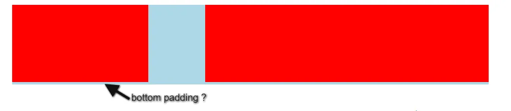
填充约为5像素 - 如果可能,我想删除此填充。我尝试将margin:0;和padding:0;添加到主div以及两个内部盒子中,但未成功。

以下是此页面部分的html代码:

<div class="features">
    <div class="list-items"></div>
    <div class="screenshot-box"></div>
</div>

css的作用:

 .features {
    width: 980px;
    margin: auto;
    margin-top: 25px;
    background-color: lightblue;
}

.list-items {
    width: 280px;
    height: 160px;
    display: inline-block;
    background-color: red;
}

.screenshot-box {
    width: 583px;
    height: 160px;
    float: right;
    padding-bottom: 0;
    display: inline-block;
    background-color: red;
}

你可以把你的代码放在Fiddle上吗? - Laxmikant Dange
3个回答

8

这实际上与 paddingmargin 无关。如果我们看一下计算样式示例,我们会发现元素本身的 height164px:

Example

这是因为您的内部元素设置为显示为 inline-block。这意味着它们受到 font-size 的影响,最终导致父元素的高度大于内部元素的高度。

有两种解决方法:

  1. 在您的 .features 元素上指定 font-size0,然后在内部元素中重置此值(通过为它们提供默认大小的 font-size,例如 16)。

.features {
  width: 980px;
  margin: auto;
  margin-top: 25px;
  background-color: lightblue;
  font-size: 0;
}

.list-items {
  width: 280px;
  height: 160px;
  display: inline-block;
  background-color: red;
  font-size: 16px;
}

.screenshot-box {
  width: 583px;
  height: 160px;
  float: right;
  padding-bottom: 0;
  display: inline-block;
  background-color: red;
  font-size: 16px;
}
<div class="features">
    <div class="list-items"></div>
    <div class="screenshot-box"></div>
</div>

  1. 将你的.features元素本身的height设置为160px,以匹配其子元素。这样浏览器就不必自己计算高度。

.features {
  width: 980px;
  margin: auto;
  margin-top: 25px;
  background-color: lightblue;
  height: 160px;
}

.list-items {
  width: 280px;
  height: 160px;
  display: inline-block;
  background-color: red;
}

.screenshot-box {
  width: 583px;
  height: 160px;
  float: right;
  padding-bottom: 0;
  display: inline-block;
  background-color: red;
}
<div class="features">
    <div class="list-items"></div>
    <div class="screenshot-box"></div>
</div>


谢谢James,我选择了字体大小的方法,因为当添加了新内容时,我希望父元素可以自动扩展。现在,我明白了那个填充为什么存在。每天都在学习,再次感谢! - Richard Rodgers

1

只需将.featuresfont-size设为0,它就会占满整个宽度。这里是你的fiddle。

.features {
  width: 980px;
  margin: auto;
  margin-top: 25px;
  background-color: lightblue;
  font-size: 0;
  /*Just make font size as 0*/
}
.list-items {
  width: 280px;
  height: 160px;
  display: inline-block;
  background-color: red;
}
.screenshot-box {
  width: 583px;
  height: 160px;
  float: right;
  padding-bottom: 0;
  display: inline-block;
  background-color: red;
}
<div class="features">
  <div class="list-items"></div>
  <div class="screenshot-box"></div>
</div>


0

你也可以放弃在两个子元素上使用display: inline-block,并在.list-items上设置float: left,在.features上设置display: table代码示例)。额外的好处是,没有硬编码的父级div高度,父级div将扩展以适应子内容。

@james donnelly已经给出了一个准确而简洁的解释。


1
我不太想采用这种方法,因为历史上不同的浏览器对表格显示元素的处理方式不同,并且浮动元素(既不是 table-row 也不是 table-cell)并不是真正意义上应该放置在其中的元素。更好的方式是在两个元素上使用 float 后清除浮动。 - James Donnelly

网页内容由stack overflow 提供, 点击上面的
可以查看英文原文,
原文链接