用CSS将屏幕分成两半

3
我一直在使用这个网站W3 Schools类似问题的Stack Overflow页面,将我的表格(在一个div中)与页面第二部分的另一个div并排显示。
我试图在屏幕上添加垂直分割线,但是右侧的内容会导致左侧下沉。左侧唯一的内容是通过PHP填充的表格,但我感觉这部分代码导致了对齐问题。
目前的情况如下图所示,但我希望能够在右侧div中添加内容而不会使左侧div下沉:
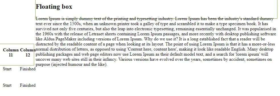
 enter image description here 代码:

.floating-box {
  display: inline-block;
  width: 45%;
  height: 75px;
  margin: 0px;
  border: 1px solid #73AD21;
}
<div class="floating-box">
  <table>
    <thead>
      <tr>
        <th>Column 1</th>
        <th>Column 2</th>
        <th>Column 3</th>
        <th>Column 4</th>
        <th>Column 5</th>
        <th>Column 6</th>
        <th>Column 7</th>
        <th>Column 8</th>
        <th>Column 9</th>
        <th>Column 10</th>
        <th>Column 11</th>
        <th>Column 12</th>
      </tr>
    </thead>
    <tbody>
      <?php foreach ($allArray  as $key => $value) { ?>

      <?php } ?>
    </tbody>
  </table>
</div>

<div class="floating-box">
  <h2>Floating box</h2>

</div>


垂直对齐:顶端; - Peter Featherstone
5个回答

3

添加vertical-align:top并将height更改为min-height以避免溢出问题:

.floating-box {
     display: inline-block;
     vertical-align:top;
     width: 45%;
     min-height: 75px;
     margin: 0px;
     border: 1px solid #73AD21;
}

2

您需要添加vertical-align:top;。

.floating-box {
    display: inline-block;
    width: 45%;
    height: 75px;
    margin: 0px;
    border: 1px solid #73AD21;
    vertical-align: top;
}

example here


2

添加

.floating-box table {
    word-break: break-all;
}

.floating-box {
     width: 45%;
     margin: 0px;
     border: 1px solid #73AD21;
     float: left;
}

.floating-box table {
    word-break: break-all;
}
<div class="floating-box">
<table>
    <thead>
    <tr>
        <th>Column 1</th>
        <th>Column 2</th>
        <th>Column 3</th>
        <th>Column 4</th>
        <th>Column 5</th>
        <th>Column 6</th>
        <th>Column 7</th>
        <th>Column 8</th>
        <th>Column 9</th>
        <th>Column 10</th>
        <th>Column 11</th>
        <th>Column 12</th>
    </tr>
    </thead>
    <tbody>
       <tr>
           <td>Lorem</td>
           <td>Lorem</td>
           <td>Lorem</td>
           <td>Lorem</td>
           <td>Lorem</td>
           <td>Lorem</td>
           <td>Lorem</td>
           <td>Lorem</td>
           <td>Lorem</td>
           <td>Lorem</td>
           <td>Lorem ipsum dolor sit amet, consetetur sadipscing elitr, sed diam nonumy eirmod tempor invidunt ut labore et dolore magna aliquyam erat, sed diam voluptua. At vero eos et accusam et justo duo dolores et ea rebum. Stet clita kasd gubergren, no sea takimata sanctus est Lorem ipsum dolor sit amet. Lorem ipsum dolor sit amet, consetetur sadipscing elitr, sed diam nonumy eirmod tempor invidunt ut labore et dolore magna aliquyam erat, sed diam voluptua. At vero eos et accusam et justo duo dolores et ea rebum. Stet clita kasd gubergren, no sea takimata sanctus est Lorem ipsum dolor sit amet.</td>
           <td>Lorem</td>
       </tr>
    </tbody>
</table>
</div>

<div class="floating-box">
     <h2>Floating box</h2>
     Lorem ipsum dolor sit amet, consetetur sadipscing elitr, sed diam nonumy eirmod tempor invidunt ut labore et dolore magna aliquyam erat, sed diam voluptua. At vero eos et accusam et justo duo dolores et ea rebum. Stet clita kasd gubergren, no sea takimata sanctus est Lorem ipsum dolor sit amet. Lorem ipsum dolor sit amet, consetetur sadipscing elitr, sed diam nonumy eirmod tempor invidunt ut labore et dolore magna aliquyam erat, sed diam voluptua. At vero eos et accusam et justo duo dolores et ea rebum. Stet clita kasd gubergren, no sea takimata sanctus est Lorem ipsum dolor sit amet.
</div>


2
CSS Grids是实现这一目标的好方法。
以下是一个示例:https://codepen.io/anon/pen/pWpgqp HTML:
<div class="screen">
  <div class="left-side">LEFT SIDE</div>
  <div class="right-side">RIGHT SIDE RIGHT SIDE RIGHT SIDE {...}</div>
</div>

CSS(层叠样式表):
html, body {
  margin: 0;
  padding: 0;
}

.screen {
  display: grid;
  grid-template-columns: 1fr 1fr;
  width: 100wh;
}

.left-side {
  grid-column: 1;
  border: 1px solid #000;
}

.right-side {
  grid-column: 2;
  border: 1px solid #000;
}
grid-template-columns: 1fr 1fr;将网格分成两半,因为两列占用相同的空间,即剩余可用空间的1个分数。
更多关于CSS Grids的信息,请参见MDNcss-tricks

1

我相信你所需要做的就是在你的 .floating-box 中添加 vertical-align: top;,但是没有一个演示链接很难确定,所以应该是这样的:

.floating-box {
     vertical-align: top;
     display: inline-block;
     width: 45%;
     height: 75px;
     margin: 0px;
     border: 1px solid #73AD21;
}

CSS规则基本上做了它所说的,将所有div垂直对齐到顶部。可以在MDN vertical-align CSS page上找到更多信息。我使用您上面的标记创建了一个CodePen示例,您可以在here中查看。

网页内容由stack overflow 提供, 点击上面的
可以查看英文原文,
原文链接