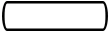
CSS的border-radius属性是否支持x和y轴不同的值?

7
假设我们有一个简单的
,它的宽度!=高度。
<div id="test"></div>

并且 CSS 看起来像:

#test {
    width: 200px;
    height: 50px;
    border-radius: 30%;
    border: 5px solid black;
}

enter image description here

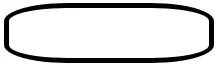
border-radius的百分比值会使较长的边更加圆润。这个以px为单位的值会让边框同样圆润:

#test{
    border-radius: 30px;
}

enter image description here

我的问题是,是否有一种方法(使用CSS)来操纵这个比例的像素(独立于改变div大小),并使div的较短边更弯曲?还是只能通过画布实现。

1
这应该会有所帮助:百分比(%)和像素(px)中的边框半径 - web-tiki
2个回答

5
写这个问题时,我找到了答案:CSS PIE支持 通过在值之间使用斜杠,可以实现这一点:
border-radius: 10px / 30px;

enter image description here


1

如果您希望所有圆角都看起来相同,可以在斜杠中间使用两个值,或者您可以为单个圆角使用选择器,并使用没有斜杠的两个值,以获得每个角独立的结果,例如border-top-left-radius: 45px 80px;

这里有三个示例(我添加了一个对称的示例,类似于您问题中的示例):

.x {
  width: 300px;
  height: 200px;
  border: 2px solid green;
  border-radius: 45px / 80px;
}
.y {
  width: 300px;
  height: 200px;
  margin-top: 30px;
  border: 2px solid red;
  border-top-left-radius: 45px 80px;
  border-top-right-radius: 125px 60px;
}
.z {
  width: 300px;
  height: 100px;
  margin-top: 30px;
  border: 2px solid blue;
  border-top-left-radius: 80px 65px;
  border-bottom-left-radius: 80px 65px;
  border-top-right-radius: 80px 65px;
  border-bottom-right-radius: 80px 65px;
}
<div class="x"></div>
<div class="y"></div>
<div class="z"></div>


网页内容由stack overflow 提供, 点击上面的
可以查看英文原文,
原文链接