Div的边框不对称

26
我想要将一个div斜倾,类似于以下链接所示的效果: Slant the top of a div using css without skewing text 或者这个链接的效果:http://tympanus.net/codrops/2011/12/21/slopy-elements-with-css3/
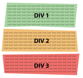
 这是我想做的事情的图片: funky bordered boxes 基本上,我需要以奇怪的方式倾斜所有4个边框。我可以使用背景图像来实现此目的,但我更喜欢使用CSS来处理,这样div可以适应宽度和高度的变化。我希望找到适用于旧浏览器的解决方案,但我知道我不能拥有一切!
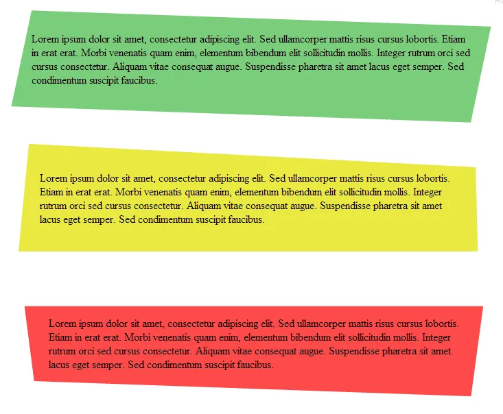
最佳方法是如何让所有4个边框都倾斜?(注意:绿色盒子底部的边框在中间向上倾斜,在外侧向下倾斜,我不需要边框做到这一点,只需倾斜即可。)

有趣的问题.. 我不知道是否应该使用 rotate 还是 skew - Josh Crozier
我对这个问题非常感兴趣 -- 很好的问题。 - Sterling Archer
你可以将 div 倾斜一定角度,然后将文本向相反的方向倾斜同样的角度。 - Paulie_D
@Paulie_D 只有在它们不是不规则的情况下才有效。我不想要平行四边形,而是一个不规则梯形。 - Michelle
相关:https://stackoverflow.com/q/52455594/8620333 - Temani Afif
2个回答

34

我能够制作出非常类似的东西...它适用于所有现代浏览器。

输入图像描述

HTML - 相当简单

div:nth-child(1) {
  background: rgb(122, 206, 122);
  height: 140px;
  transform: skew(-10deg) rotate(2deg);
  -webkit-transform: skew(-10deg) rotate(2deg);
  -moz-transform: skew(-10deg) rotate(2deg);
}

div:nth-child(1) p {
  transform: skew(10deg) rotate(-2deg);
  -webkit-transform: skew(10deg) rotate(-2deg);
  -moz-transform: skew(10deg) rotate(-2deg);
  padding: 3% 2%;
}

div:nth-child(2) {
  border-bottom: 180px solid rgb(233, 233, 65);
  border-left: 8px solid transparent;
  border-right: 14px solid transparent;
  height: 0;
  margin-top: 60px;
  transform: rotate(3deg);
  -webkit-transform: rotate(3deg);
  -moz-transform: rotate(3deg);
}

div:nth-child(2) p {
  transform: rotate(-3deg);
  -webkit-transform: rotate(-3deg);
  -moz-transform: rotate(-3deg);
  padding: 3.5% 3%;
}

div:nth-child(3) {
  border-top: 140px solid rgb(253, 74, 74);
  border-left: 23px solid transparent;
  border-right: 14px solid transparent;
  height: 0;
  margin-top: 20px;
  transform: rotate(2deg);
  -webkit-transform: rotate(2deg);
  -moz-transform: rotate(2deg);
}

div:nth-child(3) p {
  transform: rotate(-2deg);
  -webkit-transform: rotate(-2deg);
  -moz-transform: rotate(-2deg);
  position: absolute;
  top: -140px;
  padding: 3% 3%;
}

div:nth-child(3):before {
  content: '';
  width: 124%;
  height: 80px;
  background: white;
  position: absolute;
  left: -20%;
  bottom: 120px;
  transform: rotate(-2deg);
  -webkit-transform: rotate(-2deg);
  -moz-transform: rotate(-2deg);
}
<div>
  <p>text..</p>
</div>

<div>
  <p>text..</p>
</div>

<div>
  <p>text..</p>
</div>

全屏演示 ---- jsFiddle演示


2
这个效果非常不错。绿色的框架效果很好,但是黄色和红色在小尺寸下都有很多问题。就像这样:http://s16.postimg.org/42gvtkggl/Capture.png - Michelle

3
此外,您可以使用“clip-path”并设置所需的任何形状。 附注:JS仅用于每2秒进行一次转换。

var wrapper = document.querySelector(".wrapper");
var textBlock = document.querySelector(".text-block");

function gRI(max) { // getRandomInt
  return Math.floor(Math.random() * Math.floor(max));
}

setInterval(function(){

 // new color
  
  let newColor = "rgb(" + gRI(255) + "," + gRI(255) + "," + gRI(255) +")";
 
 wrapper.style["background-color"] = newColor;
  
  // new shape
  
  let newShape = 
  "polygon(" +
  gRI(40) + "px " + gRI(40) + "px, " + // top left
 gRI(40) + "px " + "calc(100% - " + gRI(40) + "px), " +  // top right
  "calc(100% - " + gRI(40) + "px) " + "calc(100% - " + gRI(40) + "px), " +
  "calc(100% - " + gRI(40) + "px) " + gRI(40) + "px " +
  ")";
  
  textBlock.innerHTML = "clip-path: " + newShape +
             " <br><br> background-color: " + newColor;
  
  wrapper.style["clip-path"] = newShape;
}, 2000)
.wrapper{
  box-sizing: border-box;

  width: 90%;
  min-width: 200px;
  
  margin: 25px auto;
  padding: 50px;
  
  background-color: lightgray;
  
  transition: 0.5s;
  
  clip-path: polygon( 25px 25px, 25px calc(100% - 25px), calc(100% - 25px) calc(100% - 25px), calc(100% - 25px) 25px );
}

.text-block{
  width: 100%;
}
<div class="wrapper">
  <div class="text-block">Changes every 2 seconds...</div>
</div>


网页内容由stack overflow 提供, 点击上面的
可以查看英文原文,
原文链接