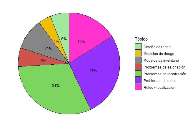
我有一些数据,想从中制作饼图。在数据中,有一个类别太少了,在图表上的标签看起来不太好。以下是我的代码和相应的图表。
library("readr")
library("fmsb")
library("car")
library("normtest")
library("nortest")
library("moments")
library("readxl")
library("ggplot2")
library("stats")
library("data.table")
library("dplyr")
library("plotly")

count.data <- data.frame(
  Tópico = c("Problemas de ruteo", "Diseño de redes ", "Ruteo y localización", "Modelos de inventario","Problemas de localización","Problemas de asignación","Medición de riesgo"),
  n = c(27,6,16,10,31,6,4),
  prop = c(27,6,16,10,31,6,4)
)
count.data

count.data <- count.data %>%
  arrange(desc(Tópico)) %>%
  mutate(lab.ypos = cumsum(prop) - 0.5*prop)
count.data

mycols <- c("#A1E89D", "#EFC000FF", "#868686FF", "#CD534CFF","#7AD55D","#9333FF","#FF33CE")

ggplot(count.data, aes(x = "", y = prop, fill =Tópico)) +
  geom_bar(width = 1.8, stat = "identity", color = "black") +
  coord_polar("y", start = 0)+
  geom_text(aes(y = lab.ypos, label = paste0(prop, "%")), color = "black",cex=3.5)+
  scale_fill_manual(values = mycols)+ theme(axis.text.x=element_blank())+theme_void()
情节是: