固定的背景覆盖在移动视图中变得放大

11

我在这里的网站上使用了固定背景封面:http://www.datisdesign.com

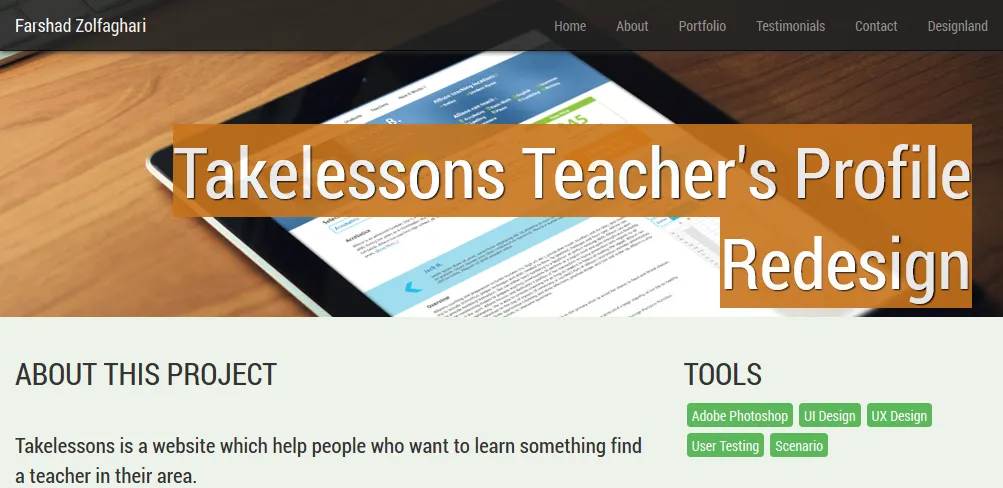
每个页面都有一个大的页眉图像,但在小设备(如移动设备)中,封面图像变得很大。我想在移动设备上将其缩小。

这是我正在使用的代码:

#takelessons {
    background: url(../img/portfolio/takelessons-intro.jpg) no-repeat;
    background-attachment: fixed;
    background-size: cover;
    background-position: center top;
}

普通视图

移动视图


尝试过使用background-size:contain或者background-size:auto吗? - Dev Man
4个回答

4

我通过限制能力来适应大型平板电脑屏幕大小解决了我的问题。

@media screen and (max-width: 992px) {
    #parallax {
        background-attachment: scroll;
    }
}

2

以下是需要添加到您的样式表中的内容...

background-size:100%;
width:100%;

我希望你能够受用。

这里不起作用,导致了多张图片而不是一张。谢谢! - dogonaroof

1
尝试一下这个。
background: url(image.format) no-repeat center center fixed; 
-webkit-background-size: cover;
-moz-background-size: cover;
-o-background-size: cover;
background-size: cover;

0

我发现如果在移动设备上使用background-size: coverbackground-attachment: fixed会导致这个问题。

将其从“fixed”更改为“scroll”可以解决此问题。

在我的情况下,我使用JavaScript实现视差效果,因此我能够更新方程以考虑不同的背景行为。


网页内容由stack overflow 提供, 点击上面的
可以查看英文原文,
原文链接