我有以下内容:jsfiddle.net
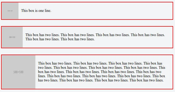
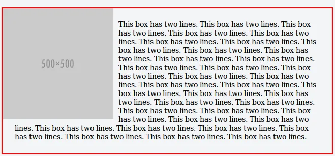
我想要的是让这张图片靠左浮动,填充父级元素(
最终效果应该是这样的: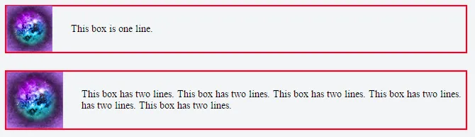 怎么做呢?
怎么做呢?
.box)。请注意,.box 的高度可能因为文本行数的不同而变化。最终效果应该是这样的:
怎么做呢?
.box {
  position: relative;
  display: block;
  width: 600px;
  padding: 24px;
  margin-bottom: 24px;
  border: 2px solid red;
}
.img {
  float: left;
}
.text {
  font-size: 14px;
}<div class="box">
<div class="img" style="background-image: url('https://pixabay.com/static/uploads/photo/2015/10/01/21/39/background-image-967820_960_720.jpg');"></div>
<div class="text">This box is one line.</div>
</div>
<div class="box">
<div class="img" style="background-image: url('https://pixabay.com/static/uploads/photo/2015/10/01/21/39/background-image-967820_960_720.jpg');"></div>
<div class="text">This box has two lines. This box has two lines. This box has two lines. This box has two lines. This box has two lines. This box has two lines.</div>
</div>