我有一个使用
这是否可行?
par(mfrow=c(2,2))绘制的四个图形的组合。我想为上方的两个图形绘制一个共同的标题,并且为下方面板中央的两个左右图形之间居中的两个图形绘制一个共同的标题。这是否可行?
这个应该可以工作,但您需要尝试调整line参数以使其完美:
par(mfrow = c(2, 2))
plot(iris$Petal.Length, iris$Petal.Width)
plot(iris$Sepal.Length, iris$Petal.Width)
plot(iris$Sepal.Width, iris$Petal.Width)
plot(iris$Sepal.Length, iris$Petal.Width)
mtext("My 'Title' in a strange place", side = 3, line = -21, outer = TRUE)
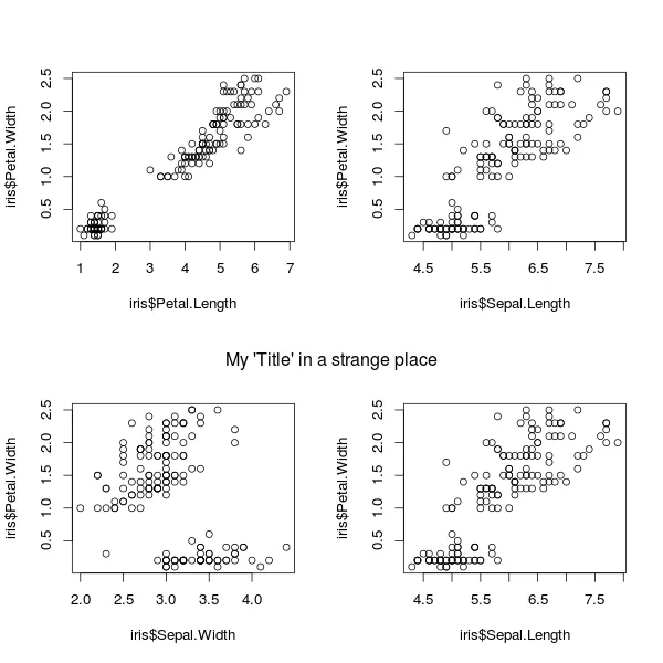
mtext 代表“边缘文本”。side = 3 表示将其放置在“顶部”边距中。line = -21 表示将其位置向上偏移 21 行。outer = TRUE 表示可以使用外边距区域。
要在顶部添加另一个“标题”,您可以使用 mtext("My 'Title' in a strange place", side = 3, line = -2, outer = TRUE) 进行添加。
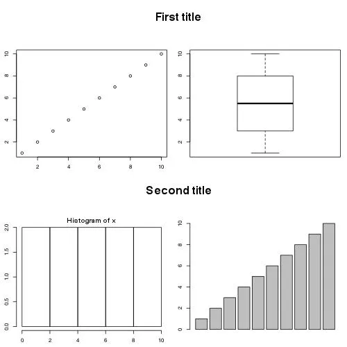
mtext可以使用负值。 - ECIIlayout来解决这个问题。 - A5C1D2H2I1M1N2O1R2T1你可以使用函数layout(),并设置两个绘图区域,这两个区域出现在两列中(请参见matrix()中重复的数字1和3)。然后我使用plot.new()和text()设置标题。您可以调整边距和高度以获得更好的表示。
x<-1:10
par(mar=c(2.5,2.5,1,1))
layout(matrix(c(1,2,3,4,1,5,3,6),ncol=2),heights=c(1,3,1,3))
plot.new()
text(0.5,0.5,"First title",cex=2,font=2)
plot(x)
plot.new()
text(0.5,0.5,"Second title",cex=2,font=2)
hist(x)
boxplot(x)
barplot(x)
使用与上述相同的参数,可以使用title(...)以加粗的方式完成相同的操作:
title("My 'Title' in a strange place", line = -21, outer = TRUE)
这里有另一种方法,使用这篇文章中的line2user函数。
par(mfrow = c(2, 2))
plot(runif(100))
plot(runif(100))
text(line2user(line=mean(par('mar')[c(2, 4)]), side=2),
     line2user(line=2, side=3), 'First title', xpd=NA, cex=2, font=2)

plot(runif(100))
plot(runif(100))
text(line2user(line=mean(par('mar')[c(2, 4)]), side=2),
     line2user(line=2, side=3), 'Second title', xpd=NA, cex=2, font=2)
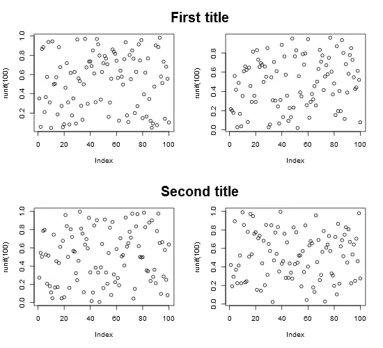
这里,标题位置比绘图的上边缘高了2行,由line2user(2, 3)指示。我们将它与第二个和第四个图形居中,偏移量为左右边距的平均值的一半,即mean(par('mar')[c(2, 4)])。
line2user表示相对于用户坐标轴的偏移量(行数),并定义为:
line2user <- function(line, side) {
  lh <- par('cin')[2] * par('cex') * par('lheight')
  x_off <- diff(grconvertX(0:1, 'inches', 'user'))
  y_off <- diff(grconvertY(0:1, 'inches', 'user'))
  switch(side,
         `1` = par('usr')[3] - line * y_off * lh,
         `2` = par('usr')[1] - line * x_off * lh,
         `3` = par('usr')[4] + line * y_off * lh,
         `4` = par('usr')[2] + line * x_off * lh,
         stop("side must be 1, 2, 3, or 4", call.=FALSE))
}
def.par <- par(no.readonly = TRUE) # save default, for resetting...

## divide the device into two rows and two columns
## allocate figure 1 all of row 1
## allocate figure 2 the intersection of column 2 and row 2
layout(matrix(c(1,1,0,2), 2, 2, byrow = TRUE))
## show the regions that have been allocated to each plot
layout.show(2)

## divide device into two rows and two columns
## allocate figure 1 and figure 2 as above
## respect relations between widths and heights
nf <- layout(matrix(c(1,1,0,2), 2, 2, byrow = TRUE), respect = TRUE)
layout.show(nf)

## create single figure which is 5cm square
nf <- layout(matrix(1), widths = lcm(5), heights = lcm(5))
layout.show(nf)


##-- Create a scatterplot with marginal histograms -----

x <- pmin(3, pmax(-3, stats::rnorm(50)))
y <- pmin(3, pmax(-3, stats::rnorm(50)))
xhist <- hist(x, breaks = seq(-3,3,0.5), plot = FALSE)
yhist <- hist(y, breaks = seq(-3,3,0.5), plot = FALSE)
top <- max(c(xhist$counts, yhist$counts))
xrange <- c(-3, 3)
yrange <- c(-3, 3)
nf <- layout(matrix(c(2,0,1,3),2,2,byrow = TRUE), c(3,1), c(1,3), TRUE)
layout.show(nf)

par(mar = c(3,3,1,1))
plot(x, y, xlim = xrange, ylim = yrange, xlab = "", ylab = "")
par(mar = c(0,3,1,1))
barplot(xhist$counts, axes = FALSE, ylim = c(0, top), space = 0)
par(mar = c(3,0,1,1))
barplot(yhist$counts, axes = FALSE, xlim = c(0, top), space = 0, horiz = TRUE)

par(def.par)  #- reset to default