CSS无限波纹动画

9

我想做无限波纹动画,但这样会变得不自然。

ripple

我不喜欢这个突然的变化,我想让动画一直持续下去。 我该怎么做呢?
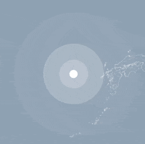
在代码片段中,由于某些原因,我无法很好地显示它,所以当前情况在 JSFiddle

body {font-size: 62.5%; background-color: #000;}

.ripple {
  margin: auto;
  margin-top: 10rem;
  background-color: #fff;
  width: 1rem;
  height: 1rem;
  border-radius: 50%;
  animation: ripple 2s linear infinite;
}
@keyframes ripple {
  0% {
    box-shadow: 0 0 0 .7rem rgba(255,255,255, 0.2),
                0 0 0 1.5rem rgba(255,255,255, 0.2),
                0 0 0 5rem rgba(255,255,255, 0.2);
  }
  100% {
    box-shadow: 0 0 0 1.5rem rgba(255,255,255, 0.2),
                0 0 0 4rem rgba(255,255,255, 0.2),
                0 0 0 8rem rgba(255,255,255, 0);
  }
}
<div class="ripple" style="animation-delay: 0s"></div>

顺便说一下,我也尝试使用 HTML 来做这个(▼),但是圆圈重叠了,我做得不好... :(
<div class="ripple" style="animation-delay: 0s"></div>
<div class="ripple" style="animation-delay: 1s"></div>
<div class="ripple" style="animation-delay: 2s"></div>
2个回答

13
如果你想让动画更加流畅,你需要将开始值与结束值匹配,这样就不会出现“跳跃”的效果。
类似这样:
@keyframes ripple {
  0% {
    box-shadow: 0 0 0 0rem rgba($ripple-color, 0.2),
                0 0 0 1rem rgba($ripple-color, 0.2),
                0 0 0 2rem rgba($ripple-color, 0.2),
                0 0 0 5rem rgba($ripple-color, 0.2);
  }
  100% {
    box-shadow: 0 0 0 1rem rgba($ripple-color, 0.2),
                0 0 0 2rem rgba($ripple-color, 0.2),
                0 0 0 5rem rgba($ripple-color, 0.2),
                0 0 0 8rem rgba($ripple-color, 0);
  }
}

12

这里有一个更简单的想法,可以产生平滑的效果。您可以将阴影动画保持简单,并考虑使用伪元素来实现延迟动画。诀窍是正确选择延迟/持续时间。

我将持续时间设为3秒(3个元素),每个元素之间有1秒的延迟。

body {
  background-color: #000;
}

.ripple {
  margin: auto;
  margin-top: 5rem;
  background-color: #fff;
  width: 1rem;
  height: 1rem;
  border-radius: 50%;
  display: grid;
  animation: ripple 3s linear infinite;
}

.ripple::before,
.ripple::after {
  content: "";
  grid-area: 1/1;
  border-radius: 50%;
  animation: inherit;
  animation-delay: 1s;
}

.ripple::after {
  animation-delay: 2s;
}

@keyframes ripple {
  0% {
    box-shadow: 0 0 0 .7rem rgba(255, 255, 255, 0.2);
  }
  100% {
    box-shadow: 0 0 0 8rem rgba(255, 255, 255, 0);
  }
}
<div class="ripple"></div>


网页内容由stack overflow 提供, 点击上面的
可以查看英文原文,
原文链接