CSS带有背景图片的三角形

13

尊敬的stackoverflow用户们,

我该如何创建一个带有背景图案的三角形元素?
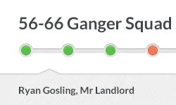
例如,我需要像这样的 div:

enter image description here

但我的状态是这样的:

enter image description here

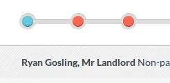
所有带三角形元素的示例都使用边框,而边框不能包含图片....

这是我的子节类,它需要带有 coolarrow:

<div class="subsection"><span>Ryan Gosling, Mr Landlord</span></div>

.subsection {
  .box-shadow (0, -1px, 1px, 0, rgba(0, 0, 0, 0.3));
  background: url('/assets/pattern-lorem.png'); // The inner part of the slider have the pattern
  display: block;
  clear: both;
  float: left;
  width: 100%;
  padding-top: 15px;
  padding-bottom: 15px;
  display: none;
}
.subsection {
    position:relative;
}
.subsection:before {
    content:'';
    position:absolute;
    top:0;
    left:0;
    height:20px;
    width:0;
    border-left:20px solid white;
    border-bottom:16px solid transparent;
}
.subsection:after {
    content:'';
    position:absolute;
    top:36px;
    left:0;
    bottom:0;
    width:0;
    border-left:20px solid white;
    border-top:16px solid transparent;
}

我遇到了这个问题:

在此输入图片描述

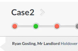
目前情况还好...但是我该如何将箭头移动到所需的位置?并覆盖cases div?谢谢。


我认为这个问题回答了一个类似的问题。https://dev59.com/6WXWa4cB1Zd3GeqPQ9lr?rq=1 - matthiasgh
不,这不是重复的......需要一个带有形状的图像,但是要有图像背景......而不是使用边框的颜色输入。 - SkyKOG
你是否考虑使用SVG而不是CSS来完成呢?这样可能更容易。 - Spudley
3个回答

4

如果您不关心跨浏览器兼容性,可以使用一个伪元素将其旋转45度并将样式附加到其中。您还需要的唯一一件事是将背景旋转(回)45度以附加到伪元素:

div.coolarrow:before {
    content: '';
    position: absolute;
    z-index: -1;
    top: -24.7px;
    left: 10px;
    background-color: #bada55;
    width: 50px;
    height: 50px;

    background: url(url/to/your/45deg/rotated/background.gif);

    box-shadow: inset 0 0 10px #000000;
    transform: rotate(45deg); 
}

这里有一个简短的示例(fiddle),用于说明(没有背景):
Fiddle

要处理除了90度箭头以外的其他情况,您需要额外倾斜矩形。但我不知道背景图像会发生什么...

谢谢...请看我的更新...我从你的想法中得到了一些启示... - SkyKOG

1
将图像作为div的背景,并只需为边距设置负值即可使其覆盖在栏上。示例(尽管是估计的,但我绝不声称这样可以工作)将是margin-left:-20px; margin-top:-20px; 并将其放在该行之后。
或者按照@Py的答案,您可以使用此CSS来制作箭头,并执行相同的负边距以使其对齐。
#triangle-up { width: 0; height: 0; border-left: 50px solid transparent; border-right: 50px solid transparent; border-bottom: 100px solid red; margin-left: -20px; margin-top: -20px; } 

1
要将其置于顶部,请在箭头div的CSS类中添加margin-top: -10px(更改10以查看适合您需求的值)。 - user2589557
现在没有箭头类了....使用伪元素before和after...我已经发布了整个CSS...你可以看一下...谢谢。 - SkyKOG
将margin-top: -10px添加到after只会增加箭头的侧面,而不是位置...它仍然在左边...不朝向顶部... - SkyKOG
我发布的代码将会生成一个向上的箭头。 - user2589557
是的,那个方法可以工作,但它不能接受一个图案,因为它使用的是纯色...有没有办法用图案替换那个红色?如果你能解决这个问题,你的解决方案将非常优雅 :)... - SkyKOG

1

网页内容由stack overflow 提供, 点击上面的
可以查看英文原文,
原文链接