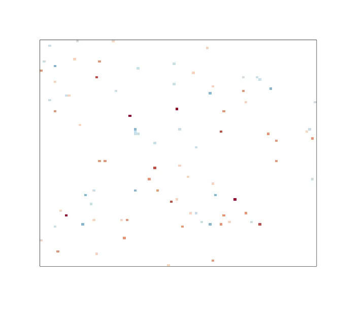
使用 RColorBrewer 将颜色以 0 为中心。

5
所以我想要像这样用颜色来可视化一个矩阵
library(RColorBrewer)
vec = rbinom(10000,1,0.1)
n = sum(vec)
vec = ifelse(vec == 1, rnorm(n), 0)
mat = matrix(vec,100,100)
image(t(mat)[,nrow(mat):1],
      col=brewer.pal(8,"RdBu"),
      xaxt= "n", yaxt= "n", frame.plot=T,
      useRaster = TRUE
)

这让我得到了这个图表

示例图表

但是我希望颜色“以0为中心”。我的意思是,我想让值为零的部分显示为白色,正/负值显示为红色/蓝色(或蓝色/红色不要紧)。有任何想法吗?

4个回答

2

gplots包中的bluered函数可以实现此功能。您可以制作自己的颜色调色板,如下所示:

library(gplots) # not to be confused with `ggplot2`, which is a very different package
color_palette <- bluered(9) # change the number to adjust how many shades of blue/red you have.  Even numbers will assign white to two bins in the middle.

为了让它们居中,你可以使用gplots中的heatmap.2函数,只是不要让它进行任何聚类:
heatmap.2(mat,
  Rowv = FALSE,
  Colv = FALSE, 
  dendrogram = 'none',
  trace = 'none',
  col = bluered, # this can take a function
  symbreaks = TRUE, # this is the key  value for symmetric breaks
)

如果你想使用image函数,你需要手动设置断点。以下代码可以帮助你实现:

pos_breaks <- quantile(abs(mat), probs = seq(0, 1, length.out = 5))
centered_breaks <- c(rev(-pos_breaks[-1]), pos_breaks)

太好了!它实际上可以在不使用breaks的情况下与图像函数一起工作。当我尝试使用breaks(以防将来需要)时,我会收到错误消息“Error in image.default(t(prec_temp)[, nrow(prec_temp):1], col = color_palette, : must have one more break than colour”。但是,如果我将颜色数量从9更改为8,则颜色就会偏离。 - Robin Lindström

2

以下是一种不需要任何额外软件包的解决方案。在您的代码中,您没有将vec变量的值分配给任何八个颜色箱之一。您需要将vec数组分割成八个箱,并将每个箱分配给一个颜色,然后绘制:

library(RColorBrewer)
vec = rbinom(10000,1,0.1)
n = sum(vec)
vec = ifelse(vec == 1, rnorm(n), 0)
mat = matrix(vec,100,100)

#cut the original data into 9 groups
cutcol<-cut(vec, 9)
#Create color palette with white as the center color
colorpal<-brewer.pal(8,"RdBu")
colorpal<-c(colorpal[1:4], "#FFFFFF", colorpal[5:8])

#assign the data to the 9 color groups
color<-colorpal[cutcol]
#create the color matrix to match the original data
colormat<-matrix(color,100,100)

#plot with the assigned colors
image(t(mat)[,nrow(mat):1],
      col=colormat,
      xaxt= "n", yaxt= "n", frame.plot=T,
      useRaster = TRUE
)

#check color assignment
#hist(vec)
#hist(as.numeric(cutcol), breaks=8)

enter image description here


谢谢!但是这样做并没有将0值变为白色,对吧? - Robin Lindström
请查看我上面的修改,需要将白色添加到调色板中。 - Dave2e

1

除了使用heatmap2之外,您还可以使用pheatmap

library(pheatmap)
pheatmap(mat,
         color = brewer.pal(7,"RdBu"),
         border_color = NA,
         cluster_rows = FALSE,
         cluster_cols = FALSE)

您也可以使用 legend = FALSE 隐藏图例,这将产生与您的图像调用类似的结果,但白色为0。

我不知道pheatmap可以做到这一点。谢谢! - Robin Lindström

1

这里提供了一种使用ggplot2包并进行手动缩放的解决方案(Ref

library(RColorBrewer)
library(ggplot2)
library(reshape2)

set.seed(2020)
vec <- rbinom(10000, 1, 0.1)
n <- sum(vec)
vec <- ifelse(vec == 1, rnorm(n), 0)
mat <- matrix(vec, 100, 100)

# convert to long format
df <- melt(mat)
summary(df)
#>       Var1             Var2            value          
#>  Min.   :  1.00   Min.   :  1.00   Min.   :-2.916137  
#>  1st Qu.: 25.75   1st Qu.: 25.75   1st Qu.: 0.000000  
#>  Median : 50.50   Median : 50.50   Median : 0.000000  
#>  Mean   : 50.50   Mean   : 50.50   Mean   : 0.000772  
#>  3rd Qu.: 75.25   3rd Qu.: 75.25   3rd Qu.: 0.000000  
#>  Max.   :100.00   Max.   :100.00   Max.   : 3.214787

### default
p1 <- ggplot(df, aes(x = Var1, y = Var2, fill = value)) +
  geom_raster() +
  theme_minimal(base_size = 16)

重新缩放
# set the limits of the palette so that zero is in the middle of the range.
limit <- max(abs(df$value)) * c(-1, 1)

p1 + 
  scale_fill_distiller(palette = 'RdBu', limit = limit)

# test with the scico package 
# https://github.com/thomasp85/scico
library(scico)
p1 + 
  scale_fill_scico(palette = "roma", limit = limit) 

# test with the rcartocolor package 
# https://github.com/Nowosad/rcartocolor
library(rcartocolor)
p1 + 
  scale_fill_carto_c(palette = 'Earth', limit = limit) 

2020年2月7日由reprex包 (v0.3.0)创建


网页内容由stack overflow 提供, 点击上面的
可以查看英文原文,
原文链接