我想在Android中为平板电脑和手机创建不同的布局。为了实现这种区分,我应该将布局资源放在哪里?
6个回答
176
我知道这是一个旧问题,但为了完整性起见... 根据文档,您应该创建多个资源文件夹,如下所示。
res/layout/main_activity.xml           # For handsets (smaller than 600dp available width)
res/layout-sw600dp/main_activity.xml   # For 7” tablets (600dp wide and bigger)
res/layout-sw720dp/main_activity.xml   # For 10” tablets (720dp wide and bigger)
- urSus
2
我需要为Nexus 9和Nexus 10设备创建哪些布局文件夹? - Dhaval Khant
尝试将Nexus 10的内容移动到sw800dp文件夹中。 Nexus 9将继续从sw768dp文件夹中获取其提示。 - Faisal Naseer
45
如果您在代码中使用片段概念(表示多窗格布局),则最好使用wdp而不是swdp。
res/layout-w600dp/main_activity.xml   # For 7” tablets (600dp wide and bigger)
res/layout-w720dp/main_activity.xml   # For 10” tablets (720dp wide and bigger)
res/layout-w600dp-land/main_activity.xml   # For 7” tablets in landscape (600dp wide and                  bigger)
res/layout-w720dp-land/main_activity.xml   # For 10” tablets in landscape (720dp wide and bigger)
参考表格以了解wdp
表2.屏幕尺寸的新配置限定符(引入于Android 3.2)。
在以下链接中查看
http://developer.android.com/guide/practices/screens_support.html
- Sakthimuthiah
23
我认为使用布局时,您只能通过以下方式进行区分:
res/layout/my_layout.xml            // layout for normal screen size
res/layout-small/my_layout.xml      // layout for small screen size
res/layout-large/my_layout.xml      // layout for large screen size
res/layout-large-land/my_layout.xml // layout for large screen size in landscape mode
你可以在这里了解更多信息,以区分不同的设置并添加到文件夹结构中。
最大的问题是Android SDK没有正式地将平板电脑纳入其中。希望这将在下一个Android版本中得到解决。否则,您只需要确保使用适用于任何屏幕尺寸的缩放布局。
- Bryan Denny
2
我认为问题不在于SDK。例如,手机屏幕尺寸为480x800 hdpi足以支持平板电脑布局。如果您的应用程序最适合平板电脑布局,则在这种情况下,用户无需拥有平板电脑即可享受其好处。因此,无需区分平板电脑/手机。您提供的链接完美解决了这个问题。谢谢。 - user942821
这个功能仅支持Android 3.2以下的版本。 - Lalit Sharma
6
根据文档,你应该创建多个资产文件夹,如下所示..完整列表...
res/layout/main_activity.xml  // For handsets (smaller than 600dp available width)
res/layout/main_activity.xml  // For handsets (smaller than 600dp available width)
res/layout-sw600dp/main_activity.xml  // For 7” tablets (600dp wide and bigger)
res/layout-sw720dp/main_activity.xml  // For 10” tablets (720dp wide and bigger)
res/layout-sw600dp-land/main_activity.xml  // For 7” tablets in landscape (600dp wide and bigger)
res/layout-sw720dp-land/main_activity.xml  // For 10” tablets in landscape (720dp wide and bigger)
- jaigish
2
Android Studio中的“预览方向”下拉菜单(如下图所示)可以帮助生成快速的横向和平板电脑布局xml。它还会创建单独的文件夹,即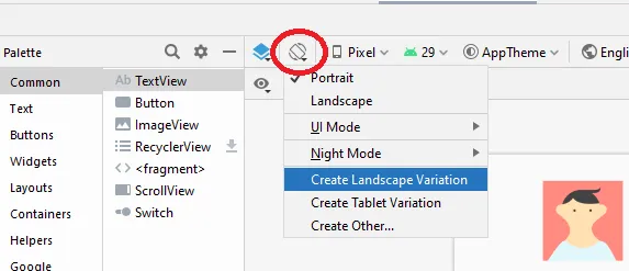
layout-land和layout-sw600dp,用于这些布局变化,并将布局xml放置在这些文件夹中。
- Nafeez Quraishi
0
这个资源还提供了如何根据设备配置调用任何资源的方法,比如:语言、屏幕宽度/高度、布局方向、屏幕方向等等。
你需要小心地将默认资源设置为所提到的源,比如为平板电脑调用高质量的图标。
- Mohammed AlBanna
网页内容由stack overflow 提供, 点击上面的可以查看英文原文,
原文链接
原文链接