R ggplot2图例边框问题

4

我知道这很微小,但这是为了一份出版物,会让我疯掉。P0688框的底部比其他地方细1-2个像素。我不想把边框加粗,因为那样就不符合其余条形图的风格。

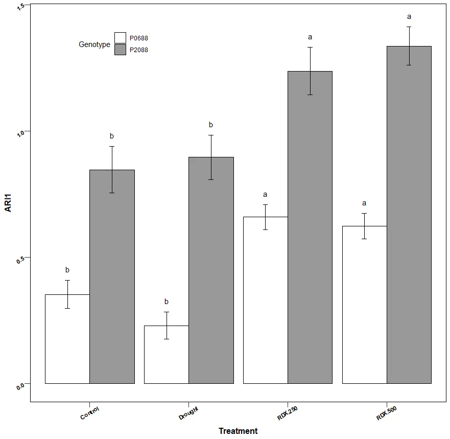
  plot<- ggplot(tukey_letters, aes(x = variable, y = value.x, 
        fill = L1)) + 
      theme(panel.background=element_rect(fill="#ffffff", color 
      ="#000000"), panel.grid.major=element_blank(), 
    panel.grid.minor=element_blank()) +
      geom_bar(stat = "identity", position=position_dodge(),color="black")+ scale_fill_manual(values=c("#FFFFFF", "#999999"))+ guides(fill=guide_legend(title="Genotype", title.position = "left")) +
  geom_errorbar(aes(ymin=value.x-se, ymax=value.x+se), width=.1,size=.5,position=position_dodge(0.9), color="black")+
  theme(
    axis.title = element_text(size =12, face="bold"),
    axis.text = element_text(angle=30, vjust=0.5,hjust=0.6,size=8,face="bold", color="#000000"),
    axis.ticks = element_line(size = rel(1)),
    axis.ticks.length = unit(0.3, "cm"),
    legend.position = c(0.2, 0.9)
  )+
  labs(
    x="Treatment",
    y="ARI1"
  )+
  #facet_wrap(~L1)+ ## You can use face_wrap function only if you need it+
  geom_text(data =tukey_letters,
            aes(x=xpos, y=ymax+offset_asterisk,label=groups), 
           size = 4,position=position_dodge(0.9) , vjust=-0.5
 )

P0688盒子底部

在较小的尺寸下甚至都不太明显。但仍然困扰我。

提前致谢。如果需要其他帮助,请告诉我。


1
你可能想查看这个问题:https://dev59.com/Wmgu5IYBdhLWcg3wYWFX。请查看u/Tung的答案(目前排在首位)。对于垂直填充图例(如您所拥有的),仍然存在小间距差异的问题(这也让我感到困扰 - 完全理解)。请参考此问题以获取更多信息:https://github.com/tidyverse/ggplot2/issues/2844。 - chemdork123
是的,我看到了。也许我实现时有些不正确,因为legend.spacing.y没有改变白色和灰色框之间的距离。 - Paul Manley
是的 - 在我找到那篇帖子和特定情况(垂直图例与填充一起使用时有点问题)之前,我调整了大约10分钟。 :/ 你能换成水平的吗? :) - chemdork123
1个回答

0

这是由于图例键的填充行为所致。这是一个已知的问题,请参见此 GitHub 线程 https://github.com/tidyverse/ggplot2/issues/2844。此网站上也提供了一种修复方法,让我在这里展示一下。

library(tidyverse)

ggplot(mtcars) +
  aes(fill=factor(cyl), x=cyl) +
  geom_bar(color = 'black') +
  guides(fill=guide_legend(title.position = "left")) +
  theme(legend.key = element_rect(color="white") +
        legend.position = c(0.2, 0.7))

放大后,图例现在看起来像这样: {{link1:输入图像描述}}

现在让我们进行修复。

  draw_key_polygon3 <- function(data, params, size) {
  lwd <- min(data$size, min(size) / 4)

  grid::rectGrob(
    width = grid::unit(0.7, "npc"),
    height = grid::unit(0.7, "npc"),
    gp = grid::gpar(
      col = data$colour,
      fill = alpha(data$fill, data$alpha),
      lty = data$linetype,
      lwd = lwd * .pt,
      linejoin = "mitre"
    ))
}

GeomBar$draw_key = draw_key_polygon3

ggplot(mtcars) +
  aes(fill=factor(cyl), x=cyl) +
  geom_bar(color = 'black') +
  guides(fill=guide_legend(title.position = "left")) +
  theme(legend.key = element_rect(color="white", fill = 'white'),
        legend.position = c(0.2, 0.7))

enter image description here

但是这里实际上发生了什么?让我们看看!

ggplot(mtcars) +
  aes(fill=factor(cyl), x=cyl) +
  geom_bar(color = 'black') +
  guides(fill=guide_legend(title.position = "left")) +
  theme(legend.position = c(0.2, 0.7),
        legend.key = element_rect(color="black", fill = 'white')) 

图例有两个边框!一个是图例符号的边框,另一个是键的边框。您可以使用调用theme来绘制键的边框,而围绕图例符号的边框则是通过geom_bar中的颜色参数创建的。

enter image description here

2020年04月04日使用reprex package (v0.3.0)创建


网页内容由stack overflow 提供, 点击上面的
可以查看英文原文,
原文链接