我知道在iPhone的Safari浏览器上,您可以通过监听onorientationchange事件并查询window.orientation角度来检测屏幕方向和方向变化。
这在Android手机浏览器中是否也可行?
明确一下,我想问的是是否可以通过运行在标准网页上的JavaScript来检测Android设备的旋转。在iPhone上是可能的,我想知道是否也适用于Android手机。
我知道在iPhone的Safari浏览器上,您可以通过监听onorientationchange事件并查询window.orientation角度来检测屏幕方向和方向变化。
这在Android手机浏览器中是否也可行?
明确一下,我想问的是是否可以通过运行在标准网页上的JavaScript来检测Android设备的旋转。在iPhone上是可能的,我想知道是否也适用于Android手机。
var previousOrientation = window.orientation;
var checkOrientation = function(){
    if(window.orientation !== previousOrientation){
        previousOrientation = window.orientation;
        // orientation changed, do your magic here
    }
};

window.addEventListener("resize", checkOrientation, false);
window.addEventListener("orientationchange", checkOrientation, false);

// (optional) Android doesn't always fire orientationChange on 180 degree turns
setInterval(checkOrientation, 2000);
要在安卓浏览器上检测方向变化,请将监听器附加到window的orientationchange或resize事件:
// Detect whether device supports orientationchange event, otherwise fall back to
// the resize event.
var supportsOrientationChange = "onorientationchange" in window,
    orientationEvent = supportsOrientationChange ? "orientationchange" : "resize";

window.addEventListener(orientationEvent, function() {
    alert('HOLY ROTATING SCREENS BATMAN:' + window.orientation + " " + screen.width);
}, false);
检查window.orientation属性以确定设备的方向。对于Android手机,screen.width或screen.height在设备旋转时也会更新(但iPhone不会)。
如果你只关心窗口尺寸(典型情况),而不关心具体方向:
resize事件。window.innerWidth和window.InnerHeight。window.orientation - 在iOS上它不会是当前值。如果你关心具体方向:
resize事件,在iOS上仅处理orientationchange事件。window.orientation(以及window.innerWidth和window.InnerHeight)。这些方法相对于记住先前的方向并进行比较有轻微的优势:
window.orientation)。您可以始终侦听窗口调整大小事件。如果在该事件上,窗口从比宽度更高的状态变为比高度更宽的状态(反之亦然),那么您可以非常确定手机方向刚刚发生了更改。
这在HTML5中是可行的。
您可以在此处阅读更多信息(并尝试实时演示):http://slides.html5rocks.com/#slide-orientation。
window.addEventListener('deviceorientation', function(event) {
    var a = event.alpha;
    var b = event.beta;
    var g = event.gamma;
}, false);
我遇到了同样的问题。我正在使用Phonegap和Jquery Mobile来开发Android设备上的应用程序。 为了正确调整大小,我不得不设置一个超时:
$(window).bind('orientationchange',function(e) {
  fixOrientation();
});

$(window).bind('resize',function(e) {
  fixOrientation();
});

function fixOrientation() {

    setTimeout(function() {

        var windowWidth = window.innerWidth;

        $('div[data-role="page"]').width(windowWidth);
        $('div[data-role="header"]').width(windowWidth);
        $('div[data-role="content"]').width(windowWidth-30);
        $('div[data-role="footer"]').width(windowWidth);

    },500);
}
以下是解决方案:
var isMobile = {
    Android: function() {
        return /Android/i.test(navigator.userAgent);
    },
    iOS: function() {
        return /iPhone|iPad|iPod/i.test(navigator.userAgent);
    }
};
if(isMobile.Android())
    {
        var previousWidth=$(window).width();
        $(window).on({
        resize: function(e) {
        var YourFunction=(function(){

            var screenWidth=$(window).width();
            if(previousWidth!=screenWidth)
            {
                previousWidth=screenWidth;
                alert("oreientation changed");
            }

        })();

        }
    });

    }
    else//mainly for ios
    {
        $(window).on({
            orientationchange: function(e) {
               alert("orientation changed");
            }
        });
    }
 var screenWidth = $(window).width();
 var screenHeight = $(window).height();
 if(screenWidth > screenHeight) { doSomething(); }
- math0ne您可以尝试这个解决方案,它与所有浏览器兼容。
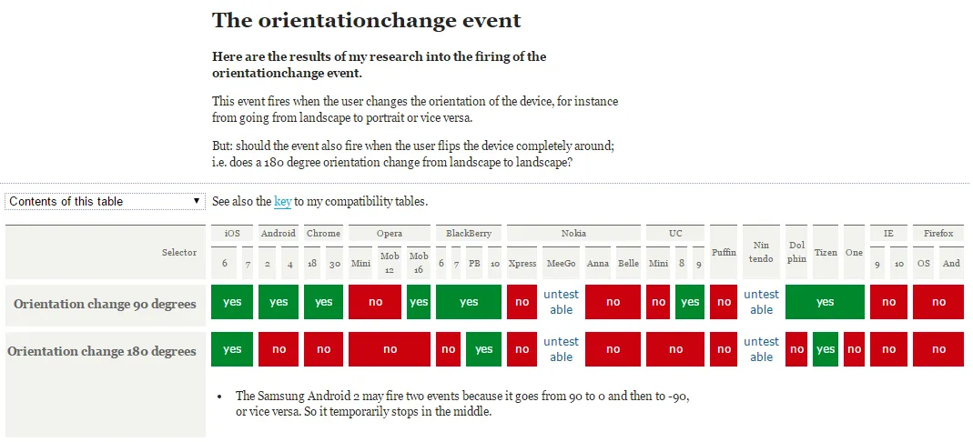
以下是 orientationchange 兼容性图片:
 因此,我编写了一个
 orientaionchange polyfill,它基于 @media 属性修复了 orientationchange 实用程序库——orientationchange-fix
window.addEventListener('orientationchange', function(){
 if(window.neworientation.current === 'portrait|landscape'){
    // do something……
 } else {
    // do something……
 }
}, false);
webView.setWebChromeClient(new WebChromeClient());
previousOrientation应该用当前方向进行初始化:var previousOrientation = window.orientation;如果您想忽略 180 度旋转,即您不需要区分左右横屏和上下颠倒或非颠倒变体,请将以下内容添加为checkOrientation()的第一行:if (0 === (previousOrientation + window.orientation) % 180) return;然而,如果没有额外的setTimeout技巧,您只能在 iOS 上受益,因为迅速的 180 度旋转只会创建一个orientationchange事件。 - mklement0