我试图在屏幕缩小到狭窄宽度时自定义Bootstrap的汉堡按钮。
Codepen: http://codepen.io/Chiz/pen/epWLjY
网站: http://oneniceday.com/SR-1/SR-3.html(将浏览器宽度调整为768px或以下)
截图: 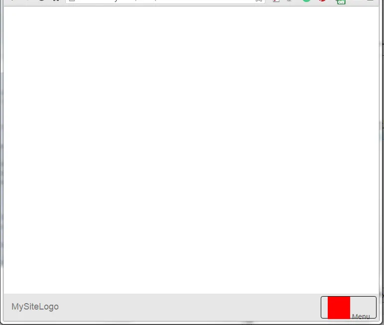
我想要“菜单”文本在容器中垂直居中,但是无论使用什么垂直居中技术都无法实现。目前,该文本对齐到按钮容器的底部。
这是代码:
$(document).ready(function() {
  $('.tab-menu li').each(function() {
    var ord = $(this).index() + 1;
    var width = $(this).width();

    $(this).click(function() {
      var width = $(this).width();
      var nextWidth = 0;
      $(this).prevAll().each(function() {
        nextWidth += $(this).width();
      });

      var widthtes = nextWidth;
      iterateLi(ord, widthtes, width);

      if ($(this).hasClass('active')) {
        //do nothing
      } else {
        //remove all active classes
        $(this).closest('ul').find('li').removeClass('active');
        //add active class to selected li
        $(this).addClass('active');
      }
    });
  });
});

// Calculating position
$('.tab-menu li:first-child').append('<span class="indicator"></span>');

$("head").append('<style class="tabs"></style>');

function iterateLi(ord, widthtes, width) {
  $('head style.tabs').append("li:first-child .indicator { -webkit-transform: translate3d(" + widthtes + "px,0,0); transform: translate3d(" + widthtes + "px,0,0); width: " + width + "px}");
}


/* fix for the indicator tab which is 1px short */
var nNum = $(".navbar ul li .indicator").height();
nNum += 14;
$(".navbar ul li .indicator").height(nNum);

$("button.navbar-toggle").width("100px").height("45px");
.navbar {
background-color: rgba(230, 230, 230, 1.00);
}
.navbar-default .navbar-nav > li.active a,
.navbar-default .navbar-nav > .active,
.navbar-default .navbar-nav > .active > a,
.navbar-default .navbar-nav > .active > a:link,
.navbar-default .navbar-nav > .active > a:visited,
.navbar-default .navbar-nav > .active > a:hover,
.navbar-default .navbar-nav > .active > a:focus {
background-color: transparent;
color: white;
}
.navbar ul {
list-style: none;
display: inline-block;
padding: 0;
background-color: rgba(230, 230, 230, 1.00);
}
.navbar ul li {
display: inline-block;
float: left;
position: relative;
margin-right: 0;
width: 150px;
text-align: center;
}
.navbar ul li a {
position: relative;
display: block;
color: #fff;
opacity: 1;
z-index: 10;
}
.navbar ul li a:hover,
.navbar ul li a:focus {
text-decoration: none;
color: #fff;
opacity: 1;
}
.navbar ul li.active a,
.navbar ul li.active a:hover,
.navbar ul li.active:focus {
opacity: 1;
color: #222;
}
.navbar ul li .indicator {
position: absolute;
bottom: 0px;
left: 0;
width: 100%;
height: 100%;
/* consider using SASS to add 1px here */
background-color: rgba(132, 132, 132, 1.00);
border-top-left-radius: 8px;
border-top-right-radius: 8px;
content: '';
-webkit-transition: -webkit-transform 100s;
transition: transform 350ms;
}
.navbar-toggle {
border: 1px solid black !important;
padding: 0 5px;
position: relative;
margin: 4px;
/* CENTER THE "MENU" text in the hamburger menu button */
height: 45px !important;
line-height: 45px !important;
}
.bgtest {
display: inline-block;
width: 45px;
height: 45px;
background-color: red;
}<link rel="stylesheet" href="https://maxcdn.bootstrapcdn.com/bootstrap/3.3.5/css/bootstrap.min.css" />
<script type="text/javascript" src="https://ajax.googleapis.com/ajax/libs/jquery/2.1.4/jquery.min.js"></script>
<script type="text/javascript" src="https://maxcdn.bootstrapcdn.com/bootstrap/3.3.5/js/bootstrap.min.js"></script>
<nav class="navbar navbar-default navbar-fixed-bottom">
<div class="container-fluid">
<div class="navbar-header">
<a class="navbar-brand" href="#">MySiteLogo</a>
<button type="button" class="navbar-toggle" data-toggle="collapse" data-target="#myNavbar">
<span class="bgtest"></span>
Menu
</button>
</div>
<div class="collapse navbar-collapse" id="myNavbar">
<ul class="nav navbar-nav navbar-right tab-menu">
<li class="active"><a href="#" data-toggle="tab">Me</a>
</li>
<li><a href="#" data-toggle="tab">Web</a>
</li>
<li><a href="#" data-toggle="tab">Print</a>
</li>
<li><a href="#" data-toggle="tab">Art / 3D</a>
</li>
</ul>
</div>
</div>
</nav>
navbar定义了自定义样式,所以很难修改整个设置以像 Bootstrap 可折叠菜单一样运行。不过你可以尝试使用一些 @media 查询。 - Guruprasad J Raojquery中有很多选项可以做到这一点。你只需要谷歌一下就可以找到很多了。 :) - Guruprasad J Rao