如何将两个使用SVG遮罩的图像对齐在同一行上

3

我有一个svg遮罩,在Chrome上它可以完美地作用于任何图像,但它不允许我对齐两个图像。当我对齐两个图像并应用这个遮罩时,只有1个图像显示出来,而且当我在图像前写文本时,文本会遮盖图像。

这是我的svg代码:

<svg width="0" height="0">
    <defs>
        <clipPath id="shape">
            <path transform="translate(0.000000,163.000000) scale(0.100000,-0.100000)" d="M373 1197 c-355 -355 -363 -363 -363 -402 0 -39 8 -47 363 -402 355
-355 363 -363 402 -363 39 0 47 8 402 363 355 355 363 363 363 402 0 39 -8 47
-363 402 -355 355 -363 363 -402 363 -39 0 -47 -8 -402 -363z" />
        </clipPath>
    </defs>
</svg>


<img class='photo_rectangle_inverse' src='http://i.imgur.com/NR6kefg.jpg' />

<img class='photo_rectangle_inverse' src='http://i.imgur.com/DXaH323.jpg' />

以下是我的CSS代码

.photo_rectangle_inverse {
    height:160px;
    width:170px;
    -webkit-clip-path: url(#shape);
    clip-path: url(#shape);
}

所以这个应该显示两张图片,但它只显示一张像这样

enter image description here

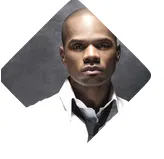
但它正常情况下应该在这两张图片上显示掩膜。

<img class='photo_rectangle_inverse' src='http://i.imgur.com/NR6kefg.jpg' />

    <img class='photo_rectangle_inverse' src='http://i.imgur.com/DXaH323.jpg' />

这里有一个 Jsfiddle

如何在同一行上显示并对齐这两个SVG遮罩图像? 谢谢

1个回答

2

您正在使用SVG的translate()功能来移动形状。这会导致该形状每次都不完全处于正确位置。

要解决此问题,您需要添加一段CSS来帮助确定位置,即-webkit-transform:translateZ(1px);

.photo_rectangle_inverse {
  height: 160px;
  width: 170px;
  -webkit-clip-path: url(#shape);
  clip-path: url(#shape);
  -webkit-transform: translateZ(1px)
}
<svg width="0" height="0">
  <defs>
    <clipPath id="shape">
      <path transform="translate(0.000000,163.000000) scale(0.100000,-0.100000)" d="M373 1197 c-355 -355 -363 -363 -363 -402 0 -39 8 -47 363 -402 355
-355 363 -363 402 -363 39 0 47 8 402 363 355 355 363 363 363 402 0 39 -8 47
-363 402 -355 355 -363 363 -402 363 -39 0 -47 -8 -402 -363z" />
    </clipPath>
  </defs>
</svg>


<img class='photo_rectangle_inverse' src='http://i.imgur.com/NR6kefg.jpg' />

<img class='photo_rectangle_inverse' src='http://i.imgur.com/DXaH323.jpg' />

我建议你检查一下SVG路径,因为形状非常简单,但是路径看起来过于复杂。我自己做了一个,结果几乎相同,但代码量要少得多。

* {
  padding: 0;
  margin: 0;
}
.photo_rectangle_inverse {
  height: 160px;
  width: 170px;
  -webkit-clip-path: url(#shape);
  clip-path: url(#shape);
  position: relative;
  -webkit-transform: translateZ(1px)
}
<svg width="0" height="0" viewBox="0 0 160 160">
  <defs>
    <clipPath id="shape">
      <path d="M10,70 Q0,80 10,90 L70,150 Q80,160 90,150 L150,90 Q160,80 150,70 L90,10 Q80,0 70,10z" />
    </clipPath>
  </defs>
</svg>


<img class='photo_rectangle_inverse' src='http://i.imgur.com/NR6kefg.jpg' />

<img class='photo_rectangle_inverse' src='http://i.imgur.com/DXaH323.jpg' />


哇,谢谢你。 - Man Of God

网页内容由stack overflow 提供, 点击上面的
可以查看英文原文,
原文链接