单元格
实现这个的一种方法是使span的位置绝对。请参见这个fiddle。
更改如下(高度和宽度仅用于演示):
CSS:
table
{
    position:relative;
}
td
{
    height:300px;
    width:300px;
    background-color:grey;
}
span
{
    top:5px;
    right:5px;
    position:absolute;
    height:100px;
    width:100px;
    background-color:red;
}
HTML:
<table>
   <td style="vertical-align: middle; font-size: 10px;">
      <span class="edit-icon glyphicon glyphicon-pencil"> </span>
      Content
   </td>
</table>
表格位置是相对的,因此这是 span 基于其绝对位置的位置。
多个单元格
现在,唯一的问题是当您有多个表格单元格时,它无法很好地工作,因为图像将始终使用表格作为偏移点。因此,您需要使位置相对于 td。但是,这并不简单。请参见
here 了解如何执行此操作。基本上,它涉及在 td 中放置另一个填充 td 的 div,然后将其用于位置。此外,您还要保留中心文本。请参见
here 以了解有关垂直居中的讨论。另一种方法是将表格单元格设置为 position 为 block。但是,如果您这样做,则会失去文本的垂直居中。一个好的解决方案是使用 transform(请注意支持的浏览器
mdn)。
这个实例展示了如何在多个表格单元中实现垂直居中。基本上:
td display:block 表示它可以作为相对点。.content 包裹需要垂直居中的文本。transform 将内容从 td 中心向上移动其高度的一半,使其处于中间位置。
CSS:
td
{
    position:relative;
    display:block;
    height:300px;
    width:300px;
    background-color:grey;
}

span
{
    position:absolute;
    top:5px;
    right:5px;
    height:100px;
    width:100px;
    background-color:red;
}

.content
{
    position:absolute;
    top:50%;
    -webkit-transform:translateY(-50%);
  transform:translateY(-50%);
}
HTML:
<table>
    <tr>
        <td style="font-size: 10px;">
                <span class="edit-icon glyphicon glyphicon-pencil"> </span>
            <div class="content">
                <p>Content</p>
                <p>More content</p>
                <p>Even more content</p>
                <p>So much more content</p>
            </div>
        </td>
    </tr>
</table>
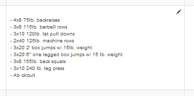
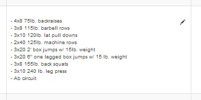 这是我想要的效果:
 非常感谢任何帮助解决这个 CSS 难题的方法!