将JSX元素呈现为多级金字塔

3
我需要创建一个金字塔图形,它分为4个级别,类似于以下内容:enter image description here 
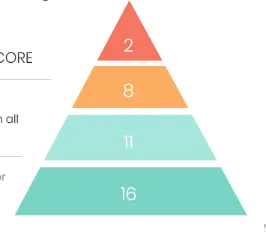
虽然我已经使用以下代码实现了相同的效果:

const PyramidChart = () => {
  return (
    <div className="d-flex flex-column align-items-center pyramid_wrap">
      <div className="category_one">
        <h6>2</h6>
      </div>
      <div className="category_two">
        <h6>8</h6>
      </div>
      <div className="category_three">
        <h6>11</h6>
      </div>
      <div className="category_four">
        <h6>16</h6>
      </div>
    </div>
  );
};

ReactDOM.render(
  <PyramidChart />,
  document.getElementById('root')
);
.pyramid_wrap {
  height: 100%;
  text-align: center;
}

.category_one {
  width: 70px;
  height: 30px;
  border-left: 35px solid transparent;
  border-right: 35px solid transparent;
  border-bottom: 50px solid tomato;
}

.category_two {
  width: 116px;
  height: 30px;
  border-left: 22px solid transparent;
  border-right: 22px solid transparent;
  border-bottom: 28px solid orange;
}

.category_three {
  width: 162px;
  height: 30px;
  border-left: 22px solid transparent;
  border-right: 22px solid transparent;
  border-bottom: 28px solid cyan;
}

.category_four {
  width: 208px;
  height: 30px;
  border-left: 22px solid transparent;
  border-right: 22px solid transparent;
  border-bottom: 28px solid teal;
}
<script src="https://cdnjs.cloudflare.com/ajax/libs/react/16.8.4/umd/react.production.min.js"></script>
<script src="https://cdnjs.cloudflare.com/ajax/libs/react-dom/16.8.4/umd/react-dom.production.min.js"></script>


<div id="root"></div>

得到了类似于这样的东西:

在此输入图片描述

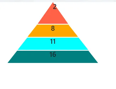
但我无法解决的问题是如何将顶级金字塔区域的文本对齐到中心。它总是与其所对齐的位置不同步。

欢迎提供任何有助于解决此问题的帮助 :)


你实际上可以使用<span>标签代替<h1>,然后对<span>标签应用CSS样式。此外,<span>是一个内联元素。 - Rohan Naik
如果你正在使用ReactJS,那么这怎么可能只是HTML和CSS呢? :) - Mr T
请参考以下链接:https://stackoverflow.com/a/56539403/8620333 - Temani Afif
@bubble-cord:为每个新层叠加单独的CSS设置可能会变得很繁琐,我更建议将这部分委托给React,并以更灵活的方式解决问题。 - Yevhen Horbunkov
2个回答

4

让我们尝试使用:before:after,并使用skew变换属性从CSS三角形移动。

我没有改变您的HTML,只需为您的<h6>添加一个.value类来进行样式设置。

基本上,您需要做的就是为每个<div>设置一个带有负度数角度的:before,并具有带有正度数角度的:after,并赋予它们相同的背景颜色,以进行匹配。

仅对于顶级的<div>,我使用了CSS三角形,因此您已经知道它的工作原理。

为了使值在水平和垂直方向上对齐,我在父元素上使用了flexbox,结合 justify-content: center; (水平对齐) 和 align-items: center; (垂直对齐)。不要忘记始终添加一个line-height: 1em;并删除要垂直对齐的元素的边距。如果line-height与其实际高度不相等,则始终会向上或向下几个像素。

.pyramid_wrap {
  margin-top: 200px;
  height: 100%;
  text-align: center;
}

.category_one,
.category_two,
.category_three,
.category_four {
  position: relative;
  margin: 6px auto;
  display: flex;
  justify-content: center;
  align-items: center;
}

.category_one:before,
.category_one:after,
.category_two:before,
.category_two:after,
.category_three:before,
.category_three:after,
.category_four:before,
.category_four:after {
  position: absolute;
  top: 0;
  display: block;
  width: 30px;
  height: 100%;
  content: "";
}

.category_one:before,
.category_two:before,
.category_three:before,
.category_four:before {
  left: -15px;
  transform: skew(-25deg);
}

.category_one:after,
.category_two:after,
.category_three:after,
.category_four:after {
  right: -15px;
  transform: skew(25deg);
}

.category_one {
    width: 20px;
    height: 40px;
    background: tomato;

}

.category_one:before,
.category_one:after {
  width: 30px;
  height: 40px;
  background: tomato;
}

.category_one:before {
  left: -16px;
  top: 0;
}
.category_one:after {
  right: -16px;
  top: 0;
}

.category_one .value:after {
  position: absolute;
  z-index: -1;
  top: -55px;
  left: 50%;
  transform: translateX(-50%);
  content: "";
  display: block;
  width: 0;
  height: 0;
  border-style: solid;
  border-width: 0 28px 70px 28px;
  border-color: transparent transparent tomato transparent;
}


.category_two {
    width: 70px;
    height: 40px;
    background: orange;
}

.category_two:before,
.category_two:after {
  width: 40px;
  background: orange;
}

.category_two:before {
  left: -12px;
}
.category_two:after {
  right: -12px;
}


.category_three {
  width: 120px;
  height: 40px;
  background: cyan;
}

.category_three:before,
.category_three:after {
  background: cyan;
}
.category_three:before {
  left: -9px;
}
.category_three:after {
  right: -9px;
}


.category_four {
    width: 150px;
    height: 40px;
    background: teal;
}

.category_four:before,
.category_four:after {
  background: teal;
}

.value {
  margin: 0;
  position: relative;
  z-index: 3;
  color: #fff;
  font-size: 16px;
  font-family: Arial, sans-serif;
  font-weight: normal;
  line-height: 1em;
}
 <div class="d-flex flex-column align-items-center pyramid_wrap">
        <div class="category_one">
            <h6 class="value">2</h6>
        </div>
        <div class="category_two">
          <h6 class="value">8</h6>
        </div>
        <div class="category_three">
          <h6 class="value">11</h6>
        </div>
        <div class="category_four">
          <h6 class="value">16</h6>
        </div>
      </div>


当我将例如.category_one,.category_two,.category_three,.category_four { /* ... */ }分组在一起时,这是因为它们共享相同的样式,并且该样式将应用于div本身。当我将例如.category_one:before,.category_two:before,.category_three:before,.category_four:before {transform: skew(-25deg);}分组在一起时,这是因为我知道所有左侧 (:before) 都将具有负度数角度。只是你不需要每次重复写 transform: skew(-25deg);。有关伪元素的更多信息,请阅读此处:https://www.w3schools.com/css/css_pseudo_elements.asp - Alessio
1
好的,我明白你为什么会感到困惑。我为你创建了一个Codepen:https://codepen.io/alezuc/pen/MWKmJNp?editors=1100,在这里你可以看到在.category_two中,元素本身是橙色的,before具有background: blue;和负斜率,after具有background: green;和正斜率。因此,before和after需要分别进行样式设置。无论如何,尝试始终按下键盘上的F12检查元素,这样您就可以可视化页面上所有元素及其样式。我希望已经解决了你的疑问,否则请告诉我! - Alessio
哦,好的。所以蓝色和绿色是伪元素提供的默认颜色,我们正在用我们选择的颜色覆盖它们。 - program_bumble_bee
1
好的,我会仔细阅读它们。感谢您提供如此详细的帮助 :) - program_bumble_bee
1
很高兴能帮忙!我的建议是学习如何使用伪元素,因为它们非常强大和灵活! - Alessio
显示剩余4条评论

3

其中一种可能的解决方案是在整个金字塔外包装器上使用CSS遮罩。目前它可能得不到很好的支持,但提供了一种用SVG路径(三角形)来塑造你的金字塔的真正方法:

enter image description here

为了不让遮罩缩小(隐藏上下层),您可能需要保留包装器的min-width(等于层数乘以层高 - 3em)。

为了避免层标签落在遮罩区域之外,您可能需要根据标签位置将遮罩居中(mask-position: center)。

实现这个概念的演示可能如下所示:

const { render } = ReactDOM,
      rootNode = document.getElementById('root')

const pyramidItems = [{label:'2', color: '#f47660'}, {label:'8', color:'#fcae60'}, {label:'11', color:'#a7e6db'}, {label:'16',color:'#79d4c5'}]

const Pyramid = ({items}) => (
  <div 
    className="wrapper"
    style={{minWidth:`${items.length}*3em`}}
  >
    {
      items.map(({label,color},key) => (
        <div 
          key={key}
          className="layer"
          style={{backgroundColor:color}}
        >
          {label}
        </div>
      ))
    }
  </div>
)

render (
  <Pyramid items={pyramidItems} />,
  rootNode
)
.wrapper {
  --triangle-shape: url("data:image/svg+xml;base64,PHN2ZyB2aWV3Qm94PSIwIDAgMTAwIDEwMCIgeG1sbnM9Imh0dHA6Ly93d3cudzMub3JnLzIwMDAvc3ZnIj48cGF0aCBkPSJNNTAsMCBMMTAwLDEwMCBMMCwxMDAgeiIvPjwvc3ZnPg==");
  -webkit-mask-image: var(--triangle-shape);
  -webkit-mask-repeat: no-repeat;
  -webkit-mask-position: center;
  mask-image: var(--triangle-shape);
  mask-repeat: no-repeat;
  mask-position: center;
  display: flex;
  flex-direction: column;
}

.layer {
  height: 3em;
  color: #fff;
  font-size: 15px;
  display: flex;
  justify-content: center;
  align-items: center;
  border: .2em solid #fff;
  margin: -.2em 0px;
}
<script src="https://cdnjs.cloudflare.com/ajax/libs/react/16.12.0/umd/react.production.min.js"></script><script src="https://cdnjs.cloudflare.com/ajax/libs/react-dom/16.11.0/umd/react-dom.production.min.js"></script><div id="root"></div>


这确实是一个非常动态的解决方案。非常感谢。但是我有一个疑问,当我尝试增加宽度时,似乎不起作用。而且顶层的提示没有指向性。你能帮忙解决这两个问题吗? - program_bumble_bee
如果您能帮我提供实际的SVG图像,那么可以吗? - program_bumble_bee
我愿意接受最适合的解决方案,因为每个解决方案都是对我的良好学习经验。在您发布问题后,我使用了它,因为它对我来说似乎更具动态可行性,因为我需要很快在其中呈现动态数据。 - program_bumble_bee
是的,我无法正确调整金字塔的宽度大小。 - program_bumble_bee
1
@bubble-cord:由于标签是居中的,为了保持它们可见(落在遮罩多边形内),您可以使用 mask-position: center 并保留包装器的 min-width,以防止您的遮罩形状缩小并隐藏金字塔的外层。请查看此修复 - Yevhen Horbunkov
显示剩余2条评论

网页内容由stack overflow 提供, 点击上面的
可以查看英文原文,
原文链接