如何在不同的屏幕尺寸下完美地放置图片?
.background-login {
  background: url(../img/login.png) no-repeat;
  background-size: 100%;
  z-index: -2;
  position: absolute;
  top: 8%;
  min-height: 400px;
  right: 2%;
  height: 100%;
}

.background-login-create {
  background: url(../img/login.png) no-repeat;
  background-size: 100%;
  z-index: -2;
  position: absolute;
  top: 17%;
  min-height: 400px;
  right: 2%;
  height: 100%;
}

.background-login-create-profile {
  background: url(../img/login.png) no-repeat;
  background-size: 100%;
  z-index: -2;
  position: absolute;
  top: 13%;
  min-height: 400px;
  right: 2%;
  height: 100%;
}

.sellfie-start-text {
  font-size: 15px;
  padding: 145px;
  text-align: center;
  font-weight: 200;
  position: relative;
  top: 8%;
  vertical-align: middle;
  color: #FFF;
}<link href="http://maxcdn.bootstrapcdn.com/bootstrap/3.3.7/css/bootstrap.min.css" rel="stylesheet"/>
<div class="container div-login">
<div class="row">
<div class="col-sm-5 col-md-offset-1">
<div class="center">
<h2 class="login-title"></h2>
<h4></h4>
<p class=""></p>
</div>
<div class="account-wall">
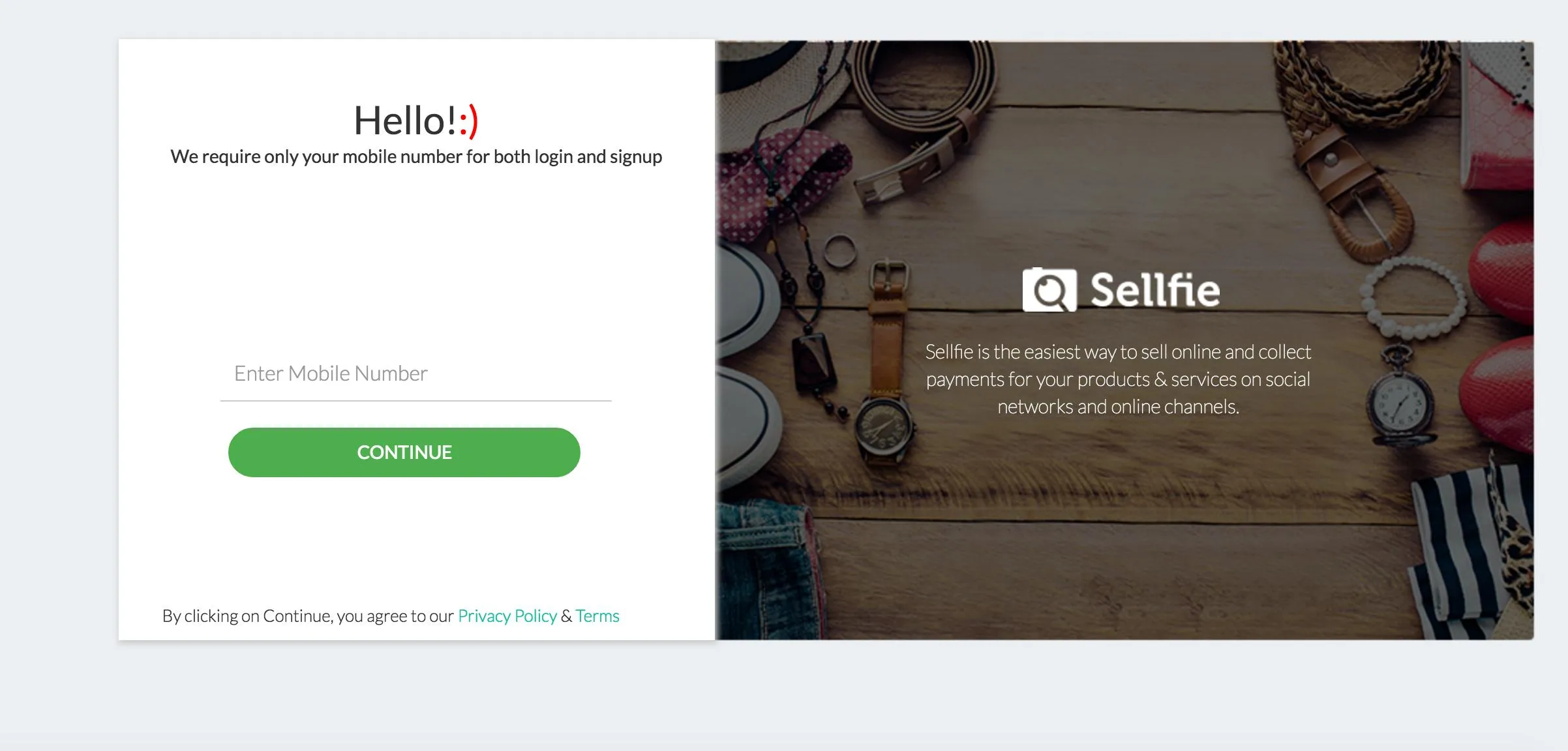
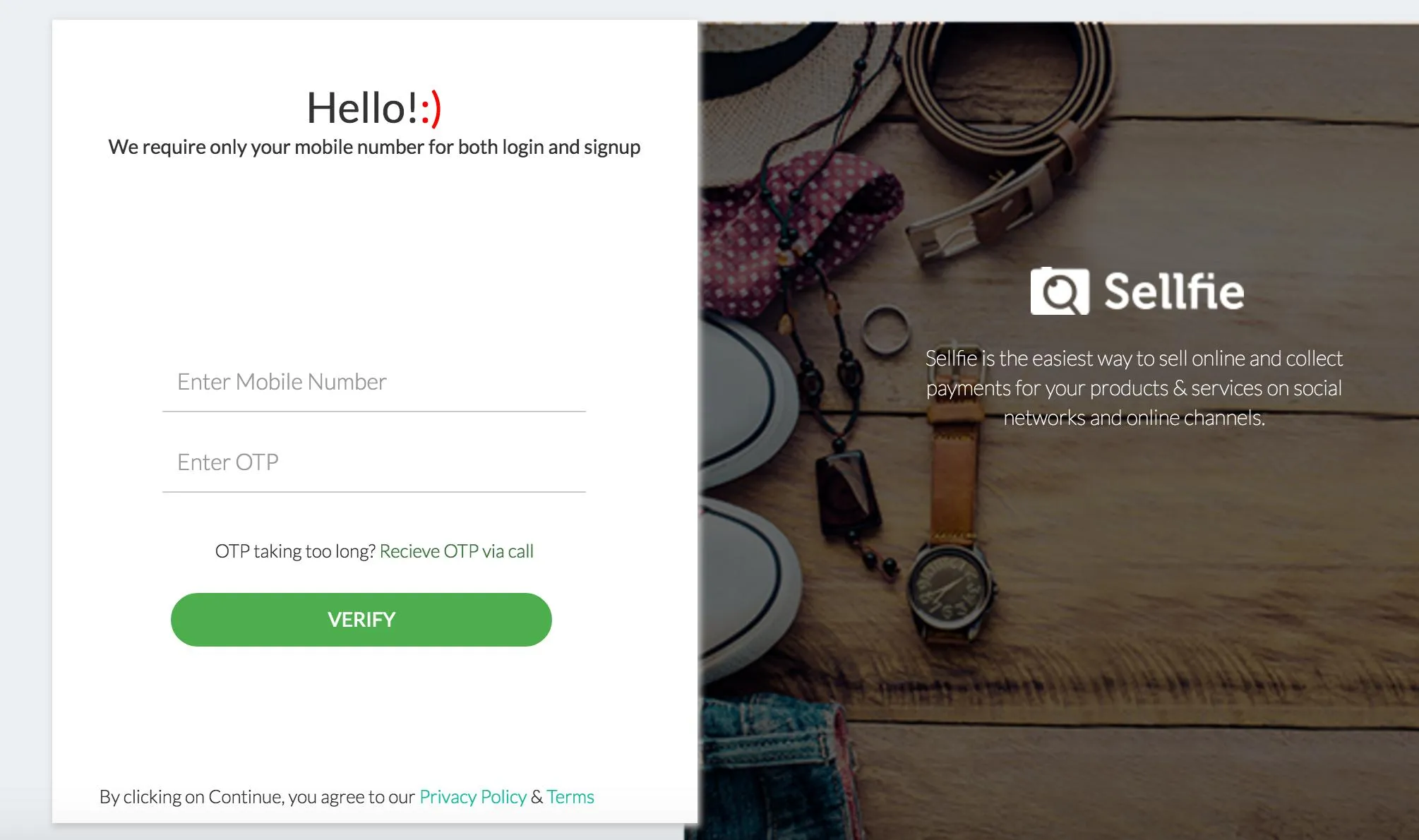
<p class="profile-name">Hello!<span style="color:red">:)</span></p>
<p class="profile-desc">We require only your mobile number for both login and signup</p>
<br>
<div class="form-signin">
<div class="md-form">
<input type="text" placeholder="Enter Mobile Number" value="" name="mobile_number" id="mobile_number" class="mobile_number form-control">
</div>
<button class="btn btn-main btn-continue" id="continue">
CONTINUE</button>
<div class="form-signin-bottom">By clicking on Continue, you agree to our <a href="">Privacy Policy</a>
& <a href="">Terms</a>
</div>
</div>
</div>
</div>
<div class="col-sm-6 background-login">
<div class="sellfie-logo">
<img src="img/sellfie_white.png"/>
</div>
<div class="sellfie-start-text">
Sellfie is the easiest way to sell online and collect payments for your products & services on social networks
and online channels.
</div>
</div>
</div>
</div> .background-login {
background: url(../img/login.png) no-repeat;
background-size: cover;
z-index: -2;
position: absolute;
margin-top: 50px;
right: 2%;
min-height:400px;
height: 100%;
}
wrapper的宽度和高度,您会发现内容也会随之改变。有用的示例。 - Roy123