我希望有人能够解决使用dplyr管道中的某种形式的
我已经在下面发布了一个可行的示例,但我想知道是否有一种方法可以避免使用循环并完成我的任务。
干杯
expand.grid的问题。我正在进行一些建模工作,其中我有几个不同的组(或下面的类型),这些组具有不同的x和y数据范围。一旦我在数据上运行了gam,我就想创建一个预测图,但我只想预测每个值占据的范围内的值,而不是整个数据集的范围。我已经在下面发布了一个可行的示例,但我想知道是否有一种方法可以避免使用循环并完成我的任务。
干杯
require(ggplot2)
require(dplyr)
# Create some data
df = data.frame(Type = rep(c("A","B"), each = 100),
x = c(rnorm(100, 0, 1), rnorm(100, 2, 1)),
y = c(rnorm(100, 0, 1), rnorm(100, 2, 1)))
# and if you want to check out the data
ggplot(df,aes(x,y,col=Type)) + geom_point() + stat_ellipse()
# OK so I have no issue extracting the minimum and maximum values
# for each type
df_summ = df %>%
group_by(Type) %>%
summarize(xmin = min(x),
xmax = max(x),
ymin = min(y),
ymax = max(y))
df_summ
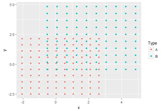
# and I can create a loop and use the expand.grid function to get my
# desired output
test = NULL
for(ii in c("A","B")){
df1 = df_summ[df_summ$Type == ii,]
x = seq(df1$xmin, df1$xmax, length.out = 10)
y = seq(df1$ymin, df1$ymax, length.out = 10)
coords = expand.grid(x = x, y = y)
coords$Type = ii
test = rbind(test, coords)
}
ggplot(test, aes(x,y,col = Type)) + geom_point()
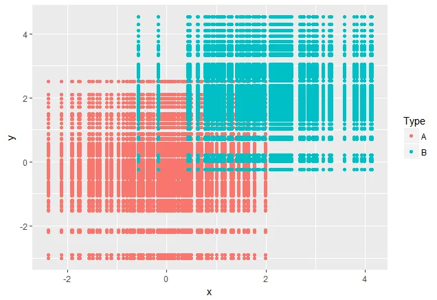
但是我真正想做的是找到一种方法来绕过循环并尝试直接从我的管道操作符获得相同的输出。我已经尝试了使用do()函数的几种组合,但都没有效果,下面发布的只是众多失败尝试之一。
df %>%
  group_by(Type) %>%
  summarize(xmin = min(x),
            xmax = max(x),
            ymin = min(y),
            ymax = max(y)) %>%
  do(data.frame(x = seq(xmin, xmax, length.out = 10),
                y = seq(ymin, ymax, length.out = 10)))

# this last line returns an error
# Error in is.finite(from) :
#   default method not implemented for type 'closure'
data_grid()和seq_range()感兴趣,它们的使用方法在这里有详细说明:链接。 - bschneidr