在WPF Grid中,是否容易指定行或列的边距(margin)和/或填充(padding)?
我当然可以添加额外的列来间隔控件,但这似乎是填充或边距的工作(它将使XAML简单得多)。有没有人从标准Grid派生出来以添加这个功能?
在WPF Grid中,是否容易指定行或列的边距(margin)和/或填充(padding)?
我当然可以添加额外的列来间隔控件,但这似乎是填充或边距的工作(它将使XAML简单得多)。有没有人从标准Grid派生出来以添加这个功能?
RowDefinition和ColumnDefinition属于ContentElement类型,而Margin是严格属于FrameworkElement属性。因此,对于您的问题,“是否轻松实现”,答案是绝对不可能的。我也没有见过任何布局面板演示这种功能。
您可以按照您提出的建议添加额外的行或列。但是,您也可以设置Grid元素本身或任何放置在Grid内部的元素的边距,因此这是目前最好的解决方法。
使用一个Border控件在单元格控件外部,并为此定义内边距:
    <Grid>
        <Grid.Resources >
            <Style TargetType="Border" >
                <Setter Property="Padding" Value="5,5,5,5" />
            </Style>
        </Grid.Resources>

        <Grid.RowDefinitions>
            <RowDefinition/>
            <RowDefinition/>
        </Grid.RowDefinitions>

        <Border Grid.Row="0" Grid.Column="0">
            <YourGridControls/>
        </Border>
        <Border Grid.Row="1" Grid.Column="0">
            <YourGridControls/>
        </Border>

    </Grid>
来源:
你可以使用类似这样的代码:
<Style TargetType="{x:Type DataGridCell}">
  <Setter Property="Padding" Value="4" />
  <Setter Property="Template">
    <Setter.Value>
      <ControlTemplate TargetType="{x:Type DataGridCell}">
        <Border Padding="{TemplateBinding Padding}" BorderBrush="{TemplateBinding BorderBrush}" BorderThickness="{TemplateBinding BorderThickness}" Background="{TemplateBinding Background}" SnapsToDevicePixels="True">
          <ContentPresenter SnapsToDevicePixels="{TemplateBinding SnapsToDevicePixels}"/>
        </Border>
      </ControlTemplate>
    </Setter.Value>
  </Setter>
如果您不需要TemplateBindings:
<Style TargetType="{x:Type DataGridCell}">
   <Setter Property="Template">
      <Setter.Value>
          <ControlTemplate TargetType="{x:Type DataGridCell}">
              <Border Padding="4">
                  <ContentPresenter />
              </Border>
          </ControlTemplate>
      </Setter.Value>
  </Setter>
</Style>
我想分享一下我的解决方案,因为目前还没有人提到这个。不需要基于Grid设计UserControl,而是可以使用样式声明来定位包含在Grid中的控件。这样可以为所有元素添加填充/边距,而无需为每个元素定义,这样会很麻烦和费力。例如,如果你的Grid只包含TextBlock,可以这样做:
<Style TargetType="{x:Type TextBlock}">
    <Setter Property="Margin" Value="10"/>
</Style>
这就像是“单元格内边距”的等效物。
Margin属性的“继承”,而是在ResourceDictionary中的任何Style将应用于其TargetType的每个元素,无论在该字典所有者元素的整个范围内的哪个位置。因此,是Style会渗透,而不是属性。 - Glenn Slayden我很惊讶没有看到这个解决方案被发布。
从Web出发,像Bootstrap这样的框架将使用负边距来拉回行/列。
可能有点啰嗦(尽管不是那么糟糕),它确实有效,并且元素是均匀间隔和大小的。
在下面的示例中,我使用StackPanel根来演示如何使用边距均匀排列3个按钮。您可以使用其他元素,只需将内部x:Type从button更改为您的元素即可。
思路很简单,在外部使用网格通过半内网格的量拉出元素的边距(使用负边距),并使用内网格以所需的量均匀分布元素。
更新: 一个用户的评论说它不起作用,这里有一个快速视频演示:https://youtu.be/rPx2OdtSOYI
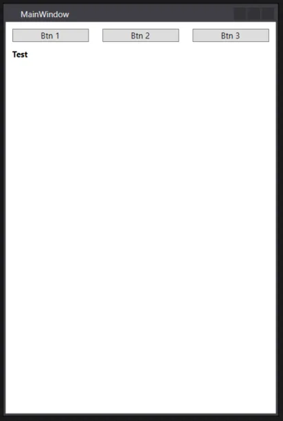
    <StackPanel>
        <Grid>
            <Grid.Resources>
                <Style TargetType="{x:Type Grid}">
                    <Setter Property="Margin" Value="-5 0"/>
                </Style>
            </Grid.Resources>

            <Grid>
                <Grid.Resources>
                    <Style TargetType="{x:Type Button}">
                        <Setter Property="Margin" Value="10 0"/>
                    </Style>
                </Grid.Resources>

                <Grid.ColumnDefinitions>
                    <ColumnDefinition Width="*" />
                    <ColumnDefinition Width="*" />
                    <ColumnDefinition Width="*" />
                </Grid.ColumnDefinitions>

                <Button Grid.Column="0" Content="Btn 1" />
                <Button Grid.Column="1" Content="Btn 2" />
                <Button Grid.Column="2" Content="Btn 3" />
            </Grid>

        </Grid>

        <TextBlock FontWeight="Bold" Margin="0 10">
            Test
        </TextBlock>
    </StackPanel>
编辑:
如果要给任何控件添加边距,您可以像这样用边框包装控件
<!--...-->
    <Border Padding="10">
            <AnyControl>
<!--...-->
<Grid>
  <Grid.RowDefinitions>
    <RowDefinition />
    <RowDefinition />
  </Grid.RowDefinitions>

  <custom:MyRowObject Style="YourStyleHereOrGeneralSetter" Grid.Row="0" />
  <custom:MyRowObject Style="YourStyleHere" Grid.Row="1" />
</Grid>
或者
<StackPanel>
  <custom:MyRowObject Style="YourStyleHere" Grid.Row="0" />
  <custom:MyRowObject Style="YourStyleHere" Grid.Row="1" />
</StackPanel>
如果您正在使用数据绑定,您的自定义控件也将继承DataContext...这是我个人最喜欢的好处。
ListView控件,但没有提供使所有“RowObjects”共享相同列宽的功能。实际上,它与网格不再有太多关系。 - Glenn Slayden<Grid.Resources>
<Style TargetType="{x:Type TextBlock}" BasedOn="{StaticResource OurLabelStyle}">
<Style.Triggers>
<Trigger Property="Grid.Column" Value="1">
<Setter Property="Margin" Value="20,0" />
</Trigger>
</Style.Triggers>
</Style>
</Grid.Resources>
我现在已经使用我的网格之一完成了这个操作。
在UWP(Windows 10秋季创作者更新版本及以上)中
<Grid RowSpacing="3" ColumnSpacing="3">
Xamarin.Forms。 - user1618054