我有一个HTML页面上的一些表格,其中某些单元格需要限制宽度。任何过长的文本都需要使用省略号(...)截断以显示存在更多的文本。text-overflow: ellipsis对此做得很好!
我的示例看起来像这样:
<html>

<head>
  <title>Test table ellipsis</title>
  <style>
    table th,
    table td {
      border: 1px solid red;
    }

    table .col-A {
      width: 25%;
    }

    table .col-B {
      width: 75%;
    }

    table .col-B div {
      text-overflow: ellipsis;
      overflow: hidden;
      white-space: nowrap;
    }
  </style>
</head>

<body>
  <table>
    <thead>
      <th class="col-A">Column A</th>
      <th class="col-B">Column B</th>
    </thead>
    <tbody>
      <tr>
        <td class="col-A">Value A1</td>
        <td class="col-B">Value B1</td>
      </tr>
      <tr>
        <td class="col-A">Value A2</td>
        <td class="col-B">
          <div class="col-B">Value B2 that is going to be ellipsized, because it's way too long!</div>
        </td>
      </tr>
    </tbody>
  </table>
</body>
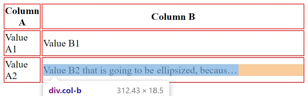
</html>- 我指定了列宽为25%和75%。显然不是这种情况。直接更改长文本会影响列宽度
- 文本被"ellipsized"(用省略号表示),但是还有很多空间。为什么不使用那些自由空间(在下面截图中标记为橙色)?
我真的希望找到一个与表格良好配合的解决方案(因为它所展示的数据确实是表格形式的,而且我有大量现有的CSS假定使用的是表格)。但是此时,我也愿意采用一些div和flexbox的组合来解决问题。