两列 HTML 布局,其中一列可以自适应宽度

6
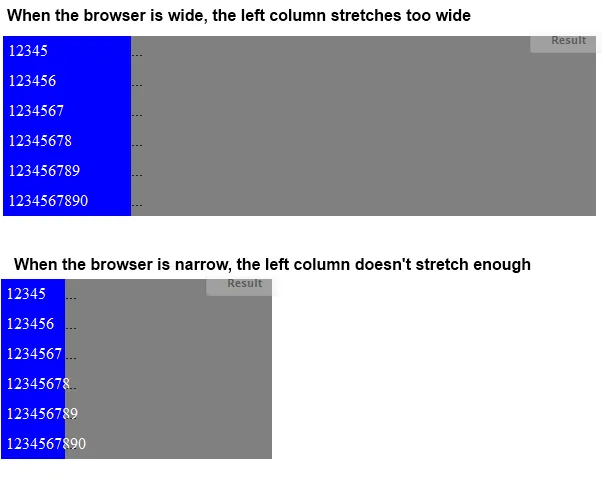
我正在寻找一种类似于表格的2列非表格布局,并且可以在IE7中正常工作。http://jsfiddle.net/YGb2y/这个例子虽然可行,但它使用了表格布局,而我们都知道,表格不是理想的布局选项。如果必须使用,我会采用它,但我希望能找到更符合语义的方法来实现这个布局。请注意左列如何拉伸以适应包含内容,右列占用其余可用空间。
<table>
    <tr><td class="left">12345</td><td class="right">...</td></tr>
    <tr><td class="left">123456</td><td class="right">...</td></tr>
    <tr><td class="left">1234567</td><td class="right">...</td></tr>
    <tr><td class="left">12345678</td><td class="right">...</td></tr>
    <tr><td class="left">123456789</td><td class="right">...</td></tr>
    <tr><td class="left">1234567890</td><td class="right">...</td></tr>
</table>

table
{
    width:100%;
}
.left
{
    width:1px;
    background-color:blue;
    color:white;
}
.right
{
    background-color:gray;
}

我试图改用ul/li/div来实现,但是我要么只能设置一个固定宽度,要么只能设置百分比的左侧栏。没有“width: stretch-to-fit”。


http://jsfiddle.net/cj6PR/

HTML

<ul>
    <li><div class="left">12345</div><div class="right">...</div></li>
    <li><div class="left">123456</div><div class="right">...</div></li>
    <li><div class="left">1234567</div><div class="right">...</div></li>
    <li><div class="left">12345678</div><div class="right">...</div></li>
    <li><div class="left">123456789</div><div class="right">...</div></li>
    <li><div class="left">1234567890</div><div class="right">...</div></li>
</ul>

CSS

ul
{
    list-style:none;
    width:100%;
}
li
{
    clear:both;
    position:relative;
    overflow:hidden;
}
li div
{
    padding:5px;
}
.left
{
    float:left;
    width:20%;
    background-color:blue;
    color:white;
}
.right
{
    background-color:gray;
}

问题

有什么建议吗?

4个回答

3
这就是我最终采用的方案
HTML: http://jsfiddle.net/cj6PR/4/
<ul>
    <li><div class="left">12345</div><div class="right">...</div></li>
    <li><div class="left">123456</div><div class="right">...</div></li>
    <li><div class="left">1234567</div><div class="right">...</div></li>
    <li><div class="left">12345678</div><div class="right">...</div></li>
    <li><div class="left">123456789</div><div class="right">...</div></li>
    <li><div class="left">1234567890</div><div class="right">...</div></li>
</ul>

CSS

ul
{
    display:table;
    width:100%;
}
li
{
    display:table-row;
}
li div
{
    display:table-cell;
}
.left
{
    width:1px;
    background-color:blue;
    color:white;
}
.right
{
    background-color:gray;
}

JS (IE7 hack)

if ($.browser.msie && $.browser.version == 7)
{
    $("ul").wrapInner("<table />");
    $("li").wrap("<tr />");
    $("li div").wrap("<td />");
}

2

如果您不知道内容的最大宽度,就不能使用固定宽度。

如果您每行使用1个div,则无法在没有JavaScript的情况下将它们调整为仍然灵活的单一宽度。

http://jsfiddle.net/Lp2un/


那个可以工作,但是使用 ul/li 更符合语义 - 如果可能的话,我想找到一个使用它的解决方案。 - kenwarner
这不是一个好的解决方案,请参考这个稍微修改过的 fiddle:http://jsfiddle.net/Lp2un/1/,在右列添加了更多行。 - NGLN

1

你可以使用em值来指定宽度,而不是%,这样它将始终相对于文本大小,因此不太可能不够宽。

或者,您可以在px中指定min-max-width,以防止布局过于“破碎”。这些的实际值需要您自己确定。

(指的是您的.left CSS规则)

.left {
    float:left;
    width:15em; /* or any other value that you consider wide enough */
    background-color:blue;
    color:white;
}

或者

.left
{
    float:left;
    width:20%;
    min-width: 125px; /* whatever suits your needs */
    max-width: 150px; /* whatever suits your needs */
    background-color:blue;
    color:white;
}

另一个选择是让您的div表现得像一个表格,而不是实际上是一个表格。
请参见:http://www.quirksmode.org/css/display.html#table 以获取有关该想法的更多信息。

表格、表格行、表格单元格可以,但需要支持IE7 :( - kenwarner

0

我认为这就是你要找的,查看更新的演示fiddle

CSS:

#wrapper {
    overflow: hidden;
}
#sidebar {
    float: left;
}
#content {
    overflow: hidden;
}

HTML:

<div id="wrapper">
    <div id="sidebar">

    </div>
    <div id="content">

    </div>
</div>

网页内容由stack overflow 提供, 点击上面的
可以查看英文原文,
原文链接