您没有提供数据样本,我将使用一个合成时间序列来向您展示如何使用自定义函数bgLevel为几个不同类别的定义了起始日期和终止日期的形状添加数字。
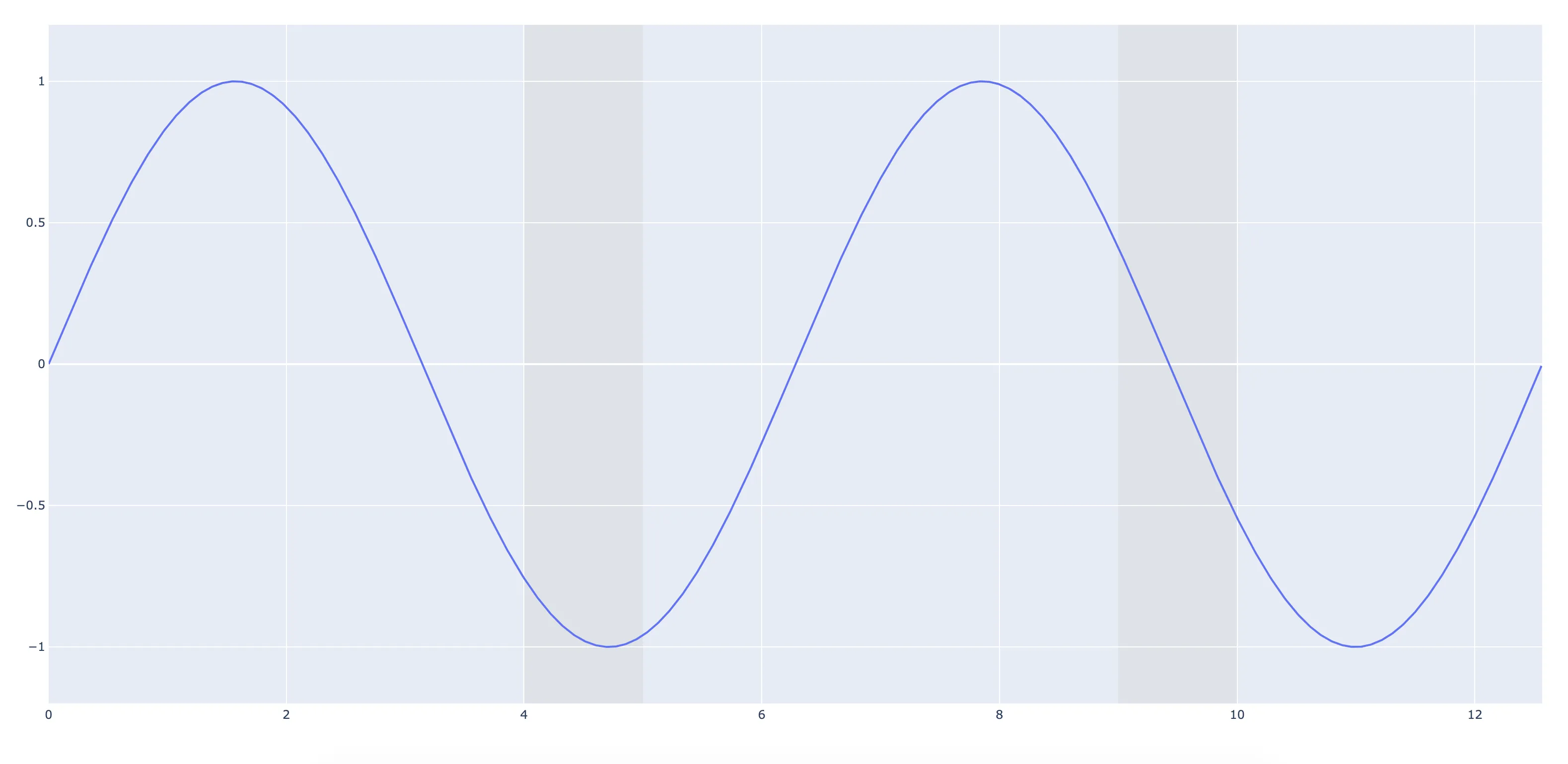
两条垂直线之间填充很快就会变成一个矩形。而矩形可以使用fig.add_shape作为形状轻松添加。下面的示例将向您展示如何查找由某些标准给定的时期的开始和结束日期。在您的情况下,这些标准是变量值是否高于或低于某个级别。
使用形状而不是fig.add_trace()中的跟踪,将让您使用layer='below'相对于绘图层定义位置。并且可以使用line=dict(color="rgba(0,0,0,0))轻松隐藏形状轮廓。
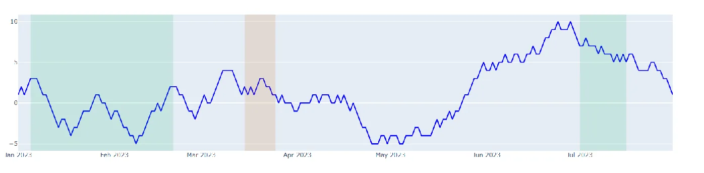
图 1: 具有随机数据的时间序列图:
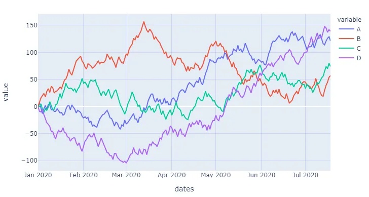
图 2: 当A > 100时,背景设置为不透明灰色:
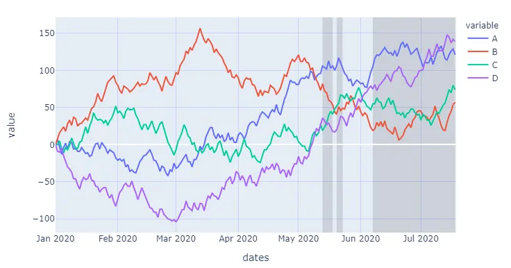
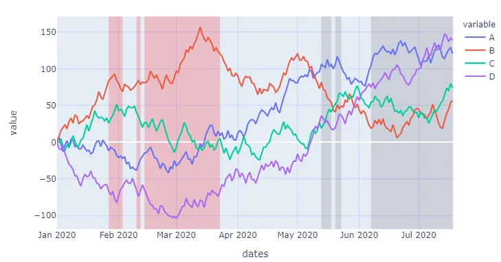
图 3: 当D < 60时,背景也设置为不透明红色
完整代码:
import numpy as np
import pandas as pd
import plotly.graph_objects as go
import plotly.express as px
import datetime
pd.set_option('display.max_rows', None)
nperiods = 200
np.random.seed(123)
df = pd.DataFrame(np.random.randint(-10, 12, size=(nperiods, 4)),
columns=list('ABCD'))
datelist = pd.date_range(datetime.datetime(2020, 1, 1).strftime('%Y-%m-%d'),periods=nperiods).tolist()
df['dates'] = datelist
df = df.set_index(['dates'])
df.index = pd.to_datetime(df.index)
df.iloc[0] = 0
df = df.cumsum().reset_index()
fig = px.line(df, x='dates', y=df.columns[1:])
fig.update_xaxes(showgrid=True, gridwidth=1, gridcolor='rgba(0,0,255,0.1)')
fig.update_yaxes(showgrid=True, gridwidth=1, gridcolor='rgba(0,0,255,0.1)')
def bgLevels(fig, variable, level, mode, fillcolor, layer):
"""
Set a specified color as background for given
levels of a specified variable using a shape.
Keyword arguments:
==================
fig -- plotly figure
variable -- column name in a pandas dataframe
level -- int or float
mode -- set threshold above or below
fillcolor -- any color type that plotly can handle
layer -- position of shape in plotly fiugre, like "below"
"""
if mode == 'above':
m = df[variable].gt(level)
if mode == 'below':
m = df[variable].lt(level)
df1 = df[m].groupby((~m).cumsum())['dates'].agg(['first','last'])
for index, row in df1.iterrows():
fig.add_shape(type="rect",
xref="x",
yref="paper",
x0=row['first'],
y0=0,
x1=row['last'],
y1=1,
line=dict(color="rgba(0,0,0,0)",width=3,),
fillcolor=fillcolor,
layer=layer)
return(fig)
fig = bgLevels(fig = fig, variable = 'A', level = 100, mode = 'above',
fillcolor = 'rgba(100,100,100,0.2)', layer = 'below')
fig = bgLevels(fig = fig, variable = 'D', level = -60, mode = 'below',
fillcolor = 'rgba(255,0,0,0.2)', layer = 'below')
fig.show()
type=‘rect’) 来解决吗?(回答很好,只是好奇为什么选择了这种方法)。 - S3DEVlayer="below"来绘制线条下方的矩形。 - Harm