
13个回答
11
表格的基本原则是,对于特定的行,在不论内容为何的情况下,列应具有相等的高度。
您可以使用Bootstrap网格系统创建表格的行/列结构,但会存在列高度不均等的问题。
因此,为了实现列的等高效果,您可以使用flexbox属性(请注意它在IE9及以下版本中无效)。
只需将以下简单的CSS添加到父容器即可实现(要查看完整的演示,请查看上面的fiddle):
.row-eq-height {
    display: -webkit-box;
    display: -webkit-flex;
    display: -ms-flexbox;
    display: flex;
}
- Saurabh Sonawane
6
您可以使用
table-responsive :
<html>
<head>
<title>Test</title>
<link rel="stylesheet" href="https://maxcdn.bootstrapcdn.com/bootstrap/3.3.6/css/bootstrap.min.css" integrity="sha384-1q8mTJOASx8j1Au+a5WDVnPi2lkFfwwEAa8hDDdjZlpLegxhjVME1fgjWPGmkzs7" crossorigin="anonymous">
</head>
<body>
<div class="table-responsive">

    <table class="table table-bordered table-striped">
        <thead>
            <tr> <td></td> <th>Chrome</th> <th>Firefox</th> <th>Internet Explorer</th> <th>Opera</th> <th>Safari</th> </tr>
        </thead>
        <tbody>
            <tr>
                <th scope="row">Android</th>
                <td class="text-success"><span class="glyphicon glyphicon-ok" aria-hidden="true"></span> Supported</td>
                <td class="text-success"><span class="glyphicon glyphicon-ok" aria-hidden="true"></span> Supported</td>
                <td class="text-muted" rowspan="3" style="vertical-align:middle">N/A</td>
                <td class="text-danger"><span class="glyphicon glyphicon-remove" aria-hidden="true"></span> Not Supported</td>
                <td class="text-muted">N/A</td>
            </tr>
            <tr>
                <th scope="row">iOS</th>
                <td class="text-success"><span class="glyphicon glyphicon-ok" aria-hidden="true"></span> Supported</td>
                <td class="text-muted">N/A</td>
                <td class="text-danger"><span class="glyphicon glyphicon-remove" aria-hidden="true"></span> Not Supported</td>
                <td class="text-success"><span class="glyphicon glyphicon-ok" aria-hidden="true"></span> Supported</td>
            </tr>
            <tr>
                <th scope="row">Mac OS X</th>
                <td class="text-success"><span class="glyphicon glyphicon-ok" aria-hidden="true"></span> Supported</td>
                <td class="text-success"><span class="glyphicon glyphicon-ok" aria-hidden="true"></span> Supported</td>
                <td class="text-success"><span class="glyphicon glyphicon-ok" aria-hidden="true"></span> Supported</td>
                <td class="text-success"><span class="glyphicon glyphicon-ok" aria-hidden="true"></span> Supported</td>
            </tr>
            <tr>
                <th scope="row">Windows</th>
                <td class="text-success"><span class="glyphicon glyphicon-ok" aria-hidden="true"></span> Supported</td>
                <td class="text-success"><span class="glyphicon glyphicon-ok" aria-hidden="true"></span> Supported</td>
                <td class="text-success"><span class="glyphicon glyphicon-ok" aria-hidden="true"></span> Supported</td>
                <td class="text-success"><span class="glyphicon glyphicon-ok" aria-hidden="true"></span> Supported</td>
                <td class="text-danger"><span class="glyphicon glyphicon-remove" aria-hidden="true"></span> Not Supported</td>
            </tr>
        </tbody>
    </table>

</div>
</body>
</html>
- dr. strange
1
最佳答案,使用Bootstrap官方方式 - dippas
4
您是否尝试过使用Bootstrap表格?如果没有,我建议您尝试并设置所需宽度的<td>。例如:
<tr class="something">
<td class="col-md-2">A</td>
<td class="col-md-3">B</td>
<td class="col-md-6">C</td>
<td class="col-md-1">D</td>
- Thomas Wolfe
1
是的,我也建议使用Bootstrap表格。毕竟,您需要更改标记的行为,以使其像表格一样正常工作。 - Anil Tiwari
3
像其他人之前说的那样,你可以使用表格标签。但是如果你仍然想使用div,你可以使用Bootstrap的网格类来确保你的表在每个屏幕大小上都能正常显示。我将你的代码编辑为:
<style>
    .table {
        width: auto;
        margin: 0 auto;
        border: 1px solid red;
    }
    .table .row {
        display: -webkit-flex;
        display: -ms-flexbox;
        display: flex;
        -webkit-flex-wrap: wrap;
        -ms-flex-wrap: wrap;
        flex-wrap: wrap;
    }
    .table .row div {
        border: 1px solid red;
    }
</style>

<div class="table">

    <div class="row">
        <div class="col-lg-4 col-md-4 col-sm-4">
            <img src="image1.jpg" alt="image1">
            Some content here. Hello stackoverflow!
        </div>
        <div class="col-lg-8 col-md-8 col-sm-8">
            Some content here. Hello world!
        </div>
    </div>

    <div class="row">
        <div class="col-lg-4 col-md-4 col-sm-4">
            <img src="image2.jpg" alt="image2">
            Some content here. Hello stackoverflow!
        </div>
        <div class="col-lg-8 col-md-8 col-sm-8">
            Some content here. Hello world!
        </div>
    </div>

    <div class="row">
        <div class="col-lg-4 col-md-4 col-sm-4">
            <img src="image3.jpg" alt="image3">
            Some content here. Hello stackoverflow!
        </div>
        <div class="col-lg-8 col-md-8 col-sm-8">
            Some content here. Hello world!
        </div>
    </div>

</div>
正如您所看到的,我在 .row 上使用了 display: flex; 和 flex-wrap: wrap; 来使单元格具有相同的高度。
祝好运!
- JoeMecPak
2
你可以使用以下方法来实现表格布局:
行:display:table;
列:display:table-cell;
- Rakesh Kumar
2
请查看工作演示。这正是您所需要的。希望它能对您有所帮助。
<link rel="stylesheet" href="https://maxcdn.bootstrapcdn.com/bootstrap/3.3.7/css/bootstrap.min.css">
  <script src="https://ajax.googleapis.com/ajax/libs/jquery/3.3.1/jquery.min.js"></script>
  <script src="https://maxcdn.bootstrapcdn.com/bootstrap/3.3.7/js/bootstrap.min.js"></script>
<div class="container" >
  <div class="row" style="border: 1px solid grey;">
    <div class="col-md-4  col-sm-4  col-xs-4 text-center" style="border-right:1px solid grey">
     <img src="https://www.mozilla.org/media/img/styleguide/identity/firefox/guidelines-logo.7ea045a4e288.png" width="20" height="20" class="img-circle"/>
    </div>
    <div class="col-md-4 col-sm-4  col-xs-4 text-center"  style="border-right:1px solid grey">
     <img src="https://www.mozilla.org/media/img/styleguide/identity/firefox/guidelines-logo.7ea045a4e288.png" width="20" height="20" class="img-circle"/>
    </div>
    <div class="col-md-4 col-sm-4  col-xs-4  text-center"  style="border-right:1px solid grey">
      <img src="https://www.mozilla.org/media/img/styleguide/identity/firefox/guidelines-logo.7ea045a4e288.png" width="20" height="20" class="img-circle"/>
    </div>
  </div>
 <div class="row" style="border: 1px solid grey;background-color:#f3f3f3">
    <div class="col-md-4 col-sm-4  col-xs-4 text-center"  style="border-right:1px solid grey">
    <strong>Yes</strong>
    </div>
    <div class="col-md-4  col-sm-4  col-xs-4 text-center"  style="border-right:1px solid grey">
       <strong>Yes</strong>
    </div>
    <div class="col-md-4  col-sm-4  col-xs-4 text-center"  style="border-right:1px solid grey">
         <strong>Yes</strong>
    </div>
  </div>
</div>
- Anil Panwar
1
这段代码在两行之间创建了一个粗水平边框。 - John
2
以下是你的问题的代码,也许这可以帮助你。
请检查此JSFiddle链接JSFiddle
HTML代码
<div style="width: 900px; margin: 0 auto;display:table-cell; border: 1px solid red;">
  <div class="row">
    <div class="col-md-4 tableColumnDiv">
        <img src="" alt="image"> Some content here. Hello stackoverflow!
    </div>
    <div class="col-md-8 tableColumnDiv">
        Some content here. Hello world!
    </div>
  </div>
  <div class="row">
    <div class="col-md-4 tableColumnDiv">
        <img src="" alt="image"> Some content here. Hello stackoverflow!
    </div>
    <div class="col-md-8 tableColumnDiv">
        Some content here. Hello world!
    </div>
  </div>
  <div class="row">
    <div class="col-md-4 tableColumnDiv">
        <img src="" alt="image"> Some content here. Hello stackoverflow!
    </div>
    <div class="col-md-8 tableColumnDiv">
        Some content here. Hello world!
    </div>
  </div>
</div>
CSS 代码
.image-column {
   border: 1px solid black;
}
.tableColumnDiv{
  display:table-cell;
  border: 1px solid black;
}
- Shubham Baranwal
2
尝试这个代码并阅读CSS区域中的注释:http://www.bootply.com/byopZWzR2K
该代码将解决任何单元格的垂直对齐问题。
以下是相同的代码:
CSS
/* This play-area class is just for testing and aligned the width of this table */
.play-area{width:400px;margin:19px auto}
.play-area img{height:32px;}

.make-this-table{border:1px solid #d7d7d7;overflow:hidden;} /* this to give our table outer border */
.make-this-table .row{border-top:1px solid #d7d7d7;background:#e7e7e7} /* This simple to add separator line between each row also to give each row background color */
.make-this-table .row:nth-child(1){border:none;background:#c5c5c5} /* This to ignore the separator for the first row since it will be the head of this table. You can remove this line to have this table without head */


/* This code to make rows in alternative background colors */
.make-this-table .row:nth-child(even) {background:#fff}


/* This to make the text vertical align in middle if the next column in the same row has more than one line while the first column just one line like the second row in this table .. You can remove this line if you like to make the alignment at the top of the cell. */
.make-this-table .row{align-items: center;display: -webkit-flex; display: -ms-flexbox; display: flex; -webkit-flex-wrap: wrap; -ms-flex-wrap: wrap; flex-wrap: wrap;}
-
HTML
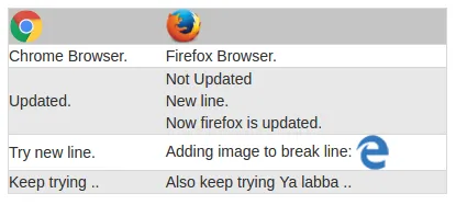
<div class="play-area">
<div class="make-this-table">

  <div class="row">
    <div class="col-md-4 col-xs-4">
        <img src="http://www.chromium.org/_/rsrc/1438811752264/chromium-projects/logo_chrome_color_1x_web_32dp.png" alt="" style="">
    </div>
    <div class="col-md-8 col-xs-8">
        <img src="https://www.mozilla.org/media/img/styleguide/identity/firefox/guidelines-logo.7ea045a4e288.png" alt="" style="width:32px;">
    </div>
  </div>

  <div class="row">
    <div class="col-md-4 col-xs-4">
        Chrome Browser.
    </div>
    <div class="col-md-8 col-xs-8">
        Firefox Browser.
    </div>
  </div>

  <div class="row">
    <div class="col-md-4 col-xs-4">
        Updated.
    </div>
    <div class="col-md-8 col-xs-8">
      Not Updated<br>New line.<br>Now firefox is updated.
    </div>
  </div>

  <div class="row">
    <div class="col-md-4 col-xs-4">
        Try new line.
    </div>
    <div class="col-md-8 col-xs-8">
      Adding image to break line: <img src="http://www.w3schools.com/images/compatible_edge.gif" alt="">
    </div>
  </div>

  <div class="row">
    <div class="col-md-4 col-xs-4">
        Keep trying ..
    </div>
    <div class="col-md-8 col-xs-8">
        Also keep trying Ya labba ..
    </div>
  </div>


</div>
</div>
- Saud Alfadhli
2
我对你的代码进行了一些更改,但我不知道是否完全符合你的期望:
HTML:
HTML:
<div class="container">
  <div class="row">
    <div class="image-column col-md-4">
      <img src="" alt="image" />
    </div>
    <div class="image-column col-md-4">
      <img src="" alt="image" />
    </div>
    <div class="image-column col-md-4">
      <img src="" alt="image" />
    </div>
  </div>

  <div class="row">
    <div class="content-column col-md-4">
      Some content here. Hello world!
    </div>
    <div class="content-column col-md-4">
      Some content here. Hello world!
    </div>
    <div class="content-column col-md-4">
      Some content here. Hello world!
    </div>
  </div>
</div>
CSS:
/* CSS used here will be applied after bootstrap.css */

.container {
    text-align: center;
}
.container .row {
    display: flex;
}
.container .row:nth-child(even) {
    background: gainsboro;
}
.container .content-column, .container .image-column {
   border: 1px solid grey;
}
.container .row:not(:first-child) .content-column, .container .row:not(:first-child) .image-column {
    border-top: 0px;
}
.container .content-column:not(:first-child), .container .image-column:not(:first-child) {
   border-left: 0px;
}
.image-column {
    padding: 5px;
}
.content-column {
   border: 1px solid grey;
   border-top: 0px;
  font-size: 1.3em;
}
.content-column:not(:first-child) {
   border-left: 0px;
}
结果:

- Waldir J. Pereira Junior
网页内容由stack overflow 提供, 点击上面的可以查看英文原文,
原文链接
原文链接
display:table和display:table-cell? - Gaurav Aggarwal