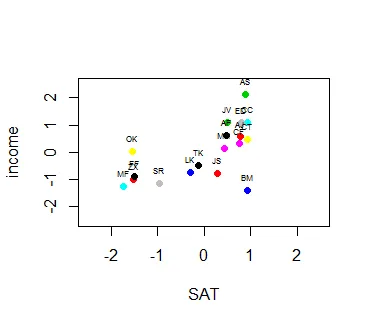
好的... 一些虚拟数据... 学科名称用缩写表示,SAT考试成绩和后来的生活收入以千美元为单位。这些条目已经被缩放和居中处理,并且看起来像这样:
names <- c("TK","AJ","CC", "ZX", "FF", "OK", "CT", "AF", "MF", "ED", "JV", "LK", "AS", "JS", "SR", "CF", "MH", "BM")
SAT <- c(1345, 1566, 1600, 1002, 1008, 999, 1599, 1488, 950, 1567, 1497, 1300, 1588, 1443, 1138, 1557, 1478, 1600)
income <- c(150e3, 250e3, 300e3, 100e3, 110e3, 199e3, 240e3, 255e3, 75e3, 299e3, 300e3, 125e3, 400e3, 120e3, 86e3, 225e3, 210e3, 60e3)

dat <- cbind(SAT, income)
row.names(dat) <- names
dat <- scale(dat, scale = T, center = T)

plot(income ~ SAT, col=as.factor(rownames(dat)), pch= 19, xlim = c(-2.5,2.5), ylim=c(-2.5,2.5), data = dat)
abline(v=0,h=0, col = "dark gray")
text(x=dat$SAT, y=dat$income, rownames(dat), pos=3, cex = 0.5)
...结果是正确的,除了缺失的标签。这是图表和错误消息:
 dat$SAT的错误:$运算符对于原子向量无效
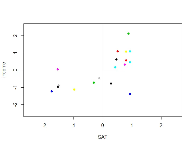
然而,在我做出一些激烈的举动之前,我发现只有在绘图之前对代码进行微小的修改才会改变一切:
dat <- as.data.frame(dat)
好的,现在开始...
dat <- cbind(SAT, income)
row.names(dat) <- names
dat <- scale(dat, scale = T, center = T)

dat <- as.data.frame(dat)
plot(income ~ SAT, col=as.factor(rownames(dat)), pch= 19, xlim = c(-2.5,2.5), ylim=c(-2.5,2.5), data = dat)
abline(v=0,h=0, col = "dark gray")
text(x=dat$SAT, y=dat$income, rownames(dat), pos=3, cex = 0.5)
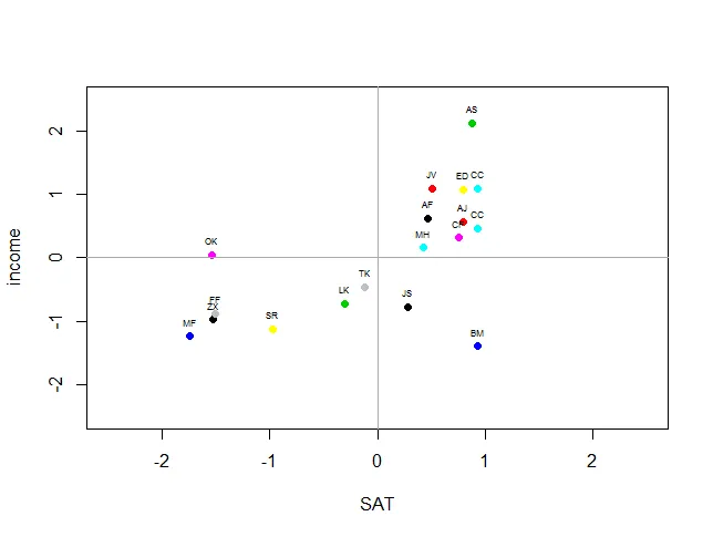
所以,我想问题在于在给点标签前要确保我们正在处理数据框架。R语言是否因为没有商业利益而 intrinsically 不友好?还是因为它底层有太多层次而使其笨重不堪?(我扯远了——并不想开启一场讨论……)