由于六边形是通过伪元素的边框创建的,因此无法直接实现此目标。另一种方法是在六边形内部覆盖其他六边形,从而实现相同的预期结果。
下面是一个示例,展示了可以实现的效果:


HTML - 相当基础,继续使用相同的模式添加更多边框。
<div class="hex">
    <div class="hex inner">
        <div class="hex inner2"></div>
    </div>
</div>
CSS(三层 - 两个内部元素)
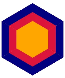
从六边形类开始,定义形状/大小/颜色:
.hex {
    margin-top: 70px;
    width: 208px;
    height: 120px;
    background: #6C6;
    position: relative;
}
.hex:before, .hex:after {
    content:"";
    border-left: 104px solid transparent;
    border-right: 104px solid transparent;
    position: absolute;
}
.hex:before {
    top: -59px;
    border-bottom: 60px solid #6C6;
}
.hex:after {
    bottom: -59px;
    border-top: 60px solid #6C6;
}
为内部类设置样式,并使用transform: scale()按比例减小内部元素的尺寸。在此示例中,使用了scale(.8, .8)的缩放比例。如果想要更粗的边框,请减小数字;相反,如果想要更细的边框,请增加数字。
指定并覆盖颜色,同时增加z-index值以将元素置于前方。
.hex.inner {
    background-color:blue;
    -webkit-transform: scale(.8, .8);
    -moz-transform: scale(.8, .8);
    transform: scale(.8, .8);
    z-index:1;
}
.hex.inner:before {
    border-bottom: 60px solid blue;
}
.hex.inner:after {
    border-top: 60px solid blue;
}
按照与上一次相同的步骤,样式化第二个嵌套元素。需要注意的是,使用了相同的scale值,因为它在已经缩放的元素内部。当然,您可以使用任何您想要的值;这只是一个基本示例。
.hex.inner2 {
    background-color:red;
    -webkit-transform: scale(.8, .8);
    -moz-transform: scale(.8, .8);
    transform: scale(.8, .8);
    z-index:2;
}
.hex.inner2:before {
    border-bottom: 60px solid red;
}
.hex.inner2:after {
    border-top: 60px solid red;
}
再次, 这里有一个实时演示例子