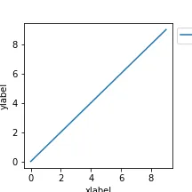
对于使用matplotlib的人来说,这可能是一个几乎每个人都会遇到的问题。如果你生成了一个包含坐标轴标签和图例的图形,并使用默认设置保存它,你将得到一个裁剪过的图像。
演示代码:
import matplotlib.pyplot as plt
def plot():
    plt.figure(figsize=[3,3],linewidth=5,edgecolor='r')
    ax=plt.subplot()
    ax.plot(range(10),range(10),label='label')
    ax.set_xlabel('xlabel\nxlabel\nxlabel')
    ax.set_ylabel('ylabel\nylabel\nylabel')
    ax.legend(bbox_to_anchor=[1,1])
plot()
plt.savefig('no_tight_layout.png')
感谢stackoverflow的帮助,我们知道了一些解决方法,但每种方法都有自己的缺点..
解决方法 #1: 在matplotlib内部使用tight_layout选项。
plot()
plt.savefig('tight_layout.png',bbox_inches='tight')
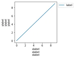
对于简单的图形,它可以工作。
然而,在我个人的经验中,对于更复杂、多面板的图形,这并不是一种可靠的选项。
tight_layout 经常会出现以下错误:
UserWarning: This figure includes Axes that are not compatible with tight_layout, so results might be incorrect.
UserWarning: tight_layout not applied: number of rows in subplot specifications must be multiples of one another.
解决方法 #2:使用matplotlib以外的方式:将图片保存为SVG格式,再转换成png格式。例如,在inkscape的命令行界面中使用--export-area-drawing选项或在inkscape图形用户界面中使用“调整大小到页面”选项。
然而,在这种情况下,您需要依赖于外部软件,而这些软件很难作为Python包的依赖项添加(目前conda仅提供了Windows版本的inkscape)。
所以我的问题是...
为什么matplotlib默认不保存整个图形?
如果我在jupyter notebook中生成相同的绘图,而不使用tight_layout选项,则可以看到所有绘图元素都包含在图形边界内(显示为红色)。
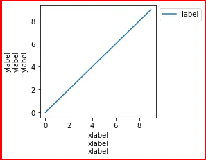
这个图是在一个jupyter notebook输出单元中生成的(!)。
那么为什么不保存成它的样子呢?为什么保存的图像与jupyter notebook中的图像默认不同?
在我看来,这是matplotlib一个非常基本的问题。
如果默认情况下,所有元素都包含在保存的图形中而无需任何解决方法,那会不会让用户的生活更轻松呢?