控制CSS中哪个边框位置设置角像素

3
假设有以下的CSS代码:

#foo {
    border: 1px solid black;
    border-right: 1px solid blue;
}

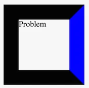
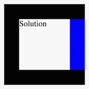
在这种情况下,至少在Chrome浏览器中,元素的右上角和右下角像素是蓝色的,而不是黑色的。有没有可能让它们变成黑色?
4个回答

2
你不能用普通的CSS边框选项来实现,但是如果你想要的话,仍然可以有一个纯CSS的解决方案: 基本上,你要做的就是用CSS创建两个伪元素,并覆盖角落:
#foo {
    border: 100px solid black;
    border-right: 100px solid blue;
    height:300px;
    position:relative;
}
#foo:after, #foo:before{
    content:'';
    background:black;
    width:100px;
    height:100px;
    display:block;
    position:absolute;
}
#foo:after{
    bottom:-100px;
    right:-100px;
}
#foo:before{
   top:-100px;
    right:-100px;
}

可能有些凌乱,但它能工作。将:after:before元素的宽度、高度和位置设置为边框的宽度。 这会产生以下效果: result

JSFiddle演示


1

enter image description here

我希望我的糟糕的Photoshop技巧可以向您解释边框。
如果您查看正方形的4个角落,您会看到一些小线条,那就是一个边框开始和另一个边框结束的地方。
这将始终存在:P
您可以将其作为背景图像(低劣的方式)或者使用其他div来制作边框(同样低劣)。

1
第一种解决方案是使用伪元素,您将绝对定位它以覆盖右边框。为了确保它完全覆盖边框,您必须通过边框宽度的负值来偏移其上部、下部和右侧位置。在本例中,我使用了宽度为5px以更好地说明示例:

#foo {
    background-color: #eee;
    border: 5px solid grey;
    width: 100px;
    height: 100px;
    position: relative;
}
#foo::before {
    content: '';
    position: absolute;
    top: -5px;
    bottom: -5px;
    right: -5px; /* move by border width */
    background-color: blue;
    width: 5px;
}
<div id="foo"></div>

另外,您可以使用CSS盒子阴影:

#foo {
    background-color: #eee;
    box-shadow: inset 0 0 0 5px grey;
    width: 100px;
    height: 100px;
    position: relative;
}
#foo::before {
    content: '';
    position: absolute;
    top: 0;
    bottom: 0;
    right: 0;
    width: 5px;
    background-color: blue;
}
<div id="foo"></div>


0
正如其他人指出的那样,你的问题在于CSS中如何绘制边框。

<div id="foo">问题</div>

#foo {
  border: 30px solid black;
  border-right: 30px solid blue;
}

enter image description here

最简单的解决方法是使用伪元素pseudo element。由于此解决方法完全依赖于border-width的值,因此我将展示一个示例,使用SCSS变量来帮助清楚地了解该宽度值的来源。 < p >注意:您不需要使用SCSS来解决此问题,使用变量只是为了提高可读性/可维护性。

HTML:

<div id="foo"></div>

SCSS:

/* Set SCSS variable */
$border-width: 30px;

#foo {
  border: $border-width solid black;
  position: relative; /* anchor the absolute positioned ::after element */
}
#foo:after {
  content: '';
  background: blue;
  width: $border-width;
  height: 100%;
  position: absolute;
  right: -$border-width;
}

演示: http://jsbin.com/cimaxe/6

希望你清楚地知道,无论在哪里看到$border-width,都可以用像30px这样的值来替换它。

enter image description here


网页内容由stack overflow 提供, 点击上面的
可以查看英文原文,
原文链接