Python绘图无法正常工作

3

我是 Python 的新手,想要用 matplotlib 来绘制一些数据。

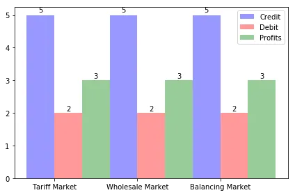
我试图对数据进行分组,但问题是这些组之间重叠在了一起。以下是一张描述我的问题的图片:Problem

Problem

以下是我的代码:

import numpy as np
import matplotlib.pyplot as plt

n_groups = 3
credits = (market[0], market[1], market[2])
debits = (dmarket[0], dmarket[1], dmarket[2])
profits = (pmarket[0], pmarket[1], pmarket[2])
fig, ax = plt.subplots()
index = np.arange(n_groups)
bar_width = 0.45
opacity = 0.4
error_config = {'ecolor': '0.3'}

rectsCredits = plt.bar(index, credits, bar_width,
                 alpha=opacity,
                 color='b',
                 error_kw=error_config,
                 label='Credit')

rectsDebits = plt.bar(index + bar_width, debits, bar_width,
                 alpha=opacity,
                 color='r',
                 error_kw=error_config,
                 label='Debit')

rectsProfits = plt.bar(index + 2*bar_width, profits, bar_width,
                 alpha=opacity,
                 color='g',
                 error_kw=error_config,
                 label='Profits')

plt.xticks(index + bar_width/2, ('Tariff Market', 'Wholesale Market', 'Balancing Market'))
plt.legend()
plt.tight_layout()

def autolabel(rects):
    """
    Attach a text label above each bar displaying its height
    """
    for rect in rects:
        height = rect.get_height()
        ax.text(rect.get_x() + rect.get_width() / 2.,
                1.01 * height,
                '%d' % int(height),
                ha='center', va='bottom')

autolabel(rectsCredits)
autolabel(rectsDebits)
autolabel(rectsProfits)

plt.show()

我不知道该怎么办。我认为只有一个小的逻辑问题,但我现在看不到它!
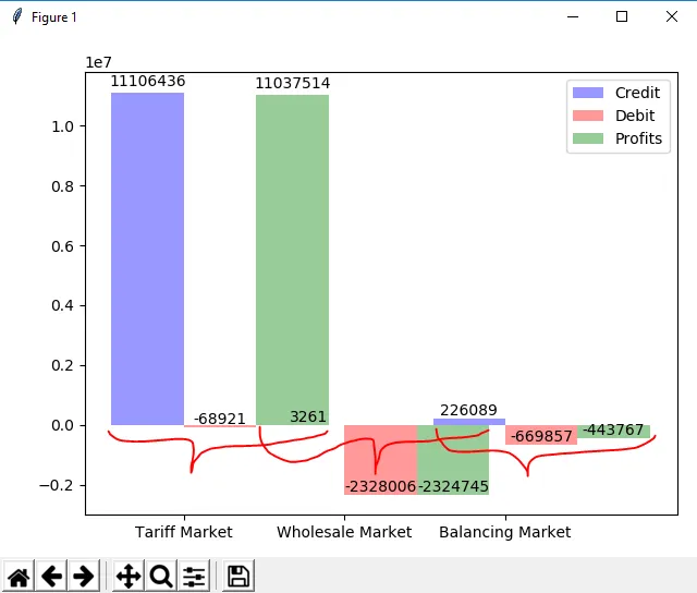

2
如果您包含marketdmarket的实际值,那么这个示例就可以直接运行,这将非常有帮助。我已经包含了缺失的导入语句,但是您需要提供实际的值。如果可能的话,您能否包含一个“预期输出”图像? - MSeifert
1
此外:一个更具描述性的标题会更好,这样潜在的回答者和未来遇到相同问题的访问者可以更轻松地找到这个问题。 - MSeifert
好的,不幸的是图片没有上传成功!再给我一次机会!谢谢你的建议,我会在未来考虑它的! - Jannik
谢谢!是的,完全正确。这就是问题所在!我想在组之间添加一些边距。 - Jannik
1个回答

3
条形图的位置有些偏移。您应该将第一个标签组插入到[0, 1, 2]index),将第二个标签组插入到[0.45, 1.45, 2.45]index + bar_width),将第三个标签组插入到[0.9, 1.9, 2.9]index + 2*bar_width)。每个条形图的宽度为0.45,因此这些重叠是情理之中的。
对于以下部分,我仅选择了一些数据进行可视化,您需要插入或使用正确的值。
如果将bar_width更改为1/3,则组之间就没有空白间隔了:
bar_width = 1 / 3

enter image description here

如果您选择像1/4这样的东西,则每组之间将恰好有一个额外的条形空间:

bar_width = 1 / 4

enter image description here

但是标签还没有居中对齐,不过可以通过在plt.xticks中使用新的索引来轻松解决:

bar_width = 1 / 4
plt.xticks(index + bar_width, ('Tariff Market', 'Wholesale Market', 'Balancing Market'))

enter image description here


谢谢!我知道这只是一个小错误,却让我浪费了将近2个小时 :D 但是如果我想让柱状图更宽怎么办? - Jannik
只要条形图的宽度小于或等于“每组中条形图数量的倒数”,就不会重叠。这里的“1”是因为那是两个不同组之间的间隔空间。 - MSeifert
好的。但有时您需要将其宽度调整为大于1。例如,如果我像您在示例中所做的那样添加一些标签,如“10,000”或更大的数字,则这些数字将重叠在一起,如果条形图仅具有<1的宽度。 - Jannik
通过使用 index = np.arange(3),您可以选择组之间的“距离”为1。如果您想要一个距离为2,则应该使用 [0, 2, 4](例如 index = np.arange(n_groups) * 2),在这种情况下,您还需要将条形图的宽度加倍。然而,Matplotlib总是会缩放图像,因此可能使标签的字体大小更小会更明智。 - MSeifert
好的,现在我明白了!非常感谢!! - Jannik

网页内容由stack overflow 提供, 点击上面的
可以查看英文原文,
原文链接