绘制元素边框(动画)

6
我正在尝试找出一种方法,使按钮在被绘制时呈现动画效果。
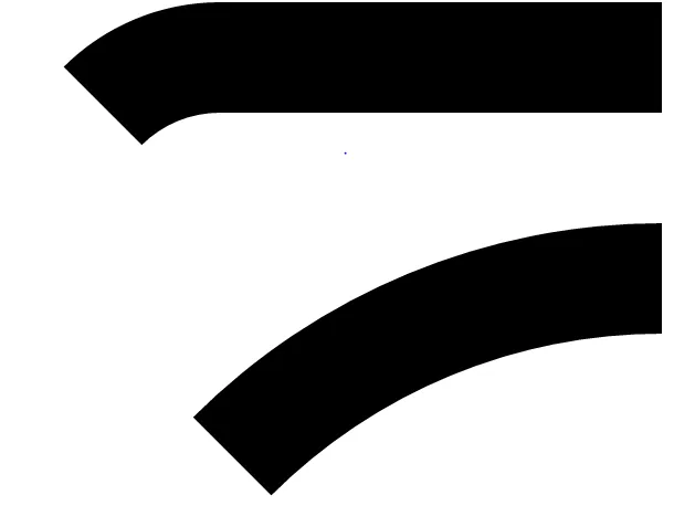
到目前为止,最接近的代码片段是这个,但是在设置了border-radius时它并不完美(请注意角落)。
参考链接:https://codepen.io/anon/pen/MbWagQ
<button class="draw">draw</button>

//Colors
$cyan: #60daaa;
$red: #f45e61;

// Basic styles
button {
  background: none;
  border: 0;
  box-sizing: border-box;
  color: $red;
  font-size: inherit;
  font-weight: 700;
  padding: 1em 2em;
  text-align: center;
  margin: 20px;

  // Required, since we're setting absolute on pseudo-elements
  position: relative;
  vertical-align: middle;

  &::before,
  &::after {
    box-sizing: border-box;
    content: '';
    position: absolute;
    width: 100%;
    height: 100%;
  }
}

.draw {
    transition: color 0.25s;
    border-radius: 7px;

  &::before,
  &::after {
    border-radius: 7px;
    border: 3px solid transparent; // Set border to invisible, so we don't see a 4px border on a 0x0 element before the transition starts
    width: 0;
    height: 0;
  }

  // This covers the top & right borders (expands right, then down)
  &::before {
    top: 0;
    left: 0;
  }

  // And this the bottom & left borders (expands left, then up)
  &::after {
    bottom: 0;
    right: 0;
  }

  &:hover {
    color: $cyan;
  }

  // Hover styles
  &:hover::before,
  &:hover::after {
    width: 100%;
    height: 100%;
  }

  &:hover::before {
    border-top-color: $cyan; // Make borders visible
    border-right-color: $cyan;
    transition:
      width 0.25s ease-out, // Width expands first
      height 0.25s ease-out 0.25s; // And then height
  }

  &:hover::after {
    border-bottom-color: $cyan; // Make borders visible
    border-left-color: $cyan;
    transition:
      border-color 0s ease-out 0.5s, // Wait for ::before to finish before showing border
      width 0.25s ease-out 0.5s, // And then exanding width
      height 0.25s ease-out 0.75s; // And finally height
  }
}

我想避免使用svg文件,最好用纯html和css来实现,但是javascript也可以。


1
“//” 在 CSS 中技术上不是有效的注释语法,但由于某种原因似乎在任何地方都可以工作 :/ - I wrestled a bear once.
1
@Pamblam 有点不相关... 不管怎样,如果它能工作,那么它是否“技术上有效”就无关紧要了吗? - kanna
试着仔细观察按钮的角落,它并不是完美的动画。 - kanna
1
没有SVG,你可以尝试使用background-clip和background-size在透明边框后面绘制颜色:http://codepen.io/gc-nomade/pen/bBGBwb,灵感来自于http://codepen.io/gc-nomade/pen/IGliC。 - G-Cyrillus
1
@Harry,你说得对,我确实认为这将是一个SVG的工作。 - G-Cyrillus
显示剩余5条评论
1个回答

5
所发生的情况是您的draw::before/draw::after元素在转换开始时高度为0像素。这意味着边框半径将非常倾斜。

button {
  background: none;
  border: 0;
  box-sizing: border-box;
  color: #f45e61;
  font-size: inherit;
  font-weight: 700;
  padding: 200px;
  text-align: center;
  margin: 20px;
  position: relative;
  vertical-align: middle;
}
button::before,
button::after {
  box-sizing: border-box;
  content: '';
  position: absolute;
  width: 100%;
  height: 100%;
}
.draw {
  -webkit-transition: color 0.25s;
  transition: color 0.25s;
  border-radius: 70px;
}
.draw::before,
.draw::after {
  border-radius: 70px;
  border: 30px solid transparent;
  width: 0;
  height: 0;
}
.draw::before {
  top: 0;
  left: 0;
}
.draw::after {
  bottom: 0;
  right: 0;
}
.draw:hover {
  color: #60daaa;
}
.draw:hover::before,
.draw:hover::after {
  width: 100%;
  height: 100%;
}
.draw:hover::before {
  border-top-color: #60daaa;
  border-right-color: #60daaa;
  -webkit-transition: width 1.25s ease-out, height 1.25s ease-out 1.25s;
  transition: width 1.25s ease-out, height 1.25s ease-out 1.25s;
}
.draw:hover::after {
  border-bottom-color: #60daaa;
  border-left-color: #60daaa;
  -webkit-transition: border-color 0s ease-out 2.5s, width 1.25s ease-out 2.5s, height 1.25s ease-out 3.75s;
  transition: border-color 0s ease-out 2.5s, width 1.25s ease-out 2.5s, height 1.25s ease-out 3.75s;
}
<h1>CSS Border Transitions</h1>
<button class="draw">draw</button>

放大/减慢动画后,您可以看到问题所在。我还建议在高度过渡期间在右/左边框上放置一个转换,以避免“绘图点”成为奇怪的形状。

这里是另一个例子,说明了我所说的边界半径被扭曲:

Skewed

http://codepen.io/anon/pen/mOdOyQ


网页内容由stack overflow 提供, 点击上面的
可以查看英文原文,
原文链接