实现无限文本旋转器,底部到顶部动画的文本旋转。

3

我想要实现一个无限从下到上旋转的轮子。目前我已经得到了以下内容:
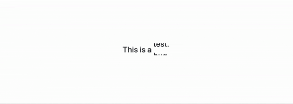
spinning wheel example

目前实现的效果:

  1. 它从下往上旋转
  2. 当它达到末尾后,会重新从第一个开始旋转

我想要的/有问题的地方:
我希望动画是无限循环的,换言之,不应该有过渡的效果。当动画到达最后一个元素时,它不能跳回到第一个元素,而是平滑地连接到其底部以创建一个持续的从下到上的动画

如何实现这样的行为?为了实现所需的效果,我使用了js-我需要更多的js或回退到纯CSS动画吗?

class Spinner extends Component {

    state = {
      active: 0
    };

    interval;

    componentDidMount() {
        this.interval = setInterval(() => {
            this.setState({active: this.state.active === this.props.content.length - 1 ? 0 : this.state.active + 1});
        }, 1000);
    }

    componentWillUnmount() {
        clearInterval(this.interval);
    }

    setPosition = () => {
        const n = 100 / this.props.content.length;
        return n * this.state.active * -1;
    };

    render() {
        const style = {
            transform: 'translateY(' + this.setPosition() + '%)'
        };

        return (
            <div className="spinner--list d-inline-block align-self-start">
                <ul className="p-0 m-0" style={style}>
                    {
                        this.props.content.map((item, index) => {
                            return (
                                <li key={index}>
                                    <h1>{item}</h1>
                                </li>
                            );
                        })
                    }
                </ul>
            </div>
        );
    }

}

.spinner--list {
    max-height: calc((10px + 2vw) * 1.5);
    overflow: hidden;
}

.spinner--list ul {
    list-style-type: none;
    transition: transform 1s;
    will-change: transform;
}

.spinner--container h1 {
    font-size: calc(10px + 2vw);
    line-height: 1.5;
    margin: 0;
}

.spinner--container是什么?它在你的JS代码中不存在。 - Richard
2个回答

2

CSS解决方案:使用@keyframes技术。

body { 
  color: black;
  padding: 0;
  margin: 0;
}

.text {
  padding: 20px 0;
  display: flex;
  position: relative;
}

.item-1, 
.item-2, 
.item-3 {
  position: absolute;
  padding: 20px 0;
  margin: 0;
  margin-left: 5px;

  animation-duration: 4s;
  animation-timing-function: ease-in-out;
  animation-iteration-count: infinite;
}

.item-1{
  animation-name: anim-1;
}

.item-2{
  animation-name: anim-2;
}

.item-3{
  animation-name: anim-3;
}

@keyframes anim-1 {
  0%, 8.3% { top: -50%; opacity: 0; }
  8.3%,25% { top: 0%; opacity: 1; }
  33.33%, 100% { top: 50%; opacity: 0; }
}

@keyframes anim-2 {
  0%, 33.33% { top: -50%; opacity: 0; }
  41.63%, 58.29% { top: 0%; opacity: 1; }
  66.66%, 100% { top: 50%; opacity: 0; }
}

@keyframes anim-3 {
  0%, 66.66% { top: -50%; opacity: 0; }
  74.96%, 91.62% { top: 0%; opacity: 1; }
  100% { top: 50%; opacity: 0; }
}
<div class="text">This is a 
  <div class="items">
    <p class="item-1">test.</p>
    <p class="item-2">bug.</p>
    <p class="item-3">fail.</p>
  </div>
</div>


谢谢!对我有用,还有一件事。当前一个文本正在动画退出时,如何实现已经显示下一个文本的过渡?希望这是可以理解的。 - Tom

2
这里有一个解决方案,不需要使用 ul,并且可以自动调整您想要旋转的文本数量。该解决方案使用 keyframes 和 CSS 中的小技巧/幻觉,在仅两个 span 上创建无限旋转动画。每次 动画迭代 后,使用 JS 更改每个 span 的文本。更改的文本取决于 HTML 中的 data-texts 属性。在您的 ReactJS 代码中,您可以简单地将所有要旋转的文本放入这些 data-texts 属性中。

const spinnerTexts = document.querySelectorAll('[class^="spinner__text--"]')
const texts = spinnerTexts[0].dataset.texts.split(',')
const textPositions = [0, 1]

function initializeSpinnerTexts() {
  spinnerTexts.forEach((spinnerText, index) => {
    // Initialize the spinner texts' text
    spinnerText.innerText = texts[textPositions[index]]
    
    // Change text after every animation iteration
    spinnerText.addEventListener('animationiteration', e => {
      e.target.innerText = texts[++textPositions[index] % texts.length]
    })
  })
}

window.onload = initializeSpinnerTexts
* {
  margin: 0;
  padding: 0;
}

.spinner {
  position: absolute;
  top: 50%;
  left: 50%;
  transform: translate(-50%, -50%);
  overflow: hidden;
}

.spinner__text {
  position: relative;
  display: inline-block;
/*  width has to be set to be >= largest spinning text width  */
  width: 50px;
}

.spinner__text--top,
.spinner__text--bottom {
  display: inline-block;
  animation: 1s ease 1.05s infinite running none;
}

.spinner__text--top {
  animation-name: spinTop;
}

/* Bottom text spinner has to be configured so that it is positioned
right at the same position as the top one */
.spinner__text--bottom {
  position: absolute;
  top: 0;
  left: 0;
  opacity: 0;
  animation-name: spinBottom;
}

@keyframes spinTop {
  from { transform: translateY(0%); }
  to { transform: translateY(-100%); }
}

@keyframes spinBottom {
  from {
    opacity: 1;
    transform: translateY(100%);
  }
  to {
    opacity: 1;
    transform: translateY(0%);
  }
}
<div class="spinner">
  This is a 
  <!-- Uses two spans to create an illusion of infinite spinning -->
  <div class="spinner__text">
    <span class="spinner__text--top" data-texts="test., bug., fail."></span>
    <span class="spinner__text--bottom" data-texts="text., bug., fail."></span> 
  </div>
</div>

更新

你不能直接使用keyframes在每个动画迭代之间添加延迟。但是,你可以调整keyframes的值和animation-duration的值,使其看起来像在每次迭代之间有延迟;实际上,在每个动画结束时,你让它们什么都不做。以下是一个示例(类似于上面的示例,但对animation-durationkeyframes进行了微调)。

const spinnerTexts = document.querySelectorAll('[class^="spinner__text--"]')
const texts = spinnerTexts[0].dataset.texts.split(',')
const textPositions = [0, 1]

function initializeSpinnerTexts() {
  spinnerTexts.forEach((spinnerText, index) => {
    // Initialize the spinner texts' text
    spinnerText.innerText = texts[textPositions[index]]
    
    // Change text after every animation iteration
    spinnerText.addEventListener('animationiteration', e => {
      e.target.innerText = texts[++textPositions[index] % texts.length]
    })
  })
}

window.onload = initializeSpinnerTexts
* {
  margin: 0;
  padding: 0;
}

.spinner {
  position: absolute;
  top: 50%;
  left: 50%;
  transform: translate(-50%, -50%);
  overflow: hidden;
}

.spinner__text {
  position: relative;
  display: inline-block;
  width: 50px;
}

.spinner__text--top,
.spinner__text--bottom {
  display: inline-block;
  /* Changed animation duration */
  animation: 5s ease 2s infinite running none;
}

.spinner__text--top {
  animation-name: spinTop;
}

.spinner__text--bottom {
  position: absolute;
  top: 0;
  left: 0;
  opacity: 0;
  animation-name: spinBottom;
}

@keyframes spinTop {
  0% { transform: translateY(0%); }
  /* Spin finishes after 20% of animation duration (1s) */
  20% { transform: translateY(-100%); }
  /* Nothing from 20% until 100% of animation duration (4s) */
  /* This makes it looks like there's a delay between each animation */
  100% { transform: translateY(-100%); }
}

@keyframes spinBottom {
  /* Similar to spinTop's logic */
  0% {
    opacity: 1;
    transform: translateY(100%);
  }
  20% {
    opacity: 1;
    transform: translateY(0%);
  }
  100% { 
    opacity: 1;
    transform: translateY(0%); 
  }
}
<div class="spinner">
  This is a 
  <!-- Uses two spans to create an illusion of infinite spinning -->
  <div class="spinner__text">
    <span class="spinner__text--top" data-texts="test., bug., fail."></span>
    <span class="spinner__text--bottom" data-texts="text., bug., fail."></span> 
  </div>
</div>


谢谢!我该如何让文本等待更长时间?比如说,让它等待5秒钟,然后再转到下一个文本,以此类推。 - Tom
@Tim 你可以简单地调整动画时间和关键帧动画的值,使其看起来像在等待。 - Richard
我还没有尝试过你的新方案,明天我会试试! - Tom

网页内容由stack overflow 提供, 点击上面的
可以查看英文原文,
原文链接