将多个图形作为子图绘制

29
这些资源展示了如何从一个单独的Pandas DataFrame中获取数据,并在Plotly图表上绘制不同列的子图。我对从不同的DataFrame创建图形,并将它们作为子图绘制到同一张图上很感兴趣。在Plotly中是否可以实现这个功能?

https://plot.ly/python/subplots/

https://plot.ly/pandas/subplots/

我正在根据这样的数据框创建每个图形:
import pandas as pd
import cufflinks as cf
from plotly.offline import download_plotlyjs, plot,iplot
cf.go_offline()

fig1 = df.iplot(kind='bar',barmode='stack',x='Type',
                       y=mylist,asFigure=True)

编辑:

这是基于Naren的反馈的一个示例:

创建数据框:

a={'catagory':['loc1','loc2','loc3'],'dogs':[1,5,6],'cats':[3,1,4],'birds':[4,12,2]}
df1 = pd.DataFrame(a)
b={'catagory':['loc1','loc2','loc3'],'dogs':[12,3,5],'cats':[4,6,1],'birds':[7,0,8]}
df2 = pd.DataFrame(b)

这个图表只会显示狗的信息,不包括鸟或猫:

fig = tls.make_subplots(rows=2, cols=1)

fig1 = df1.iplot(kind='bar',barmode='stack',x='catagory',
                       y=['dogs','cats','birds'],asFigure=True)

fig.append_trace(fig1['data'][0], 1, 1)

fig2 = df2.iplot(kind='bar',barmode='stack',x='catagory',
                       y=['dogs','cats','birds'],asFigure=True)

fig.append_trace(fig2['data'][0], 2, 1)

iplot(fig)

Just the dogs are shown, not the cats or birds:

5个回答

28

这是一个简短的函数示例,可以将一组图形保存到单个HTML文件中。

def figures_to_html(figs, filename="dashboard.html"):
    with open(filename, 'w') as dashboard:
        dashboard.write("<html><head></head><body>" + "\n")
        for fig in figs:
            inner_html = fig.to_html().split('<body>')[1].split('</body>')[0]
            dashboard.write(inner_html)
        dashboard.write("</body></html>" + "\n")


# Example figures
import plotly.express as px
gapminder = px.data.gapminder().query("country=='Canada'")
fig1 = px.line(gapminder, x="year", y="lifeExp", title='Life expectancy in Canada')
gapminder = px.data.gapminder().query("continent=='Oceania'")
fig2 = px.line(gapminder, x="year", y="lifeExp", color='country')
gapminder = px.data.gapminder().query("continent != 'Asia'")
fig3 = px.line(gapminder, x="year", y="lifeExp", color="continent",
               line_group="country", hover_name="country")

figures_to_html([fig1, fig2, fig3])

输入图像描述


2
这解决了我一直以来的一个问题。有没有一种方法可以启动/打开dashboard.html,而不是将其写入文件,然后再查找和打开它?类似于plotly express自动在浏览器中打开的方式。有没有一种方法可以将图形并排显示,而不是堆叠显示? - WillH
3
如果您添加函数属性 
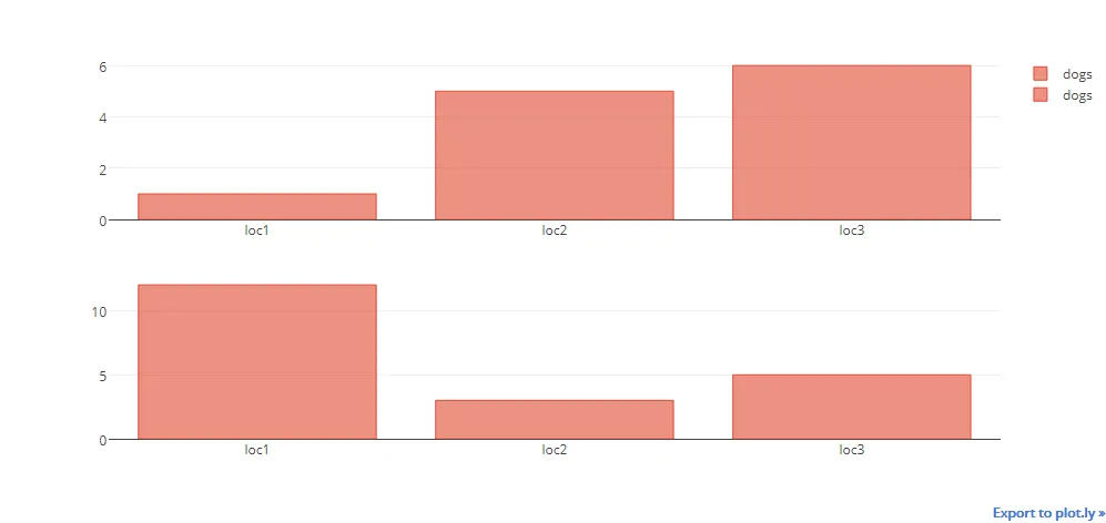
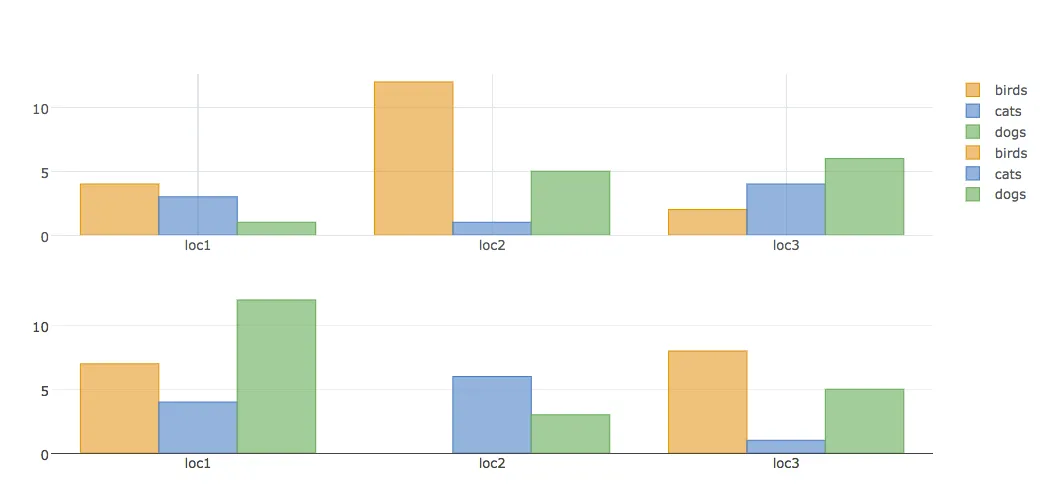
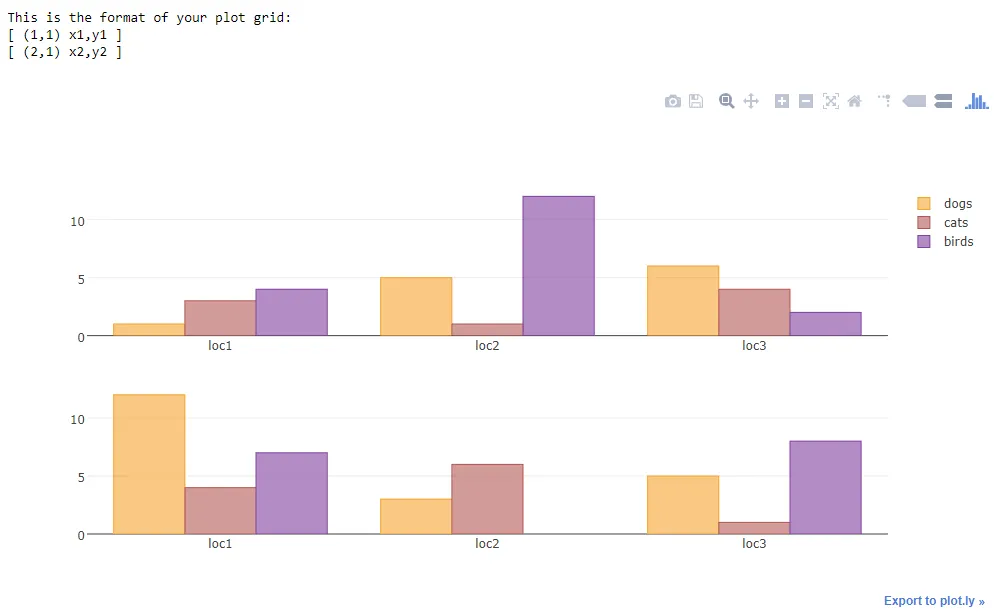
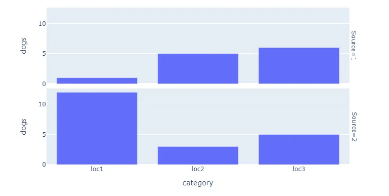
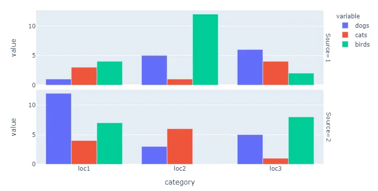
fig.to_html(include_plotlyjs="cdn"),文件大小将会大大缩小,但需要网络连接才能加载。 - Engensmax
2
为了减小最终HTML的大小,只需使用选项include_plotlyjs=True保存一个图形,而其他图形则使用include_plotlyjs=False - pashok3ddd
1
这是一个帮助我的小技巧。如果你在使用IPython.display中的HTML元素将图形显示到ipywidgets Output时遇到问题,可以改用IFrame(使用上述函数保存html文件,然后调用例如display(IFrame(iframe_path, width=1300, height=len(figures) * (fig_height))))。 - Druudik
如果你遇到Unicode/charmap错误,可以使用以下代码来打开文件并指定编码为utf-8:open(filename, "w", encoding="utf-8") as dashboard - undefined
另外,要在保存后自动打开它,你可以在导入webbrowser之后使用webbrowser.open_new_tab(filename) - undefined

12

您可以获得一个包含几个图表和每个图表旁边带有图例的仪表板:

import plotly
import plotly.offline as py
import plotly.graph_objs as go
fichier_html_graphs=open("DASHBOARD.html",'w')
fichier_html_graphs.write("<html><head></head><body>"+"\n")

i=0
while 1:
    if i<=40:
        i=i+1


        #______________________________--Plotly--______________________________________


        color1 = '#00bfff'
        color2 = '#ff4000'

        trace1 = go.Bar(
            x = ['2017-09-25','2017-09-26','2017-09-27','2017-09-28','2017-09-29','2017-09-30','2017-10-01'],
            y = [25,100,20,7,38,170,200],
            name='Debit',
            marker=dict(
                color=color1
            )

        )
        trace2 = go.Scatter(

            x=['2017-09-25','2017-09-26','2017-09-27','2017-09-28','2017-09-29','2017-09-30','2017-10-01'],
            y = [3,50,20,7,38,60,100],
            name='Taux',
            yaxis='y2'

        )
        data = [trace1, trace2]
        layout = go.Layout(
            title= ('Chart Number: '+str(i)),
            titlefont=dict(
            family='Courier New, monospace',
            size=15,
            color='#7f7f7f'
            ),
            paper_bgcolor='rgba(0,0,0,0)',
            plot_bgcolor='rgba(0,0,0,0)',

            yaxis=dict(
                title='Bandwidth Mbit/s',
                titlefont=dict(
                    color=color1
                ),
                tickfont=dict(
                    color=color1
                )
            ),
            yaxis2=dict(
                title='Ratio %',
                overlaying='y',
                side='right',
                titlefont=dict(
                    color=color2
                ),
                tickfont=dict(
                    color=color2
                )

            )

        )
        fig = go.Figure(data=data, layout=layout)
        plotly.offline.plot(fig, filename='Chart_'+str(i)+'.html',auto_open=False)
        fichier_html_graphs.write("  <object data=\""+'Chart_'+str(i)+'.html'+"\" width=\"650\" height=\"500\"></object>"+"\n")
    else:
        break


fichier_html_graphs.write("</body></html>")
print("CHECK YOUR DASHBOARD.html In the current directory")

结果:

在此输入图片描述


最后一行有错误,我得到了这样的文本:="Chart_12.html" width="650" height="500">' - prehistoricpenguin

9
您也可以尝试使用cufflinks进行以下操作:
cf.subplots([df1.figure(kind='bar',categories='category'),
         df2.figure(kind='bar',categories='category')],shape=(2,1)).iplot()

这应该给你:


1
我注意到当我在堆叠条形图中这样做时,“堆叠”属性被移除了。有没有办法将数字放入子图中而不删除任何属性?我尝试了这个:iplot(cf.subplots([fig1,fig2],shape=(2,1))) - sparrow
同样地,如果我添加了一堆distplot,则地毯图不会被绘制,但是图的主要部分会被绘制。 - Jeremy
2
@jorge santos - 在使用上述代码时 - cufflinks.subplots([fig1],shape=(1,1)).iplot() 我遇到了以下错误: AttributeError: 'dict' object has no attribute 'iplot'有什么替代方法或解决方案吗? - Prachi

5

新答案:

我们需要循环遍历每个动物,并附加一个新的跟踪以生成所需的内容。这将产生我希望看到的所需输出。

import pandas as pd
import numpy as np
import cufflinks as cf
import plotly.tools as tls
from plotly.offline import download_plotlyjs, plot,iplot
cf.go_offline()
import random

def generate_random_color():
    r = lambda: random.randint(0,255)
    return '#%02X%02X%02X' % (r(),r(),r())

a={'catagory':['loc1','loc2','loc3'],'dogs':[1,5,6],'cats':[3,1,4],'birds':[4,12,2]}
df1 = pd.DataFrame(a)
b={'catagory':['loc1','loc2','loc3'],'dogs':[12,3,5],'cats':[4,6,1],'birds':[7,0,8]}
df2 = pd.DataFrame(b)

#shared Xaxis parameter can make this graph look even better
fig = tls.make_subplots(rows=2, cols=1)

for animal in ['dogs','cats','birds']: 
    animal_color = generate_random_color()
    fig1 = df1.iplot(kind='bar',barmode='stack',x='catagory',
                       y=animal,asFigure=True,showlegend=False, color = animal_color)
    fig.append_trace(fig1['data'][0], 1, 1)

    fig2 = df2.iplot(kind='bar',barmode='stack',x='catagory',
                       y=animal,asFigure=True, showlegend=False, color = animal_color)
    #if we do not use the below line there will be two legend
    fig2['data'][0]['showlegend'] = False

    fig.append_trace(fig2['data'][0], 2, 1)
    #additional bonus
    #use the below command to use the bar chart three mode
    # [stack, overlay, group]
    #as shown below
    #fig['layout']['barmode'] = 'overlay'
iplot(fig)

输出: 堆叠子图条形图

新答案:

以下是解决方案。

解释:

Plotly工具有一个subplot函数用于创建子图,您应该阅读文档以了解更多详细信息,文档在此处: https://plot.ly/pandas/subplots/。因此,我首先使用cufflinks创建了一个柱状图的图表。需要注意的一点是,cufflinks创建的对象包含数据和布局。Plotly只接受一个布局参数作为输入,因此我从cufflinks图中仅取出数据参数,并将其附加到make_suplots对象的append_trace中。所以fig.append_trace() 的第二个参数是行号,第三个参数是列号。

import pandas as pd
import cufflinks as cf
import numpy as np
import plotly.tools as tls
from plotly.offline import download_plotlyjs, plot,iplot
cf.go_offline()

fig = tls.make_subplots(rows=2, cols=1)

df = pd.DataFrame(np.random.randint(0,100,size=(100, 4)), columns=list('ABCD'))
fig1 = df.iplot(kind='bar',barmode='stack',x='A',
                       y='B',asFigure=True)
fig.append_trace(fig1['data'][0], 1, 1)
df2 = pd.DataFrame(np.random.randint(0,100,size=(100, 4)), columns=list('EFGH'))
fig2 = df2.iplot(kind='bar',barmode='stack',x='E',
                       y='F',asFigure=True)
fig.append_trace(fig2['data'][0], 2, 1)
iplot(fig)

如果您想为子图添加一个常见的布局,我建议您这样做:
fig.append_trace(fig2['data'][0], 2, 1)
fig['layout']['showlegend'] = False
iplot(fig)

甚至更多
fig.append_trace(fig2['data'][0], 2, 1)
fig['layout'].update(fig1['layout'])
iplot(fig)

在绘图之前的第一个示例中,我访问布局对象的各个参数并更改它们,您需要通过布局对象属性进行参考。

在绘图之前的第二个示例中,我使用由cufflinks生成的布局更新图形的布局,这将产生与我们在cufflinks中看到的相同的输出。


谢谢@Naren,我尝试了那个方法,但是它只在两个子图中显示了一些数据。我已经添加了一个示例来说明我的问题发生了什么。 - sparrow
1
@sparrow,根据您的最新更新,我会更新我的回答。 - Naren Murali
您甚至可以在同一张图表中放置多个追踪器,通过迭代fig1['data']元素并将它们全部写入相同的行列位置。 - Kai Aeberli

4
您已经收到了一些完全有效的建议。但是它们需要大量编码。使用px.bar()绘制Facet / trellis图,几乎只需要以下内容就可以生成下面的图表:
px.bar(df, x="category", y="dogs", facet_row="Source")

enter image description here

您只需要额外进行一些步骤,即引入一个变量来拆分数据,然后像这样收集或连接您的数据框:
df1['Source'] = 1
df2['Source'] = 2
df = pd.concat([df1, df2])

如果您想包含其他变量,只需执行以下操作:
fig = px.bar(df, x="category", y=["dogs", "cats", "birds"], facet_row="Source")
fig.update_layout(barmode = 'group')

enter image description here

完整代码:

# imports
import plotly.express as px
import pandas as pd

# data building
a={'category':['loc1','loc2','loc3'],'dogs':[1,5,6],'cats':[3,1,4],'birds':[4,12,2]}
df1 = pd.DataFrame(a)
b={'category':['loc1','loc2','loc3'],'dogs':[12,3,5],'cats':[4,6,1],'birds':[7,0,8]}
df2 = pd.DataFrame(b)

# data processing 
df1['Source'] = 1
df2['Source'] = 2
df = pd.concat([df1, df2])

# plotly figure
fig = px.bar(df, x="category", y="dogs", facet_row="Source")
fig.show()

#fig = px.bar(df, x="category", y=["dogs", "cats", "birds"], facet_row="Source")
#fig.update_layout(barmode = 'group')

网页内容由stack overflow 提供, 点击上面的
可以查看英文原文,
原文链接